Filed under: ANG Main Line Stitchers Chapter, Razzle Dazzle by Ann Strite-Kurz
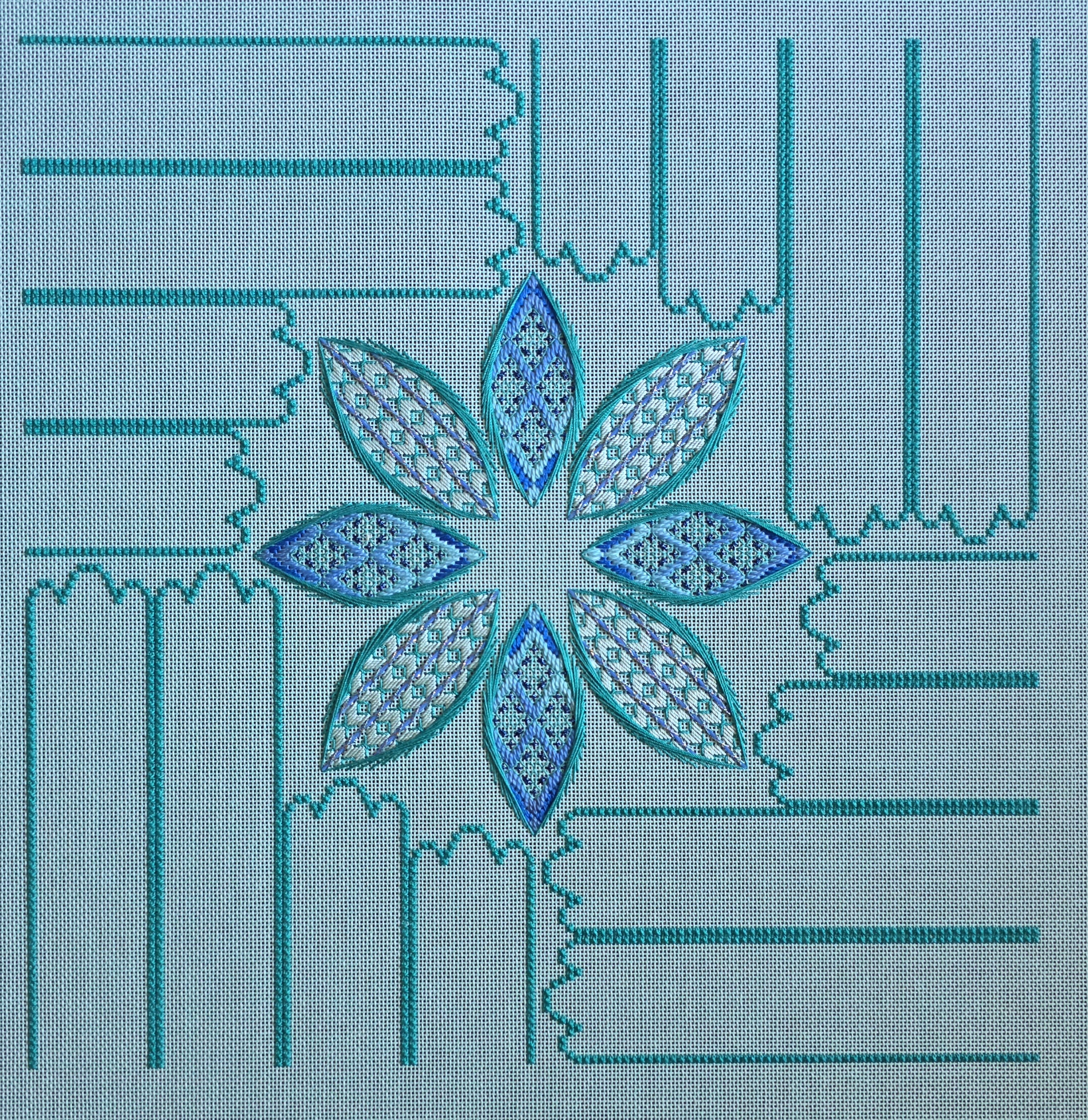
If you work with Watercolours often enough, you should come to realize that when you unwind the skein, the color flow can look different than how it is packaged. I shouldn’t have been but was surprised to see one span of light teal portion and the rest was all the blue. So, I found the repeating pattern of color and cut a long enough length to move from light teal in the center moving towards blue for the outer edges. Very pretty. But, I didn’t realize the full impact of the Watercolours until I went to pull threads for Area 2 of Razzle Dazzle by Ann Strite-Kurz.
Initially, I picked up Petite Very Velvet (V660, a blue) but based on Ann’s color scheme it should be the teal color. So, I selected V662 Green Aqua at our ANG Main Line Stitchers May Monday meeting. I was thinking of staying with silk but there isn’t the correct blue in Grandeur (a silk #5 pearl). So, I went home to regroup. In my stash there was a full skein of DMC #5 Pearl 517, a blue cotton. That’s when I realized that the Watercolours caused the first four petals to be more blue than teal and I need to make the diagonal petals more teal. I had inadvertently inverted (partially) the colorway. So, back to my stash and into the teal drawer. What should appear but a lovely spool of Trebizond, a silk, in a lovely aquamarine (TRA701). I only had the one spool until stopping at Nimble Needle in NJ for another 2 spools. Problems solved!
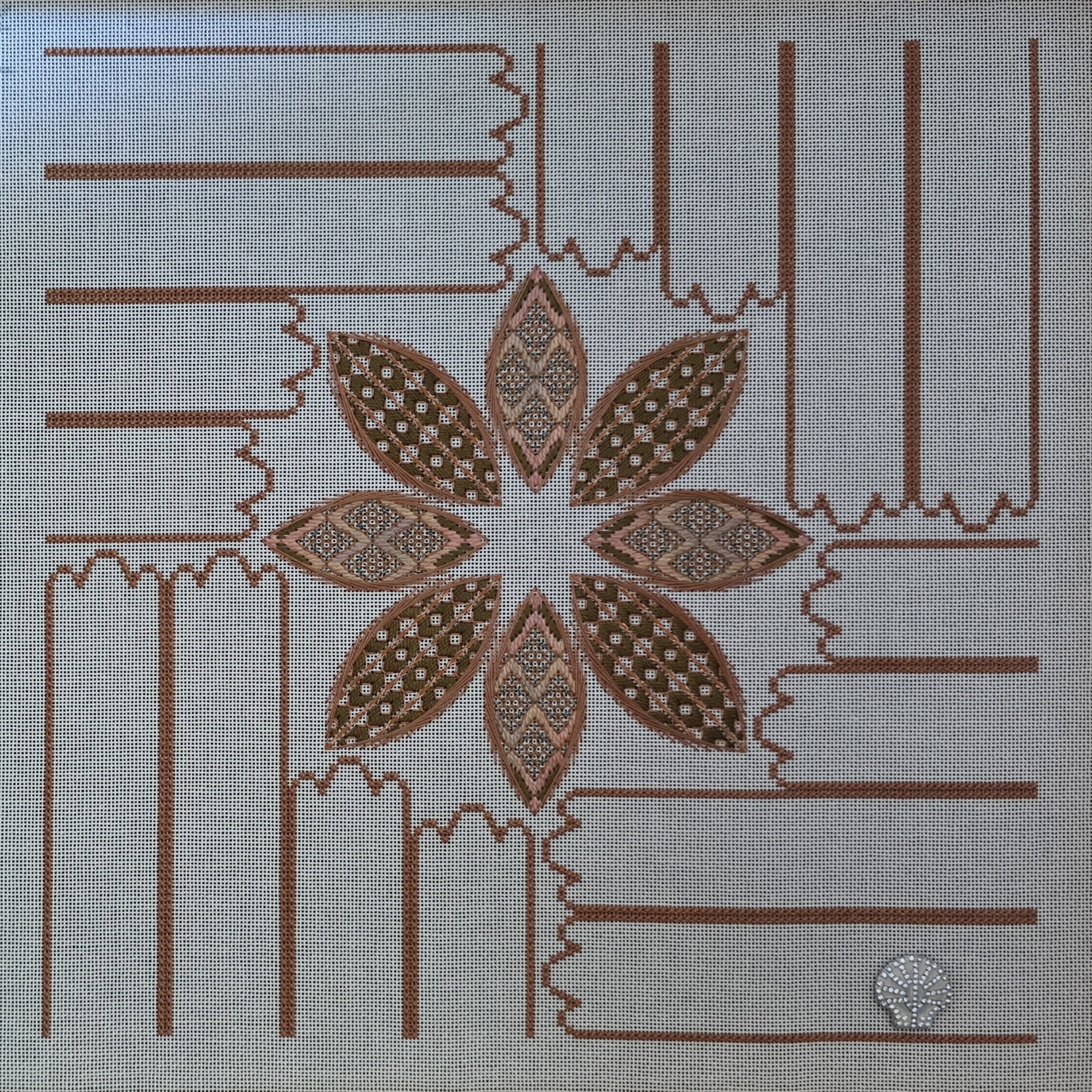
One of Ann’s comments after giving us guidance on selecting colors for her design is, “Beyond this, anything goes, so have fun playing with threads.” That part is easy! In studying various versions of the design I’ve seen online, they can and do vary. So, as long the colors look good together, it should be fine. In a recent email with her, Ann said she believes a dark canvas is better because it creates a negative space better than the lighter canvas colors. I can see that as well but working on the darker colors is tougher on my eyes and I will not stitch a third colorway.
I did go back to do the Autumnal colorway and as you can see the diagonal ovals are stitched in an overall darker value than you see in the diagonal ovals of the Aquamarine colorway. Ann is correct in that it is fun to see these develop.
Next up (at tomorrow night’s June meeting) will be filling in the center and tips around the ovals. While that will be pretty, I am really looking forward to getting to the ribbons and I have enough thread to go in whatever direction moves me.
2 Comments so far
Leave a comment

I really like the green/blue scheme.
Comment by MyGeorgiaOKeeffe June 7, 2026 @ 8:09 pmYeah. Me too!
Comment by melitastitches4fun June 7, 2026 @ 9:58 pm