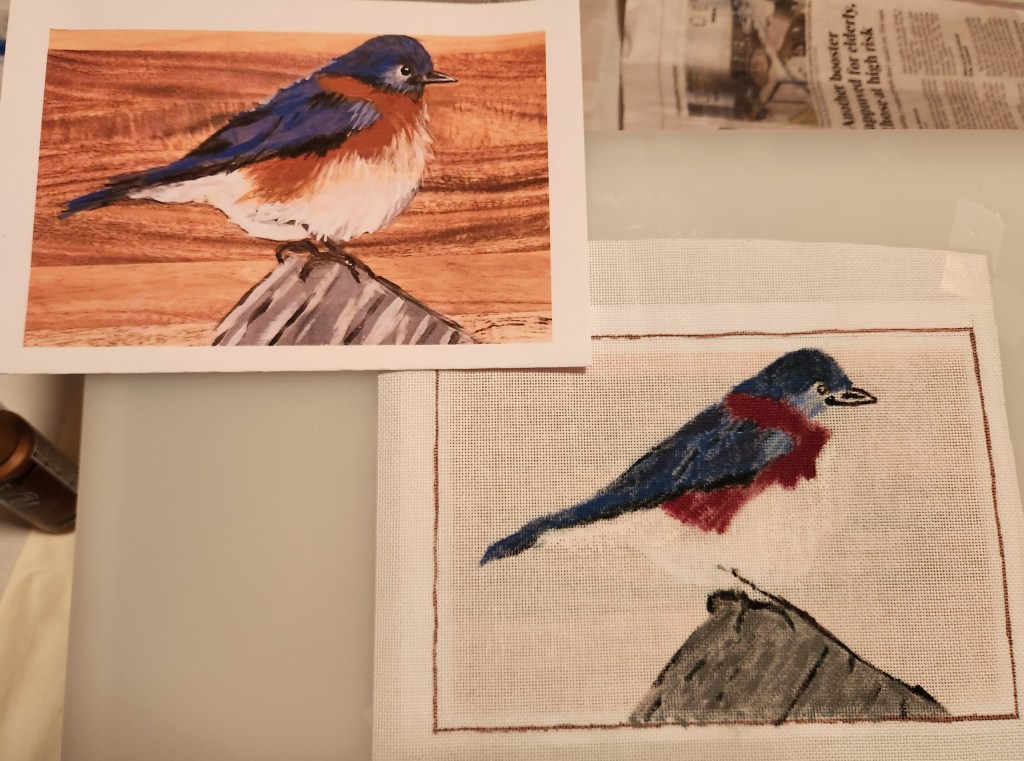
A few Christmases ago, my sister-in-law, Sher, gave me a wooden cutting board on which she had painted a bluebird because I had raved about how good it was when I saw her post it on Facebook. I knew she was crafty but hadn’t known she studied art or painted!

Since Sher had made three similar bluebirds, I used Photoshop to morph my favorite face on my favorite body. And, after taking several classes on how to paint on canvas, I was ready to paint and stitch it for her Christmas gift.
Step 1. I made a line drawing using Vellum tracing paper. This allowed me to focus on the main elements of the design.

Step 2. Initially, I was going draw the tracing onto the canvas. Instead, I placed Congress Cloth on top of the photo. I could see the photo clearly when it was on my light box. My first attempt was heavy on the paint and holes got clogged.
Step 3. In my second painting attempt, I used less paint and waited for each color to dry before starting on the next. I didn’t try to get the exact coloration of the bird’s feathers onto the canvas because I knew I’d cover them completely with threads. I especially loved how the background turned out.

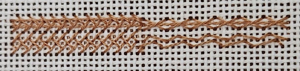
Step 4. I selected threads and a stitch for the log. The grays are Cosmo, a 6-strand cotton floss in 3 values of grey (from dark to light, including 2154, 153A, and 2151) and black DMC 310 for his perch (3 strands). The stitch is from Patchwork of Peace (page 68), which I saw stitched on Facebook’s Virtual Notebooks by Meg W. The pattern created a bit of a vertical appearance, but from a distance, it is ok.

For his feet and leg, I used Trio T12 Black with an outline stitch.

Step 5. I definitely wanted to do the background first in case the feathers needed to cover that up some along the edges. The background is a brown wooden board. I love how my painted canvas turned out. So, I don’t want full coverage.
I tested a Woven Trame (too heavy), Woven (the holes show more than canvas), Alternating Oblong Cross Trame (some canvas would show but still heavy), a Horizontal Wave Double Running Stitch (photo makes it look more open than it actually was and it was tough to see the holes with brown thread on brown canvas), and finally the Horizontal Wave Running Stitch without the short stitch (from Sandra Arthur’s Shapes of Needlepoint Series IV page 46). It is open so my painted canvas will show through.

I had intended to use 5 different values of browns to follow my paint coverage. I realized that it would be difficult to switch threads so often. Then I remembered that Amy Bunger (in her DVD #6 Barely There) suggested matching the thread to the middle value of a shaded painted area and used the same stitch throughout. Here are the top 10 rows and the right side stitched.
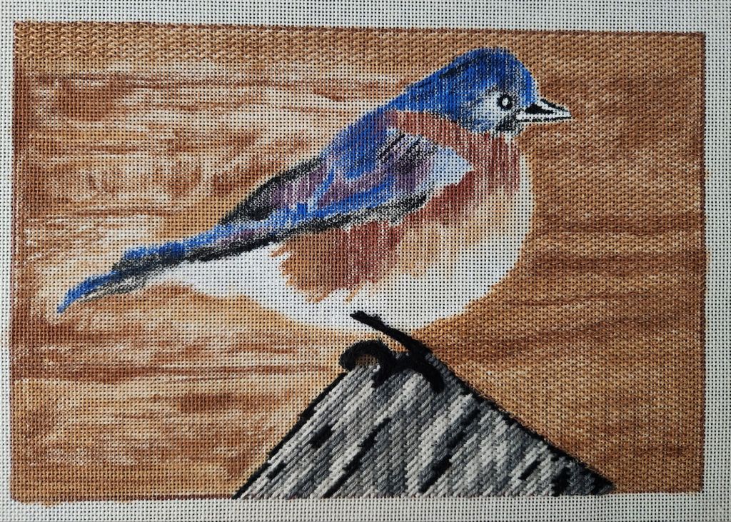
It really evened out the paint and allowed the painted color variation to show through. I couldn’t be happier with the result. But, the background seemed to take forever to stitch.
Once I got to the bird, I stayed with it and was done in about 5 days of concentrated stitching (thanks in large part to the US Open for keeping my husband occupied for 4 days!).
I used Splendor threads for the bird’s body using 1 white, 3 grays, 3 blues, a brown, and a rust. I used 2 strands in the needle varying the combinations: 2 black, 2 bright blue, 1 black with 1 bright blue, 1 black with dark gray, etc. A couple of other threads for the leg and beak.
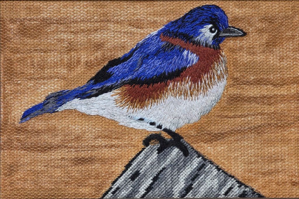
It flew off to the framer, Jim at Repenning Fine Arts in NJ, so it could head west to St. Louis for the ANG Exhibit at Seminar. That was the first of two exhibits he would enter before heading north for it’s permanent nest. I’m very happy with how it turned out!

It was in the Adaptation category in the exhibit. No ribbon but good scores and good feedback from the Judge in the critique:
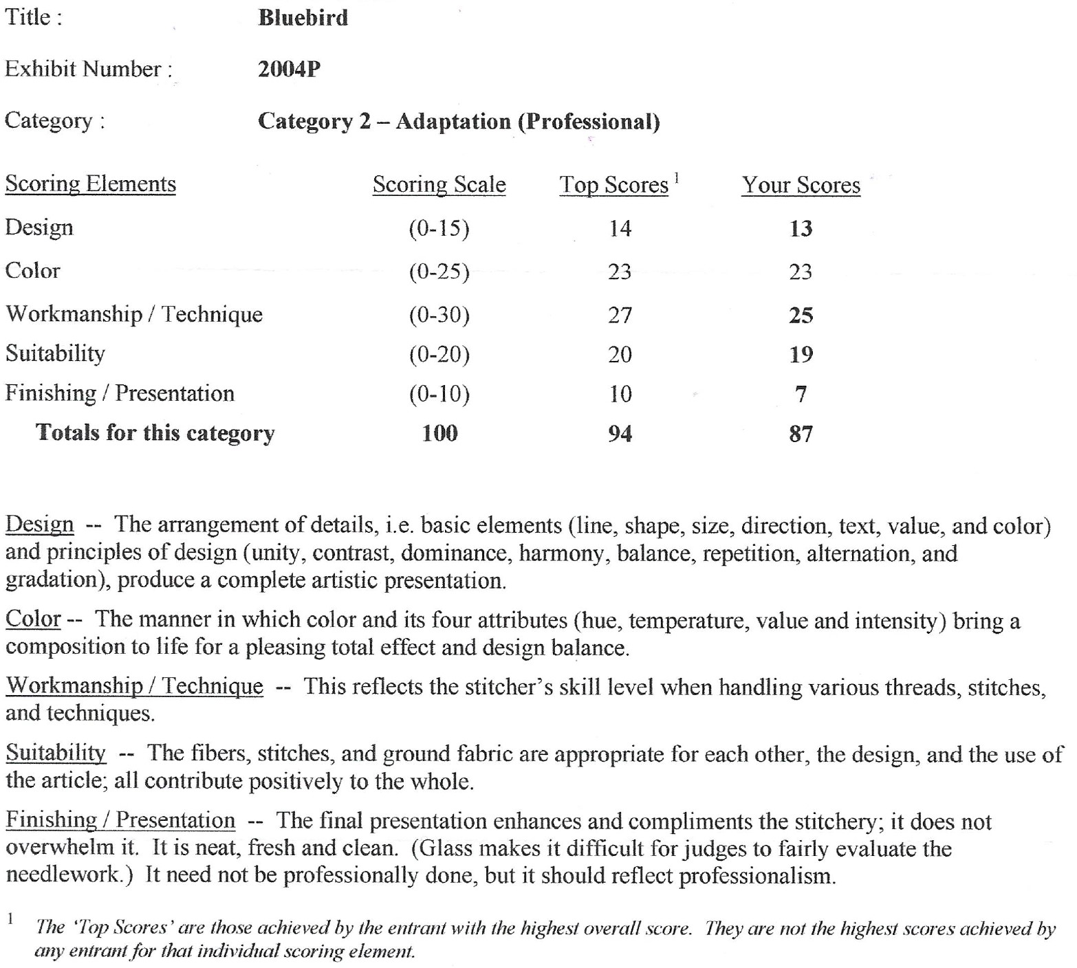
• Ordinarily some of my comments would have been about the line of the back of the bluebird could have been smoother. But then I realized that your depiction was truer to what had been painted, which is more important. Bluebirds may not be as dark of a blue as your sister-in-law painted him but we felt that you wanted to replicate her painting as much as possible in tribute.
• Your threadpainting was successful in transitioning from the darkest of colors to white. In the front of the breast, the transition was a bit more abrupt than on the side (middle) of the bird.
• Your threadpainting of the blue feathers was successful in the way you added the nuances of the different colors in those feathers. The success of the stitching of the feathers is in following the line of flow of the feathers from the breast to the tail. The line of stitches in the breast area follows the flow from the top of the breast to the lower part.
• Transitioning from the breast area to the midway area was not as smooth as it was from midway to the back area. The flow of the line of stitches truly followed the line of the body when going from the middle to the tail. Slanting some of the rusty brown stitches a bit in the middle areas would help a viewer to see a better flow.
• Using an open stitch allowed the shades of the background to come through in a much better way than if you had completely covered the ground fabric with stitching.
• Looking at the overall presentation of your piece, the bluebird might have been happier with a bit more space above his head. Adding some more background above the bird and less rock below would have helped. A less heavy frame would also have improved the presence of the bird.
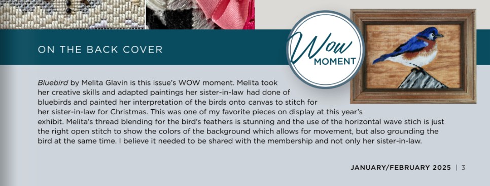
It was really special that Patty, the editor of NeedlePointers, has Bluebird as the WOW Moment & displayed it on the back cover page of the January/February 2025 issue! Here’s what she had to say about it:
Many thanks to Linda M who gave me her copy of the magazine so that I can present Sher with the issue. I want to keep a copy of the issue myself.
The piece was going to go to Sher for Christmas 2024, but I decided to send it south for the winter to the 2025 Woodlawn Needlework Exhibit where it earned Honorable Mention in Adaptation in Surface Embroidery category. It should not have been reclassified from Canvaswork to Surface Embroidery, but the Judges said it wasn’t them. There were 3 judges listed in the Woodlawn booklet and I had their contact information. Apparently, there is a committee that takes in the pieces, and it must have been them. I didn’t pursue it further.

Here’s the piece, ribbon, and pin from Patty..

We visited Sher for her birthday in May 2025. She was blown away and I can finally post this saga! Here we both are with our gifted bluebirds. Neither Lady nor DeeDee seem impressed.

I was asked recently about what stitches would be good for the fur of wolves. What thread used could vary some depending on the animal but I think my response would offer good suggestions for the stitch for any animal.
Random long and short or random encroaching Gobelin-split stitch all come to mind first with two or more colors for shading (or a subtle overdyed). Regular encroaching gobelin on an angle to match direction needed would work too. Packed or Outline Stem stitch moves directionally as well. Do you have others you like?
The only animals I have done (as far as I recall) are penguins. I used Split Encroaching Gobelin of various colors and various lengths on my penguins (https://melitastitches4fun.com/2010/03/16/the-penguin-family/). I used Trio and Fuzzy Stuff. If I were to do this again (10+ years later), I would make the black more slick with different threads. I see now that my sky is vertical – I would switch that to horizontal.
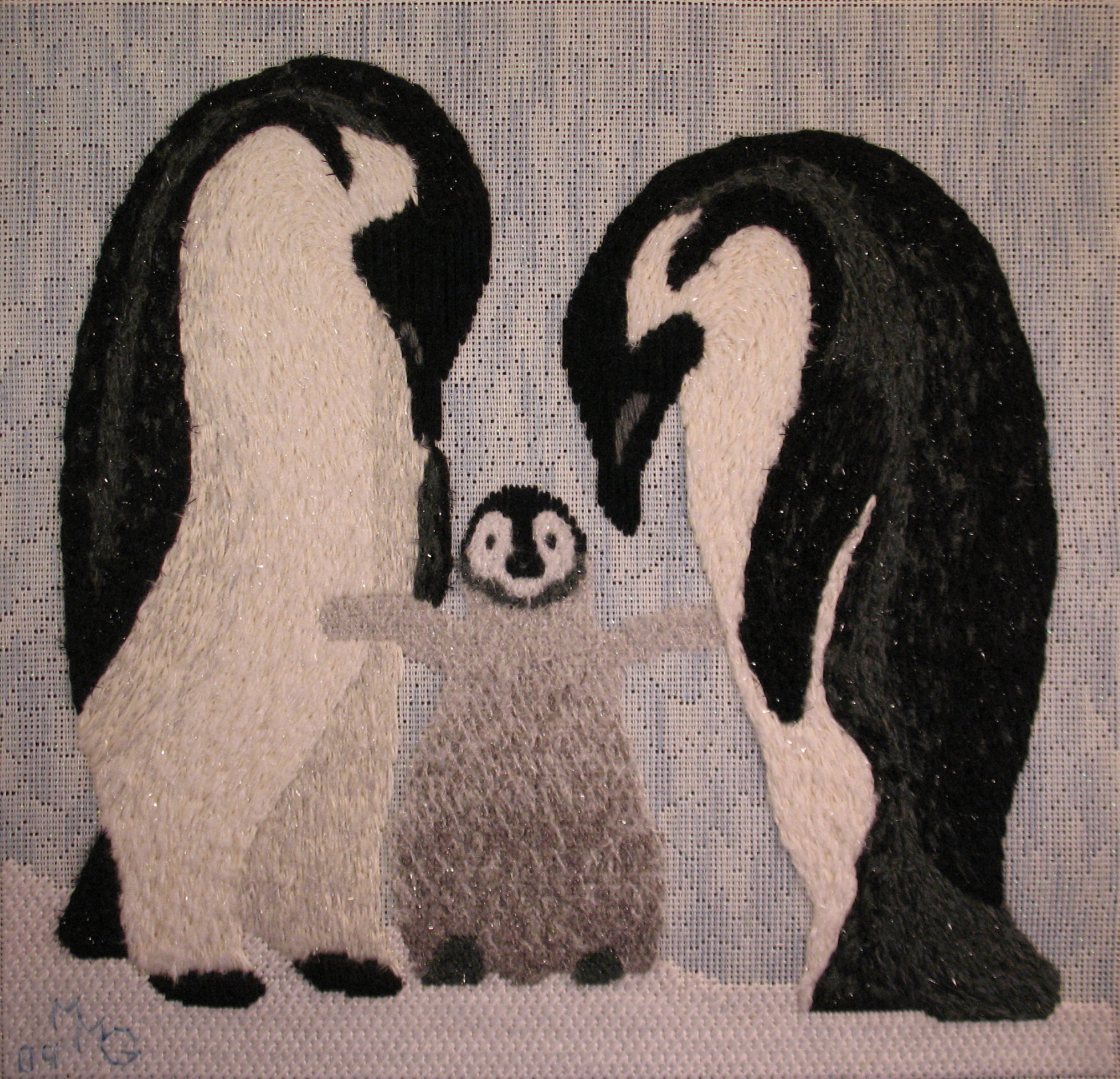
Congratulations to Kayla on her graduation! She followed in her father’s footsteps and has become a teacher. But, she shares her love of animals and especially of dogs with both her parents. So, I thought she’d appreciate this design. I already stitched her favorite animal, a family of 3 penguins! Bill and I wish her all the success and happiness life holds for her.
The design, Paw Print Love Paws, is a free image on Pixabay. There were several variations of the design online. I traced it and then adjusted slightly. The design area is not large (3&1/2″ x 3″).
I used Vineyard Silk Shimmer for the letters and paw print. L is stitched with Diagonal Mosaic, paw with Basketweave, V with Diagonal Cashmere, and E with Reversed Mosaic.
The background is Alternating Continental using Subtlety Y899.
The border is DMC #5 Perle 801 for the Continental stitch on both sides of Kreinik 1/8″ Ribbon 052HL laid and couched with elongated crosses using DMC Floche 433.
I should always get the finishing item beforehand. I love this frame but I needed to make the right and left borders wider. So, I added an additional border on each side and like it better anyway.

When I was organizing my NeedlePointer’s magazines, I couldn’t resist thumbing through them and I found Jean Hilton’s Diamond Bargello design. It is in the April/May 1996, volume XXIV, No. 3 issue.
I modified the design to fit the 4″ x 4″ space for this set of bookends. It was originally an 8″ x 12″ design. What I especially liked about the design for the bookends was how the motion of the pattern pushes the books together.
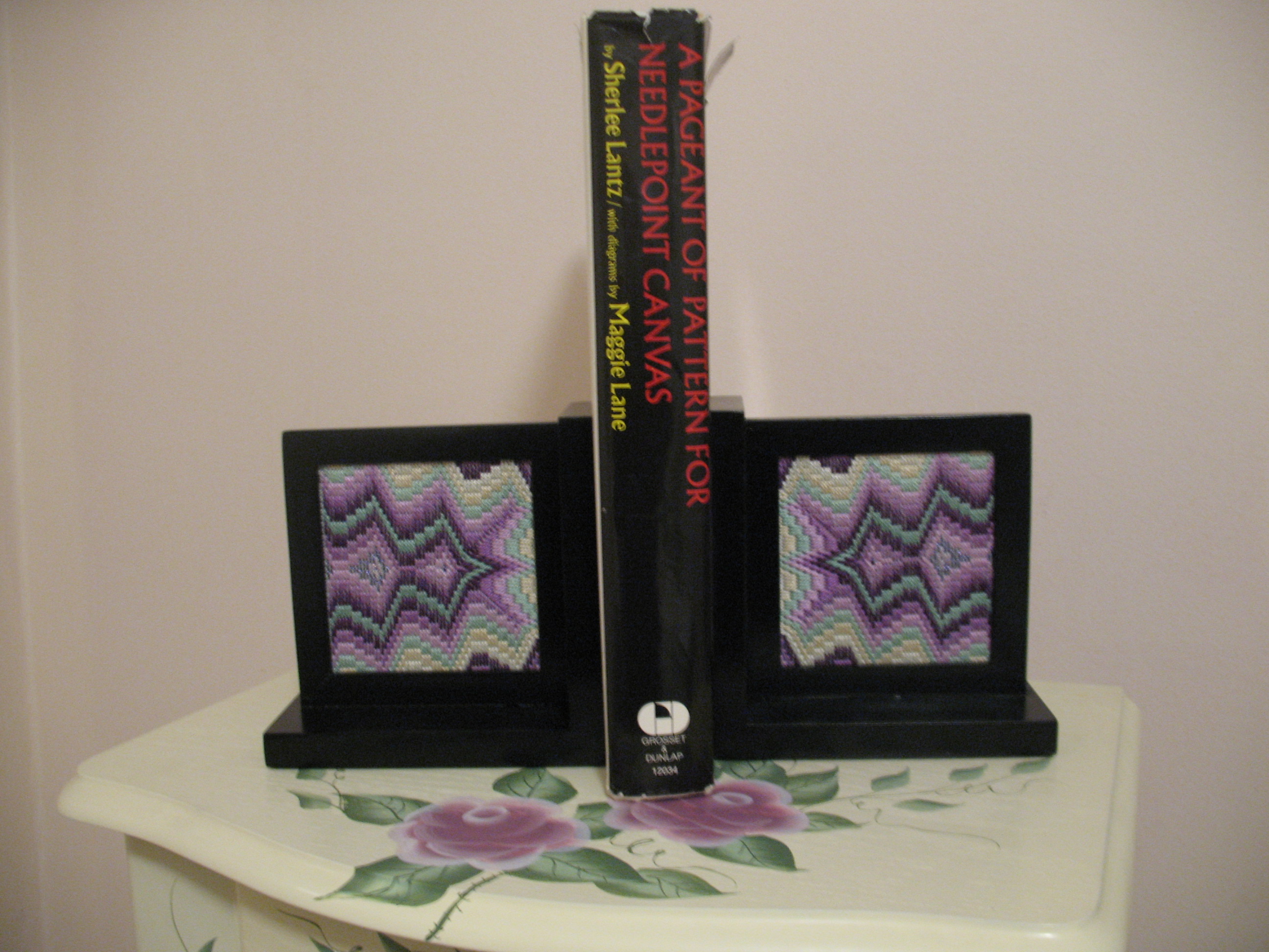
Speaking of books, I used A Pageant of Pattern for Needlepoint Canvas by Sherlee Lantz with diagrams by Maggie Lane to showcase the bookends. I am surprised by the variety of prices for this book on various sites. It ranges from $10 to $288 (I got mine used for $4). I do like the diagrams but what I really like are the historical notes associated with some of the patterns. Most are adapted or re-interpreted from photographed needlework but some stitch patterns are invented by the author and she clearly notes this distinction.
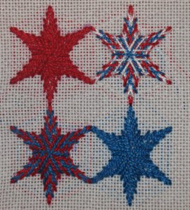
I made several attempts to eyeball the placement of the 6 points of the star before I realized that I must have missed something in her directions. Back I went to Mary Corbet’s Needle ‘n Thread article on Stitch Play for Stars and Snowflakes (http://www.needlenthread.com/2012/07/stitch-play-petals-spokes-spacing.html
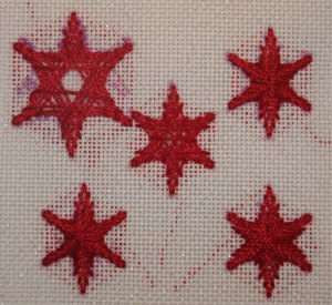
Am I glad I did. There is a website that graphs these points out based on your specifications (http://incompetech.com/graphpaper/polar/). Very helpful! Looking much better now! I have it plotted out on graph paper if anyone is interested. Happy Holidays!
Filed under: ANG Seminar 2012, Melita's Adaptations, Monet's Poppy Field
“An Adventure into a Poppy Field” was entered in 2012’s ANG 40th Seminar in the Adaptation category and it won the State Art Award Ribbon. There were about 2 dozen pieces from Pennsylvania. I was shocked and thrilled! I didn’t even know that “State Art Award” was ribbon category. I am glad I am not a judge – too many beautiful pieces to choose from.
Mary Smull, a fiber artist and educator from Philadelphia, was the guest judge asked to select the winner of the award. Read all about her at http://www.marysmull.com/artist_statement/ Mary gave the keynote speaker address at the Welcome Banquet. She founded SPUN, the Society of the Prevention of Unfinished Needlework. Read all about SPUN at http://www.marysmull.com/portfolio/the-society-for-the-prevention-of-unfinished-needlepoint/
For this piece, the critique noted that “my journey was well documented”. So true, it is easier because I blog and keep notes. The documents and photos that I sent for the artist’s statement were taken from a previous blog (https://melitastitches4fun.wordpress.com/2011/02/18/an-adventure-into-a-poppy-field/).
I still twist the thread (a comment I got last year too) in some sections particularly in the sky on top dark area. So, I will keep working on that. And, the perspective a bit off. I had told friends that one comment I expected was that I had gotten carried away on the poppy field. It got away from me like wild flowers. Better “integration” of stitching to create the hillside was also recommended. I also got nice comments such as “truly lovely”. I would like to thank all the judges for taking time to write the critiques. As was last year’s, they are thoughtful, instructive, and encouraging! I highly recommend getting them done so that you can learn and grow.
And, I just love the double mat especially the grayish blue inner mat that was suggested by Ted (Theodore) Hartz, Custom Picture Framing, in West Chester (google will get his name and address – or call Fireside Stitchery who referred me to him).
I am very happy with the piece but will the 5th try be my last attempt? Even my husband is ready for a change in design! For now, perhaps I can photograph, enlarge, and project certain areas using the critique as a teaching tool to my local chapter. I bought a book at Ruth Kern’s bookstore (only 1 of 3 – I thought I did good to limit myself to 3) regarding photography. And, several other projects have been put aside with all this seminar activity. So, for now, I look forward the next adventure . . .
My artist’s statement was as follows (excluding photos from previous attempts which can be found on my blog as noted above):
I can’t remember where or when I fell in love with Monet’s Poppy Field in a Hollow near Giverny (1885) but, I want to capture it in needlepoint. It seems so peaceful and relaxing.

My first attempt was all about testing stitches. I really like the Whipped or Laced Running Stitch (Elegant Stitches by Judith Baker Montano) for the light blue on the right. I didn’t care for it as much for the 2 greens to the left of that area. I also liked the stitch Serendipity used in the top blue-green portion for the distant tree line and Rococo for the dark green bushes in the middle (both are from Stitches To Go by Suzanne Howren & Beth Robertson). It’s size is 4&1/2″ x 4&1/2″ and too square.
The quest continued for stitches in my second attempt. I had it in my mind that a large stitch pattern base would work for the poppies and then thought random french and colonial knots would make the flowers on the field appear random but it became too dense. I did like the Knotted Stitch on the upper left and a similar stitch with less slope for the area to the left of the center dark green bushes called Diagonal Roumanian. Then, I created a variation of Kennan for the area left of the center dark green bushes. These stitches came from Stitches To Go by Suzanne Howren & Beth Robertson. I expanded the size to 4″ x 4&1/2″.
I felt pretty good about stitches and decided in the third attempt that I better test some colors and threads. To combat the density of the poppy field, I switched to a thinner thread. It was better but it wasn’t right – it seemed flat and lifeless. So, I put it away for a long time deciding further experience was needed before I could improve the piece.
Always on the lookout for new threads, I tried a variety of threads for my fourth attempt. I also tried some different stitches. I liked this version much better, especially the poppy field because I used various shades. While I saw improvement, I wasn’t sure where to go next and decided to put it away – again.
Then, I saw the class ‘Landscapes’ was teaching design and stitching techniques just for landscapes at the 2010 ANG Seminar taught by Lois Kershner. So, I attended my first seminar to help me figure out how to do my poppy field. I left Ohio armed with knowledge from her class as taught by Pat Rusch. Working now on a full scale size (8″ x 9&1/2″), I studied the techniques in the book and reconsidered threads and stitches – again!
I hope the patches of the long grass will be as inviting as Monet’s and you and I enter into the field, sit, and relax for a while until another adventure comes along.

I met 2 of the ladies from the chapter that stitched the ribbons & now can’t remember their names or chapter. I found their names/chapter in the seminar brochure. So, thanks to the ladies in the Cape Cod Chapter and Keystone Chapter. I discovered that our state flower is the Mountain Laurel! It is a lovely ribbon.


On the unofficial first weekend of summer, I want to blog about this wonderful picture. A woman I work with, Jackie, wanted it translated into needlepoint. Initially, I was going to make her a line drawing until I heard about copic markers. Another woman I work with and her daughter picked me up the 5 colors I needed with 40% off coupons at Michael’s. They cost about 8 dollars each (before the coupon). They are really nice with double ends – a brush shaped nib on one end and a chisel tip on the other end.
There was no way to track copyright for the picture she wanted to use. However, Jackie is doing this for her own person use & is not planning to enter it into a competition of any kind. Should I wish to stitch this myself someday & select stitches on my own, I could enter it as an Adaptation. The only problem is that if it were to win a ribbon, it would not get photographed for the magazine. I would not be able to reproduce the design/stitch guide either.
I think the drawing turned out quite good – certainly not as good as a professional painter could have done. But, it should be good enough – and way less expensive. I didn’t charge her! The canvas was only about $3 and I can reuse the markers. I just wanted to see if I could do it! Then, I selected some simple stitch patterns for her for the dresses & hand wrote up a stitch guide (of sorts-certainly not professional quality). Some other areas are simple diagonal or straight stitches. And, even smaller areas I suggested simple basketweave. We met a couple of times to go over the stitches. Jackie practiced them first & now is stitching the design! I am excited to see it.


Well, I missed the mark on the this project because I didn’t start with the right subject. And, I stitched in a classic embroidery style. So, I’m glad to get a second chance at an Oct 22 class at Rittenhouse Needlepoint.
Here’s the concept for the first class I took a few months ago with Joetta Maue – Glean from daily observation to create a one of a kind personal artwork by creating a visual “diary sampler” of embroidery stitches, incorporating abstraction and pattern or confessional writing and images. The “diary” of stitches will be explored as a daily act and observation. We will discuss the creative use of diaristic writing and daily life documentation, while looking at examples of contemporary fiber artists.
It was supposed to be more ‘Autobiographical Embroidery’. I don’t know what photo to take for the second class but I’m thinking about a photo from our wedding because we are celebrating 25 years of marriage next year! At least that is more in keeping with the concept.
I have stitched the orchid before (https://melitastitches4fun.wordpress.com/2010/03/08/orchids/ & it still looks nice enough:

Filed under: Melita's Adaptations, Monet's Poppy Field, Needlework in Progress, Poppy Field
Thanks to a combination of stitches including padded satin and freestyle stitching I am happy with the oranges areas. I combined 3 Bark (WDW) for the padding. Then, 2 Hazlenut + 1 Bark or 1 Bark + 2 Hazlenut for the top layer. Plus, a little freestyle stitching on the top.

Filed under: Melita's Adaptations, Monet's Poppy Field, Needlework in Progress, Poppy Field
The strip along right side that is blueish green worked up quicker than last time when I used Diane’s Stitch on that side!
I used the blue portions of one strand of the overdyed thread, ThreadworX 1067, but switched to two strands of a darker overdyed green thread from Weeks Dye Works named Lucky (medium greens). You should be able to see the difference between the Blue patch I added yesterday & this one.

