One of the volunteers for the ANG Seminar Exhibit complimented me on my packaging of Shelly the Turtle. Because of the dimensionality of the piece, I wanted to protect it from shifting and getting crushed. So, I created a well for the frame to sit in. The base is foam board.
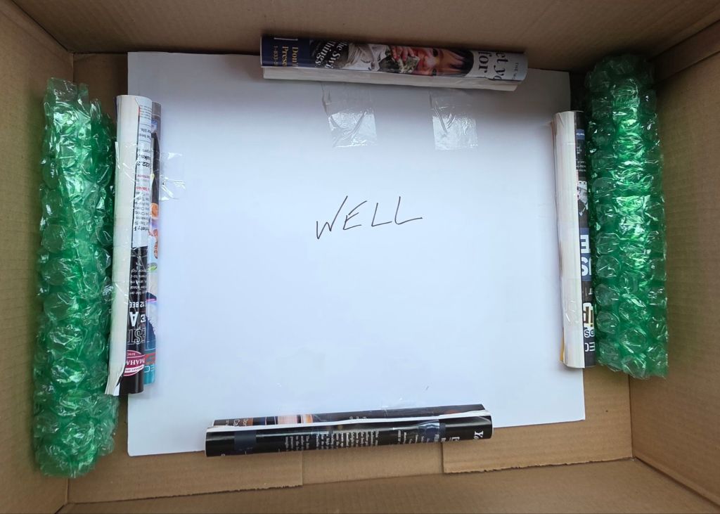
The piece is wrapped in tissue paper and placed it top side up inside the well. The two stacked rolled up magazines are taped in place on each of the four sides to accommodate the raised areas.
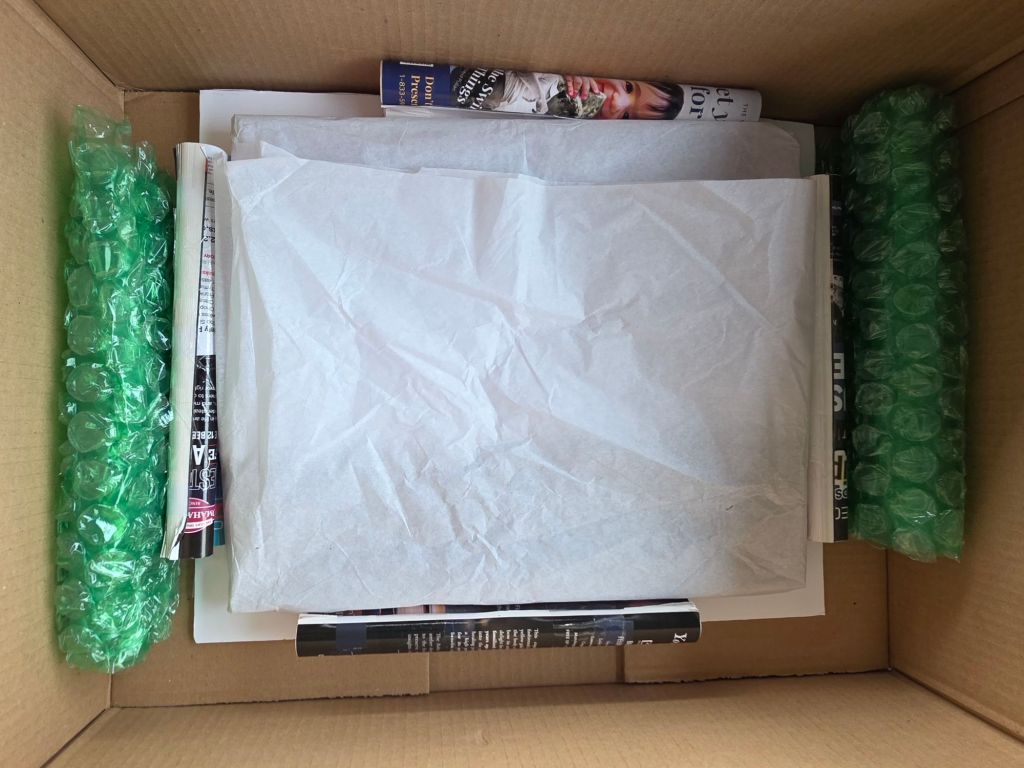
Another foam board is placed on top of the magazines for the lid. Bubble wrap corners are held in place by string but loose enough that they can slide off and be reused.
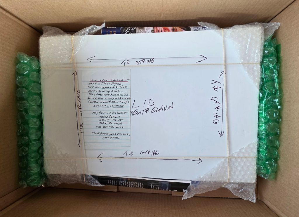
Then, written instructions are provided in case they won’t let me pack it! Twice Shelly has traveled and twice I was allowed to repack it. Once I drove it home and in Denver because I wanted to ship FedEx and ANG was only using UPS.
There will not be an exhibit next year in Nashville because it’s only a 4-day Seminar. I heard just under 100 pre-registered for next year (about 1/3). It’s the second time that was offered. Pre-registrees are allowed to register for classes one week before other ANG members. I saw pieces that I like and pre-registered. My top picks are the Aurora Borealis by Wendy Moore (3-day class) and the ornaments by Toni Gerdes (1-day class). Nashville is a very cool city and it’s in October (21-24). Save those dates!
Three days of Heart of the Matter with Wendy Moore went fast especially because we were having fun and getting alot done!
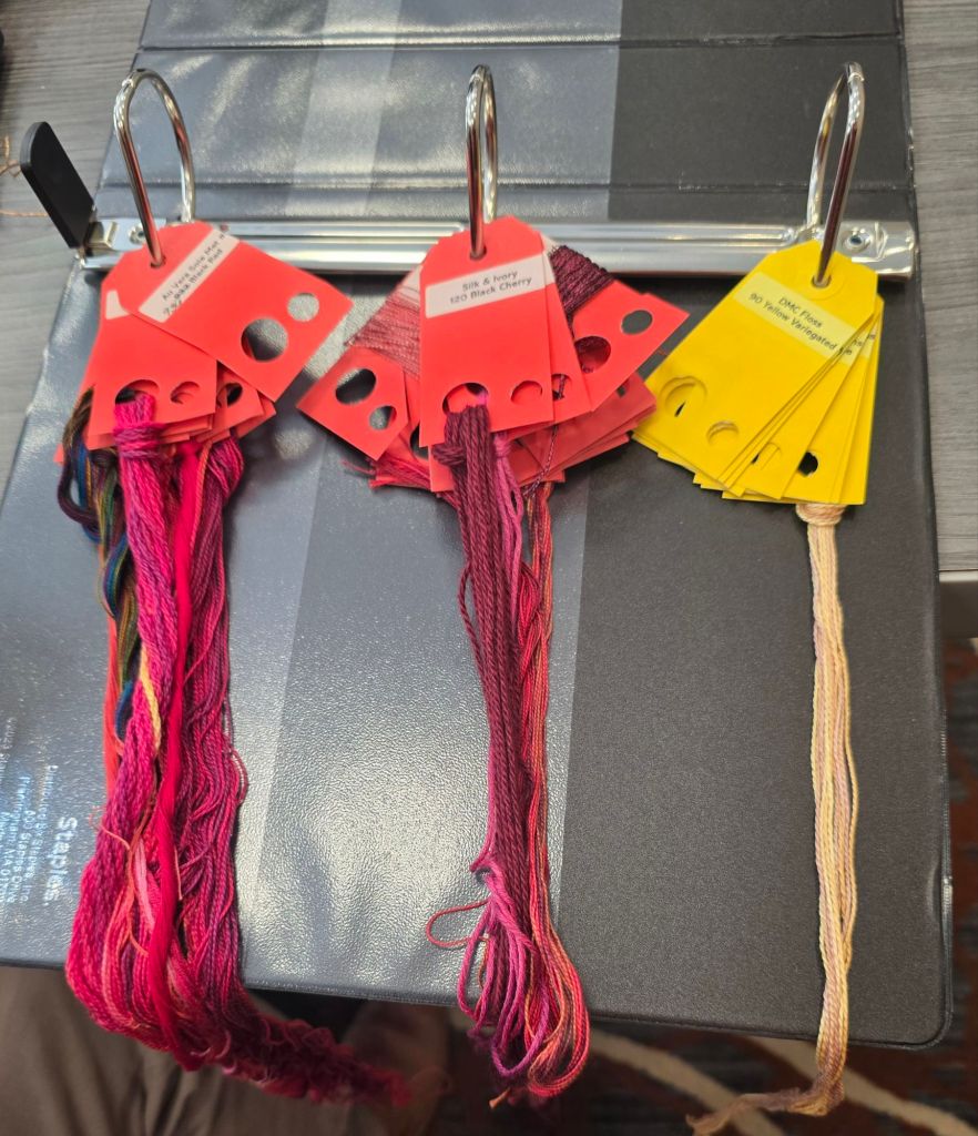
Here’s the way David from ANG Main Line Stitchers organized his threads. Very clever. He has another three ring binder for the instructions. I wonder if they would combine easily.
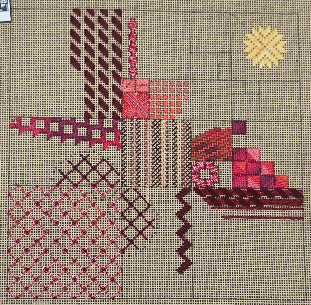
One heart is visible – can you find it? There are more to come. I caught up from skipping yesterday’s final section and cleaned up my spaghetti except for 2 threads. Some in class will be eating Italian for a week! Here’s my progress on Heart of the Matter with Wendy Moore.
We started with Chotties Plaid in our second day of Heart of the Matter with Wendy Moore. I elected not to place any horizontal stitches until my vertical ones are done.
I got started in the wrong square once but got back on track before too long. I didn’t get to the square motif we worked on at the end of the day and today’s spaghetti will have to wait thanks to a bad muscle spasm in my back. It started yesterday and came back this afternoon. Despite everything, it feels like I’ve got alot done for 2 days.
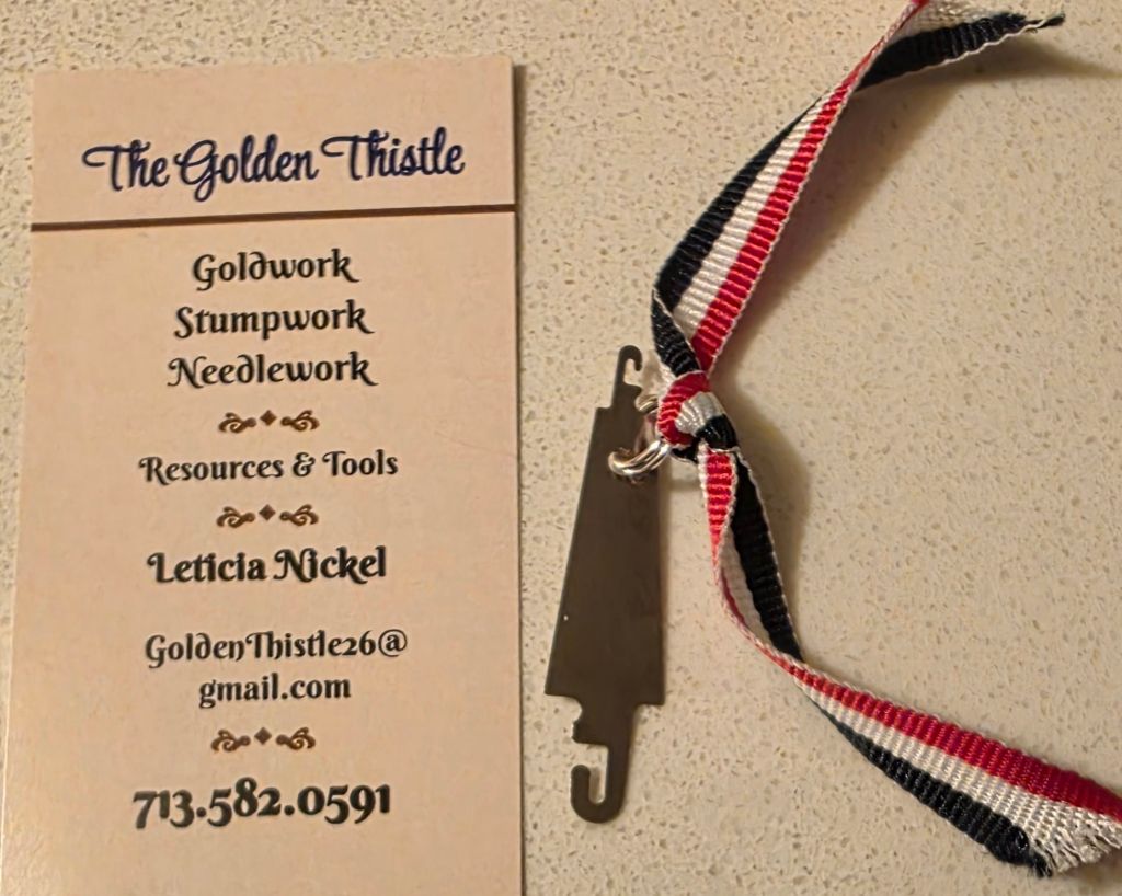
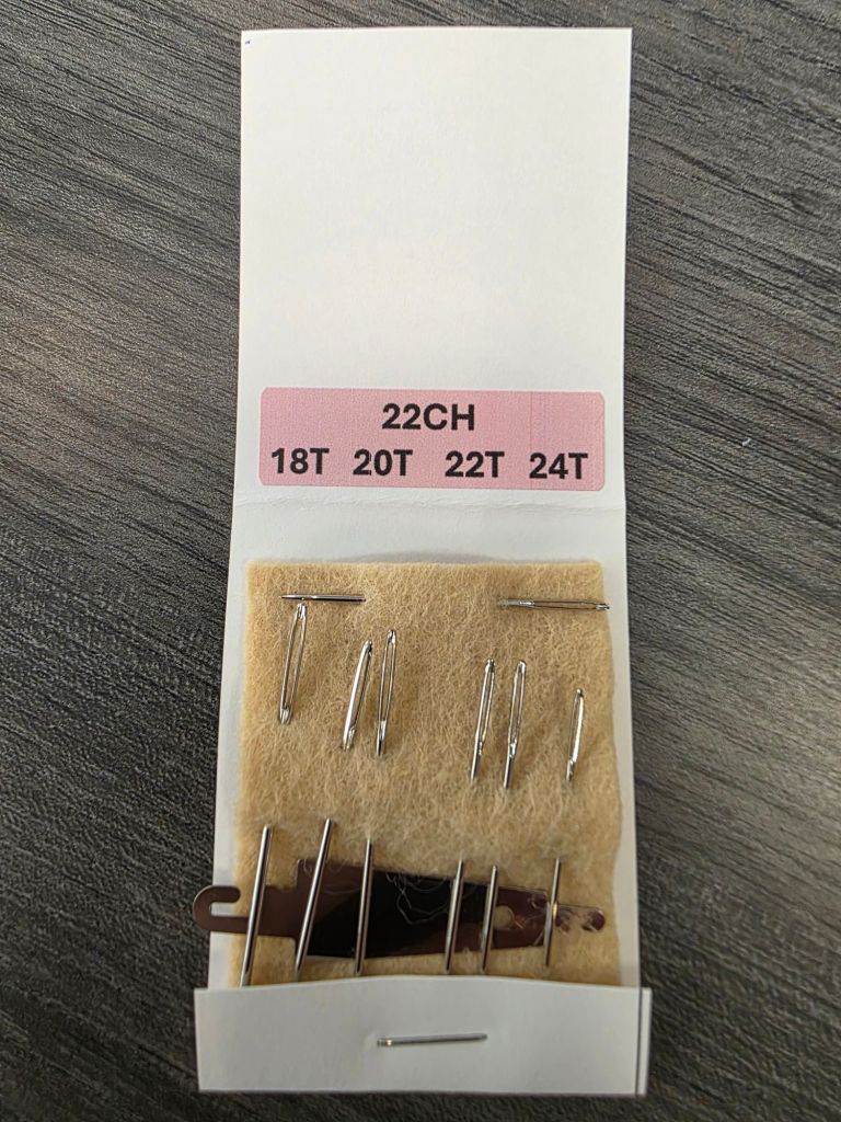
First, I want to thank Leticia at The Golden Thistle for donating my favorite needle threader. Somehow, it’s not in my travel tool tote! So, I really needed this.
Today, I started Heart of the Matter, a 3-day class with Wendy Moore. I haven’t taken a class with Wendy yet and this has some challenging stitches.
The kit is wonderful. Big! Two bags of thread – 37 different ones! That must be a record!! The red bag is for the first 2 days and the yellow bag for the third day. There are 3 completely new threads for me including Au Vera Soie metallic, Wonderfill Perle Cotton, and Wonderfill Dazzle (rayon). We got a glue stick for fraying threads such as Dazzle.
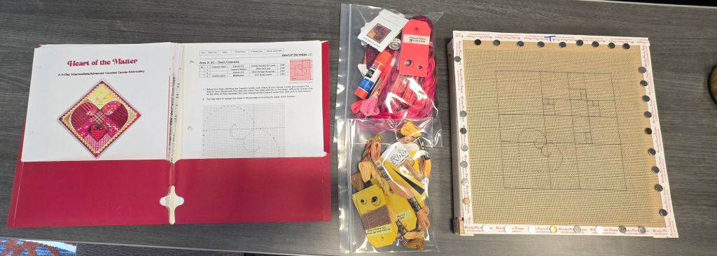
The needlecase Wendy gave us also has my favorite needle threader and plenty of needles. Wonderful.
Wendy provided empty thread cards for when we open a skein and have leftover threads. Amazing. It’s great that her husband helps her kit up doing a variety of tasks.
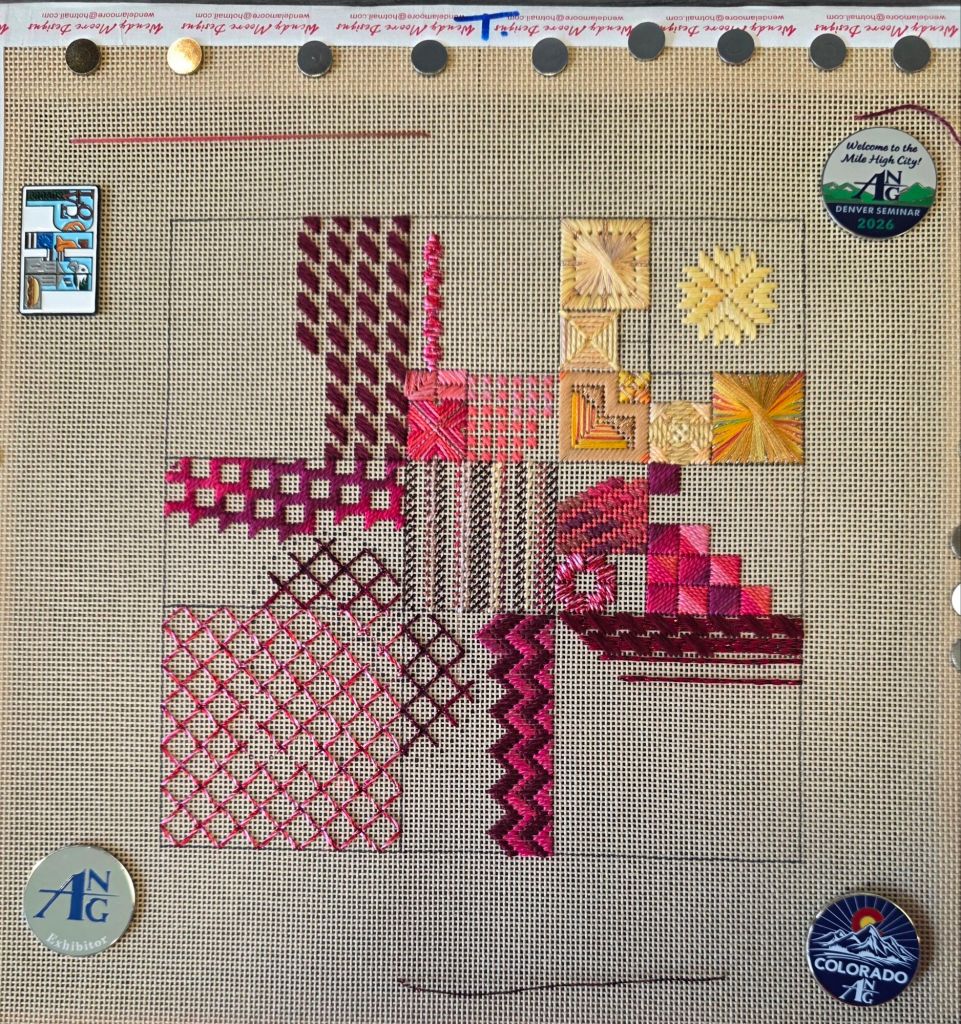
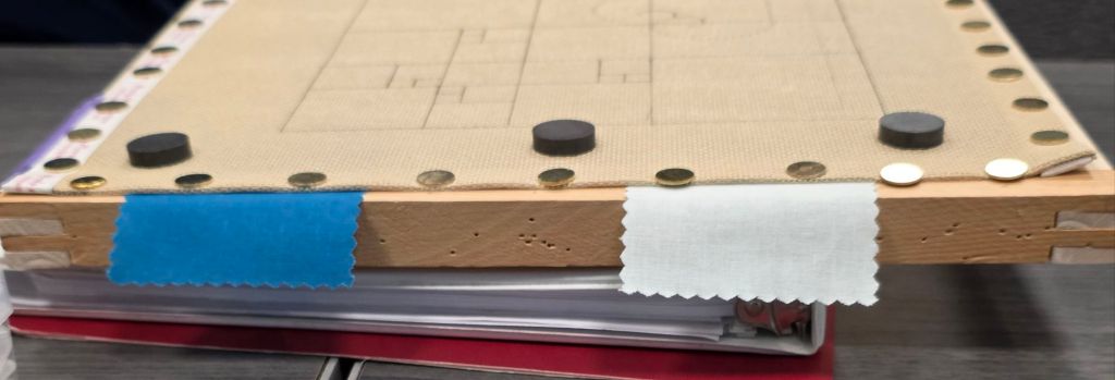
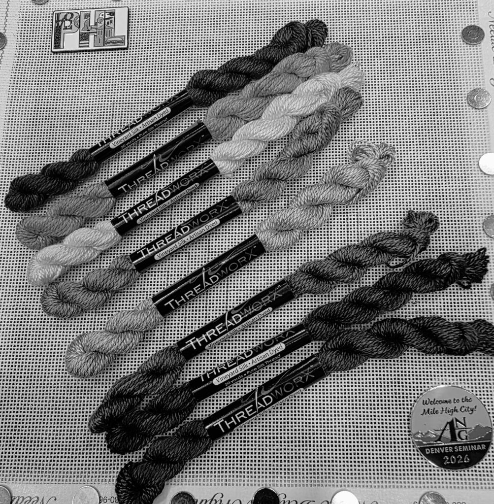
Part of coming to class is seeing what other things, tips, and tricks people have. Wendy tells us we’ll have alot of spaghetti. So, this set up from the woman behind me is clever and will help with spaghetti. I have 4 magnets in each corner.
The instruction booklet is 59 pages! At least it’s not double-sided.
Here’s my progress after Day 1. Actually looks like alot for one day.
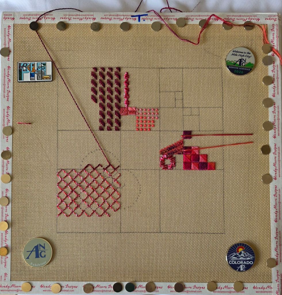
I did clean up my 3 spaghetti strands before tomorrow’s class (didn’t bother to rephotograph).
I took a 1-day class with Kathy Rees, ROY G BIV to get her take on color theory. The threads are all ThreadworX Vineyard Silk. So, no need to lay threads! Nice since this is a 1-day class.
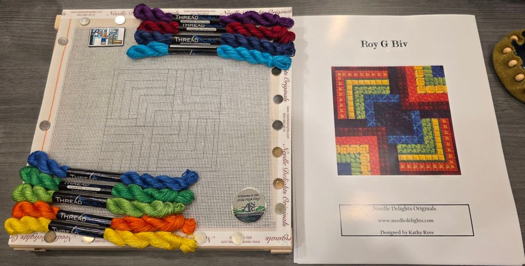
We got 2 canvases so we can stitch only in the primary colors (if desired) or any colorway. All the colors are getting used in the one we worked on today. I cleaned all the spaghetti threads before leaving class.
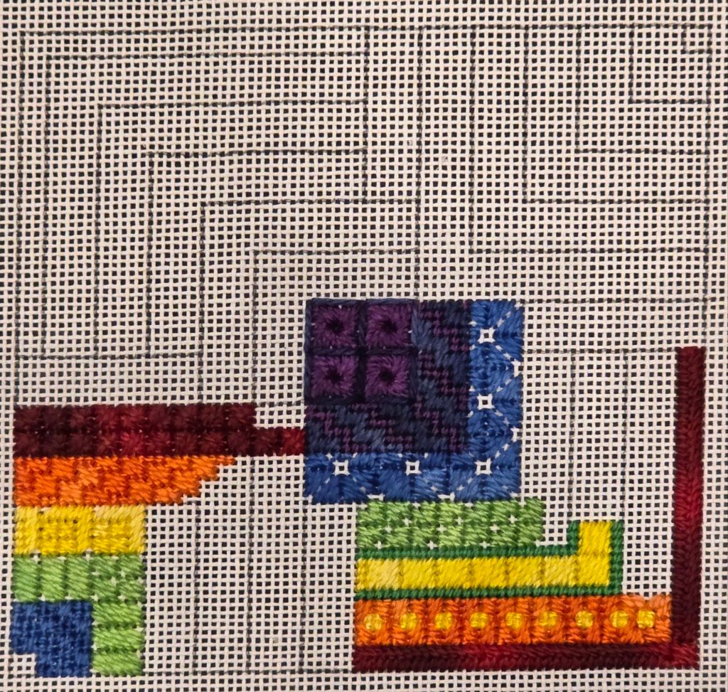
Along with other tidbits, we learned color gets the glory but value does the work! Can’t get too much information and stitch in 1 day but we have enough to go home and experiment.
There are some amazing pieces on display at this year’s ANG Exhibit. It’s always fun to see your own piece on display. And, even more fun to see a ribbon next to it. Shelly the Turtle was awarded a First Place ribbon in the Adaptation category. I am thrilled!

This was my inspirational photo.

The shell is a canvas applique of Congress Cloth placed onto 18-count canvas, the stems on the left are needle weaving over thread and wire, the growths on the rocks and frog are stumpwork both using wire. Here are better close-up photos.


My special packaging to protect the three dimensionality of the stitching was applauded by one of the woman unpacking the pieces. I’ll need because Shelly will be heading to Florida for EGA’s exhibit in October 2026 and Virginia for the Woodlawn exhibit in March 2027.
It got the Second Place Award and The Muse’s Kiss/Peggy Laflam Award for innovation or imagination at the National Academy of Needlearts Assembly in March (https://melitastitches4fun.com/2026/03/13/2026-national-academy-of-needlearts-nan-assembly/).
Filed under: ANG Seminar 2026
It’s begun. I picked up my Welcome bag and Tote Bag for the ANG 2026 Seminar in Denver, CO yesterday. I bought an extra magnet. There is a tape measure, book with post-it notes and tab markers, a cleaning cloth, and may be a gel pack that can be heated up in the microwave or cooled in the fridge for sore muscles (I haven’t verified this yet).

Attendance is at least 265 & more if everyone didn’t want their name listed. But, it wouldn’t have hit 300.
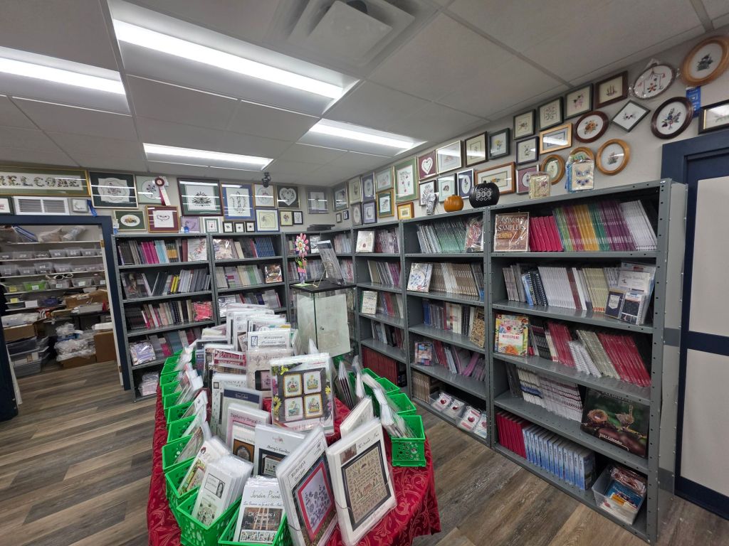
If you get a chance to visit A Stitching Shop in Denver, CO, you will be amazed by the selection of threads. Good lighting throughout the store. First down one long aisle:

Then down the next long aisle:

You can see a room over on the left with more threads.
They had the Japan Silver, Silk Lame Braid, and one of the Neon Rays+ I needed but not the white or red Neon Rays+. But, more about that another time.

Beads, sequins, Sundance Metallic Accents, and charms are available.

And, bins of charted instructions organized by designer (canvaswork in these and cross stitch elsewhere).
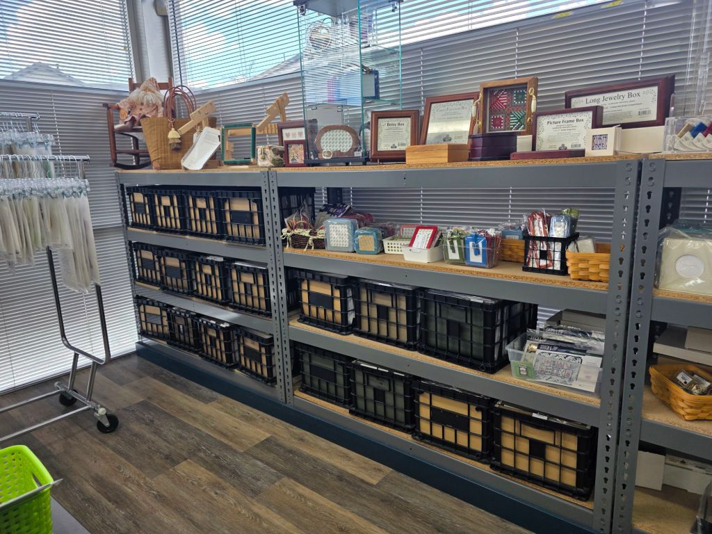
Painted canvases are available as well. It’s nice to see a store represent counted and painted canvases.

And, so many books!
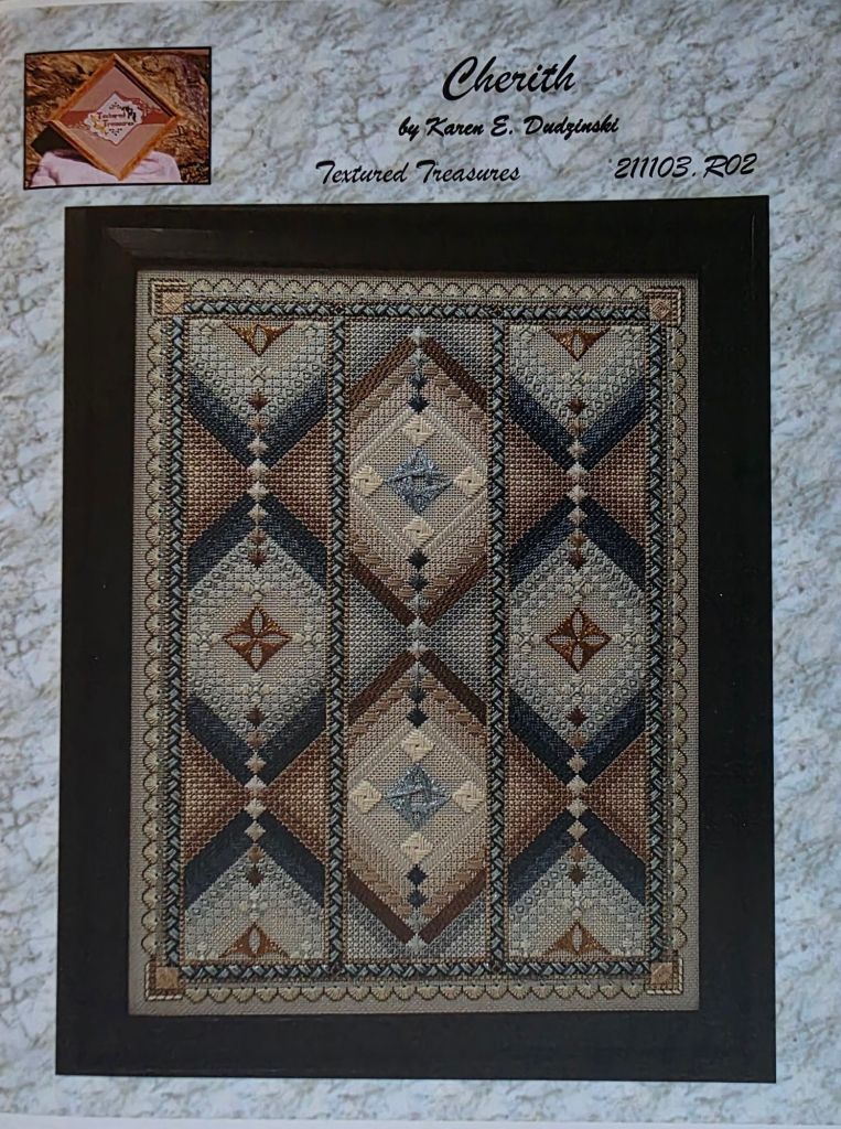
A few ANG Seminar atendees were shopping in the store. Some I knew. Some I met for the first time. One lady was shopping for threads for Cherith by Karen Dudzinski of Textured Treasures. It was a great find that I wouldn’t have even looked for and I got the last copy of the instructions but more about that another time.
Apparently, there may be drivers willing to take people to and from the Seminar on Expo day. Since I have already visited, I didn’t need to inquire about the logistics. Uber worked well for me today.
Filed under: ANG Main Line Stitchers Chapter, Razzle Dazzle by Ann Strite-Kurz
When I work with needlepoint up close, I forget to look at it from a distance. So, I really didn’t think the Petite Very Velvet V662 was so light that it wasn’t going to be seen from afar. But, when I set it down for the night, I realized the star points between the ovals were practically invisible against the canvas.
There wasn’t a darker Petite Very Velvet that matched the Elegance that I had been using. So, I decided to match it to a Trebizond that I seperated and ironed. I learned from Kay Stanis while taking her Nautilus class that Trebizond is not meant to be taken apart but the three plies of flat silk can be separated. Then, I carefully wrapped the Petite Very Velvet with one strand.
It turned out great. Tedious but you can see it!
And, here is the autumnal colorway. Looks good too. This Petite Very Velvet was dark enough.
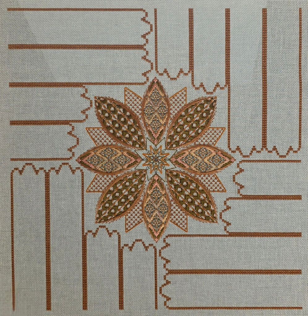
Here are close-up photos of the center. I switched around colors in the Teal version but not in the Autumnal version.
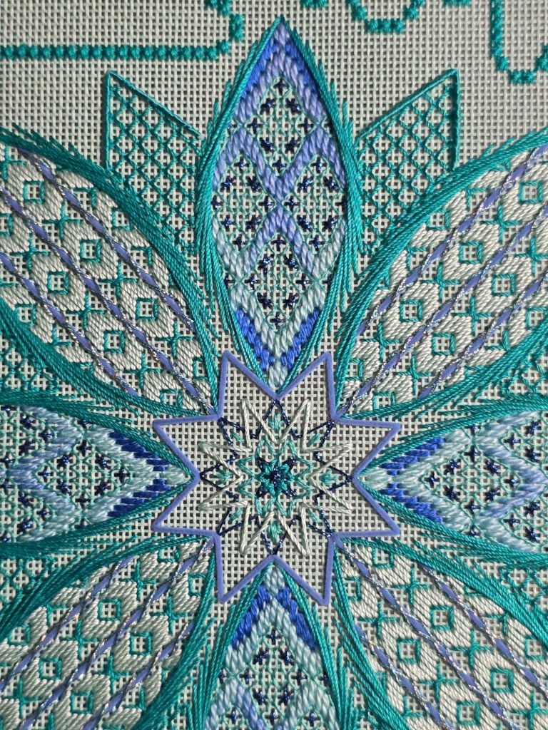
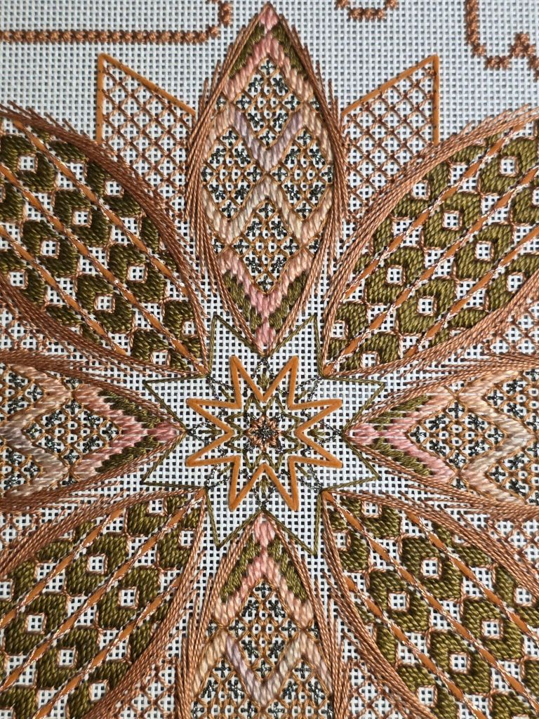
We got insights from Linda at our ANG Main Line Stitchers chapter meeting on this past Monday night for the smallest of the ribbons. Looking forward to seeing these develop.
Filed under: Brandywine Chapter, Embroidery Guild of America, Lotus Blossom by Brenda Kocher, Or Nué Hearts by Brenda Kocher
My Or Nué Hearts and Lotus Blossom by Brenda Kocher are all framed and ready for Tuesday at our EGA Brandywine Chapter Quarterly meeting.
I had enough thread and canvas space to make three pieces. The extra framed Heart is going to Olga, the woman who works the gate at the retirement community where we meet. Very nice lady.
The frames are from Michael’s. There are a few canvas threads left unstitched around the edge of the stitching so that it fits snuggly. It’s stitched on a black canvas and black really helps set off the gold.
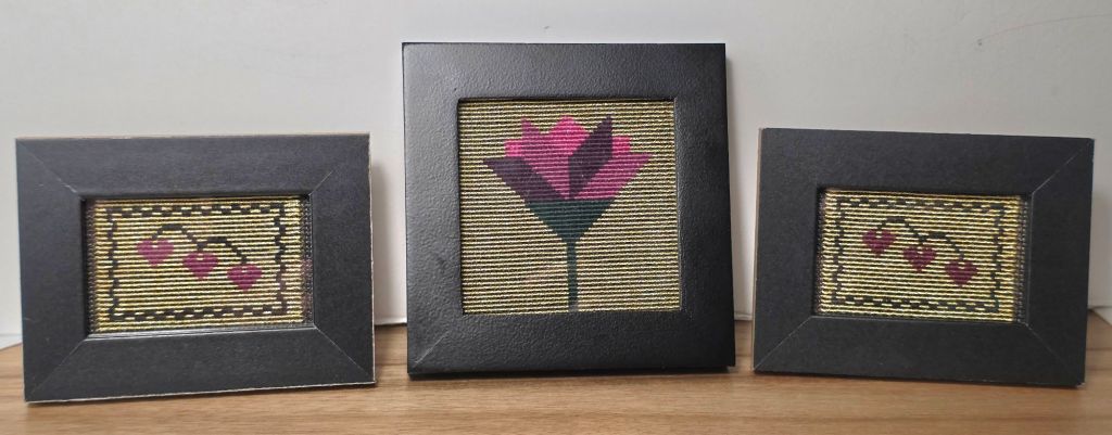
It sparkles more in person.
