I attended my first but the 2nd Annual NJ Needle Festival held at The Presbyterian Church at Pluckemin, 311 US 202 Bedminster Township, NJ hosted by Susan Hoekstra (foxview.com). It was so well organized. We got a retractable tape measure with “New Jersey Needle Festival” & the website (needlefest.com) marked on it as a favor. And, there were a bunch of free designs you could take if you wanted. I want to do a piece for someone who brought back a scarf from India for me. And, there was a mosaic pattern inspired by a scarf from the Philippines. It is very colorful (and it will be our secret that the pattern is not Indian).
About a dozen vendors including Nimble Needle were there – it is always nice to see Karen!
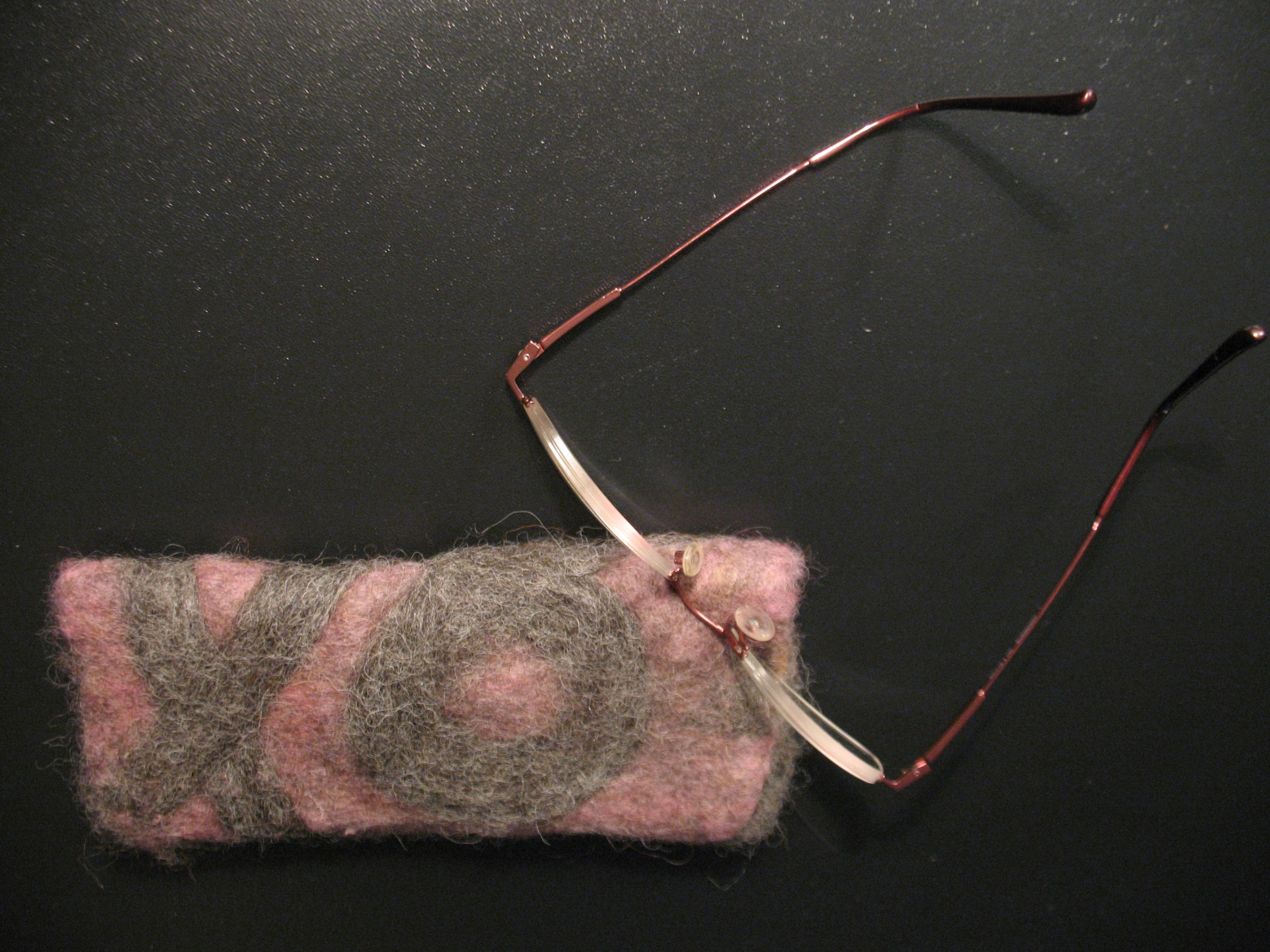
I got a lesson on fleece stabbing (a wonderful way to work out frustrations and be productive) using a needle felting tool & bought this eye glass case made from alpacas (hwralpacas.com) for me (since Bill didn’t need it)!
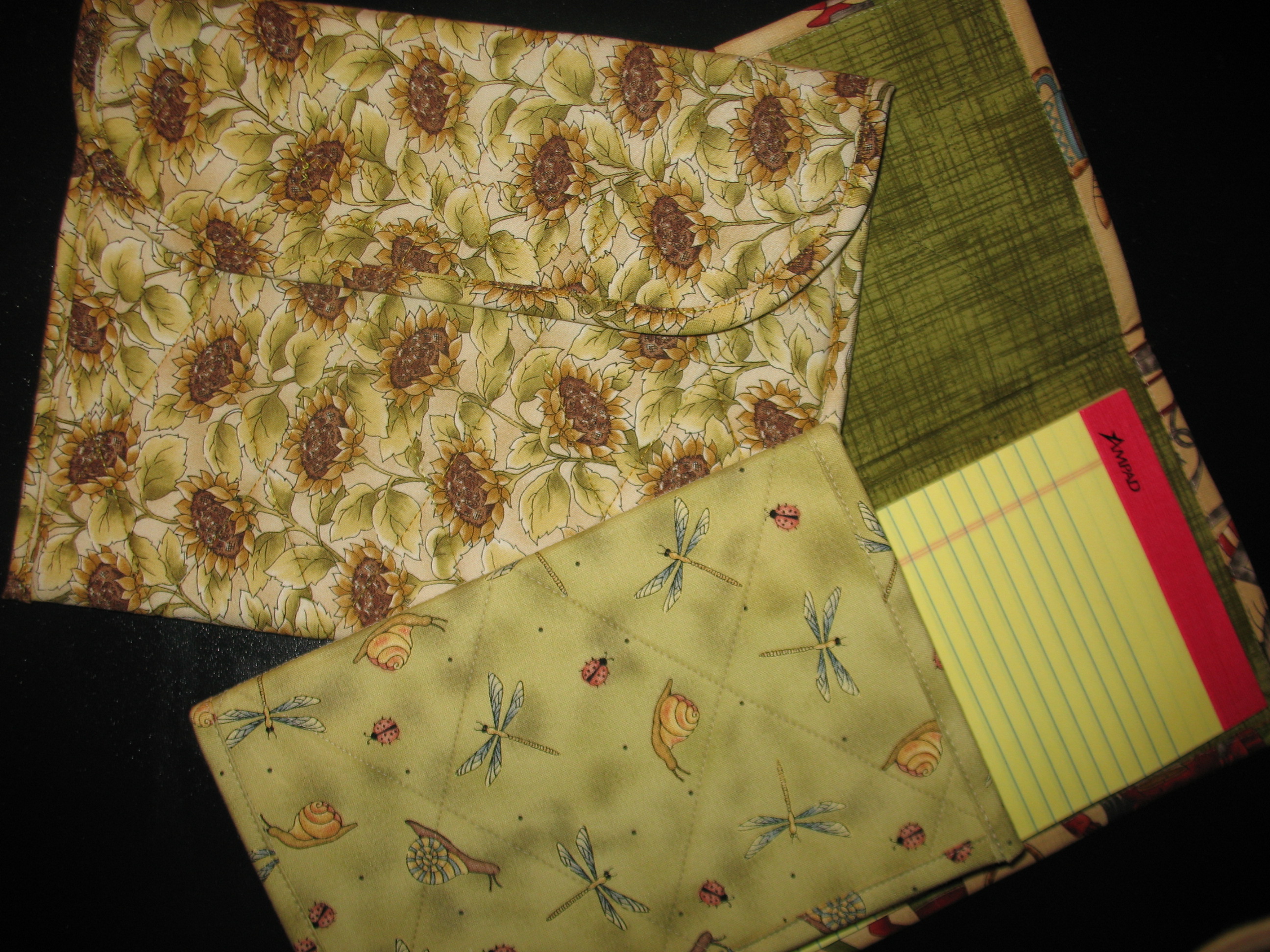
And, I got 2 quilted notepad covers (Xmas gifts) and an iPad pouch for me from Trish Vine Designs. I had met Trish from ANG PA Keystone Garden Chapter last month when I visited them with the Correspondence Course booklets. She also had some wonderful clear plastic project holders with quilted edging.
Read more about both vendors and others at http://blogs.mycentraljersey.com/institches/
You can see my table in the In Stitches blog (bottom left but 2nd one up – I was probably walking around looking at all the pieces or shopping – it is the table with the large flag on a frame). I had a great time chatting and stitching with Rae & Rona – Ann & Barbara from NYC joined us & then Mary McG also from the Keystone Garden chapter arrived a little late. I was thrilled when Rona first looked at my piece and said “what great movement” – that was what I was going for! Then, before I’d gotten too much done, Mary asked about how I was going to develop the piece & I shared my very rough ideas & showed my threads. But, she set me on the right path about the size of rocks along rivers. I’m thrilled because while I want it abstract, I do want it to be authentic. Now I know the smaller rocks are nearer the water & large rocks are farther away from the water’e edge.

You can see me standing on the far left of the first picture (light green shirt) admiring someone’s work in Rosie’s entry at http://blog.njneedleartists.org/ . I love that the whole NJNA chapter can contribute to the blog entries. I didn’t know that was possible. Bill and I really enjoyed dinner and talking with Rosie & Sue later that evening. I’m looking forward to seeing how they progress on the stitch of the month project.
It was a fun, wonderful opportunity to meet tons of people & see loads of beautiful projects! Already looking forward to next year’s event on Saturday April 26, 2014.
Thread blending is time consuming. Seems like I just get a rhythm going & then need to rethread. These crescents do take a good amount of thread. And, even with my chart, I got confused a couple of times!
Thread blending formula (lightest to darkest):
Splendor/Pebbly Perle (# crescents)
S1026/P061 (4)
S860/P061 (3)
S860/P80 (3)
S868/P80 (2)
S868/P57 (2)
S1143/P57 (2)
S1143/P58 (2)
S858/P58 (4)
The river is flowing!!

I love working a design out on graph paper almost as much as stitching it! Maybe that is why mechanical drawing was attractive to me in high school. I thought it was the music (Bob Dylan) that the teacher played during class. Or, that HE was nice looking, pretty cool, and the youngest male teacher that I ever had as a teacher. Or, because as one of the few elective vocational courses that I took, I liked the change of pace from all the academic ones.
My first attempts dissected the paper almost straight across with no movement but it did narrow nicely.

No need to bore you with my 2nd or 3rd attempts that wouldn’t curve. But, my 4th was better.

And, by starting at both the top and the bottom, I found I could get the bend. However, it was necessary to modify the crescent shape from the diagram in Jean Hilton’s Stimulating Stitches in order to make the bend. But, I think she’d be ok with that. I didn’t narrow as much as in my earlier attempts but there is narrowing and I love the bend. The design doesn’t look too top-heavy to me. I like it!

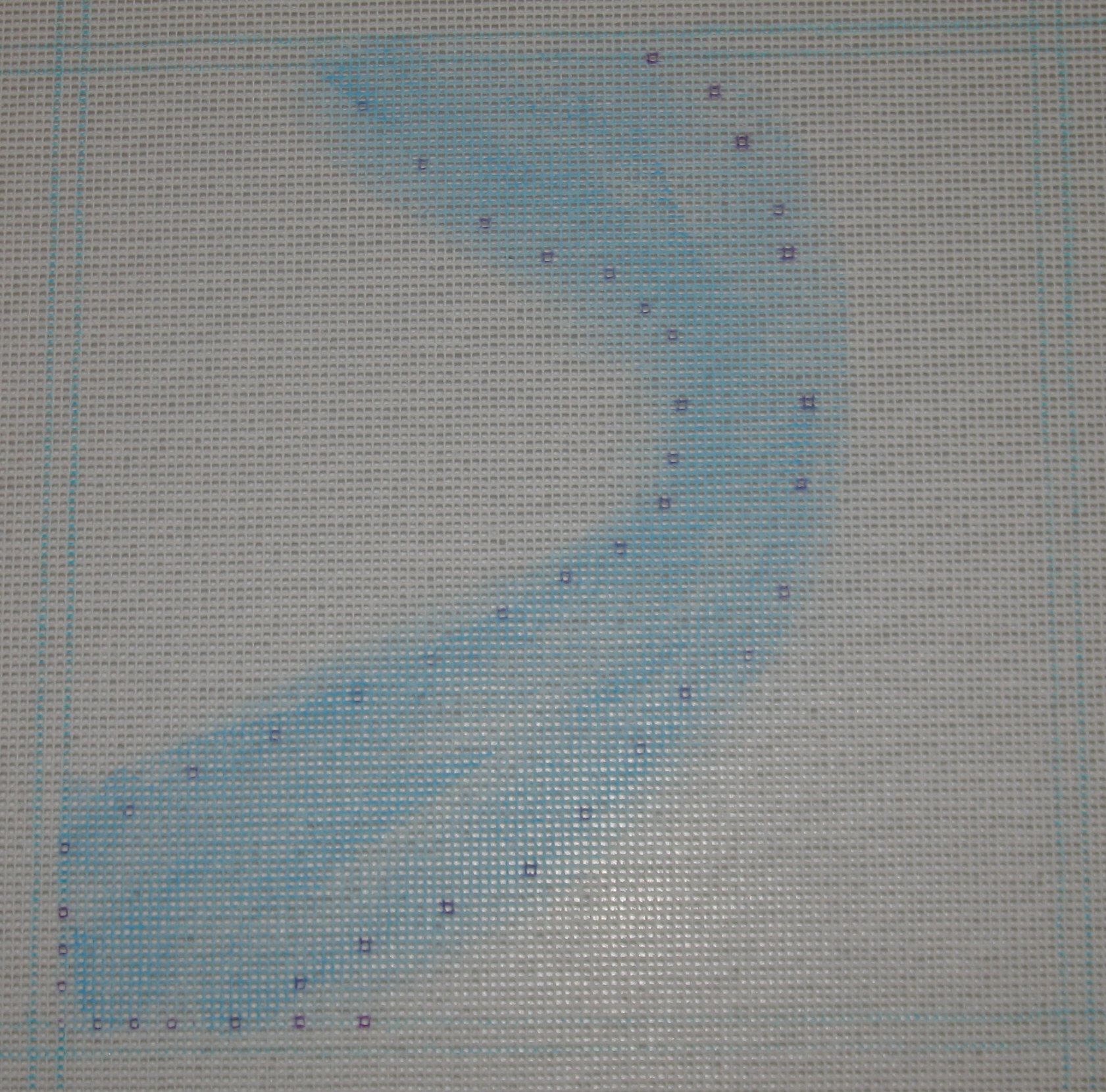
The blue Copic marker didn’t look good with my blue threads. So, I got the paint out. And, I am glad I did. I’m very happy that there are areas with a little less paint than other areas. I went beyond the area where the crescents will sit because the cresents are supposed to be the ripples in the water. The purple dots you see are the Disappearing Ink Pen marks. I’ll have to get the crescents stitched soon or keep reapplying more ink! The borders are marked by the Mark-Be-Gone Pen (water washable) but they should get covered by stitching. My framer says he like about 3 extra stitched rows on the edges to work with.
I’ve been talking fall ANG chapter projects via email with Carol T in Central PA and mentioned that I was “making a Fireside Stitchery run after work tonight (Friday)! Need (?) some threads. Great start to the weekend.”
Later, I had to laugh when Carol asked, “Did you get to Fireside? What’s your new project? What new threads did you buy? Did you get to start it? I’ve always got a bad case of startingitis and am always interested in new projects and what others are stitching.” I could just hear the excitement in her “voice”! And, there is a thrill to starting a new project – maybe that is why we have so many works in progress (WIP)?!? Speaking of WIP, I do have to finish my Queen’s crown by applying the beads but am afraid to get started – it looks like it is going to be hard to get them placed just right. So, I am getting my next one ready as I mentally prepare to sit down with the Queen.
I replied to Carol, “I did (get to Fireside)! Well, I’m going to call it Crescent River. And, it’ll use Hilton stitches. I’ve had a river in my head for quite a while & decided to get it done for seminar in CA. There will be areas on both sides that will be gray for rocks & then green for grass/meadow. It is going to be an abstract depiction rather than a realistic view from the sky. I’ve been working out the crescents on graph paper-trying to get a curve – that’s been the tough part. I have decided to make the crescents fit the space rather than follow a strict shape defined on a page in one of Jean Hilton’s books. I’m going rogue! Living life on the wild side! Tomorrow, I’m going to paint my canvas with blue where the river belongs because the crescents will not cover the canvas. My last painting experiment wasn’t all that successful but this is just a light blue. I could even use my Copic marker. Hmmm, wouldn’t have to let paint dry! And, I can start stitching! We’ll see what happens when I start tomorrow after a good nights sleep.”
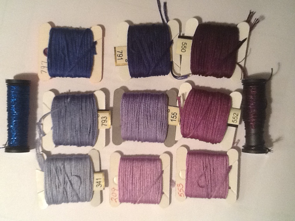
Today, I realized that I had the start of my blog entry already done! I just needed to answer, “What threads did you buy for Crescent River?” & take a picture of the threads. I am not sure if I will use all these but I have lots to work with.
The river is going to use Pebbly Perle blended with Splendor:
The Splendor Designer Collection card for Delft Blue gives me S800, S860, S868, S1001, S1143, S858 to work with. And, I selected Pebbly Perle’s P061, P80, P57, P58.

The left crescent used 1 strand of Pebbly Perle, the middle used 1 strand of Splendor, and the right used 1 of each.

The rocks and grassy meadow will use some/all of:
Impressions (1106) light golden-yellow
Watercolours (223) Rye, overdyed with golden-yellow/brown
Impressions (1104) dark golden-yellow
Impressions (5022) medium green
Watercolours (222) Sierra, overdyed with greens and some golden-yellow
Impressions (1043) dark gray
Watercolours (247) Dark Suede, overdyed grays/browns
Impressions (1065) light grayish brown
Watercolours (165) Granite, overdyed grays and some light green
Impressions (1062) medium gray
Impressions (1072) medium grayish blue
Watercolours (223) Ash, overdyed with grays/whites
Impressions (1046) light grayish blue

Now, back to the graph paper. This is about my 5th attempt to work it out on paper & each one is getting closer to what I see in my head. I think letting go of the pre-defined stitch pattern to make the shape of the crescent fit my space will make the big difference. And, from what I read of Jean Hilton through her books, I think she’d agree!
All this is good to write down now anyway because I’ll need it for the artist statement that goes with each original design (being optimistic it will be adequate to send once stitched).
At our last meeting, I exposed my ANG Main Line chapter (outside Philadelphia in Devon, PA) to the world of Fiber Arts by sharing the work of this artist, http://ingejacobsen-inge.blogspot.com/search/label/Sewing (thanks to Linda from ANG Yahoo group who shared this link a year ago for http://www.mymodernmet.com/profiles/blogs/hand-stitched-vogue-covers).
I thought it would be fun to have our members give this art form a try. So, I bought New American Paintings, a catalog of the fourteenth open studios competition, a juried exhibition from Feb 1998 at a flea market. The pictures were interesting, different, and colorful.
In advance of the meeting, I started stitching one to show them what it would look like in person. And, the one I selected is this fruit basket piece. I contacted the artist of the Fruit Basket, Stacy Thomas-Vickory (you can find anyone and anything with google if you try), and explained what I was doing & included a photo of the half stitched piece. I told her I’d like to blog about it with a photo of the finished piece but I wanted to be sure she’d be ok with that. I don’t want to violate any copyright issue. And Stacy, a professor at a College of Art, agreed saying, “I would be thrilled to have you make a needlework piece from my painting. If possible could you send me a large size jpg of the finished work, so I can have it for my records. The project with your guild sounds like a great contemporary twist on such an old form. I liked Inge Jacobson’s work as well. Thank you for opening my eyes to this direction in needlework.”
So, I’ll send Stacey the jpg & a link to my blog. Thanks again Stacey – I love your painting! And, next month when Mary Smull visits to talk about the Society for the Prevention of Unfinished Needlepoint (SPUN), we should have several examples of this fun fiber art form to share with Mary!!
As I told my chapter members, you could do this to any photo & it might really impress your kids & grandkids especially if you stitched some photo of them. I think the heavier weight paper makes it easier to handle. I didn’t block it. and I used a fine thread – you can do any stitch you want – no rules!! All I did was couching of a copper color metallic filament thread, Accentuate (228). I think it turned out great.

And, a close-up:

I am not thrilled with the analogous colors I selected for this project. They looked ok together before I stitched but didn’t come together as I expected. Oh well, back to the color wheel for another spin! I’m looking forward to seeing how my chapter members made out with theirs.
It should not reflect badly on the design which I tried to shrink to fit into a 3″ x 3″ space. The bottom left corner turned out the best. But, this will not be getting a mate for another set of bookends.

