Filed under: ANG Seminar 2015, Gentle Waves, Melita's Designs | Tags: ANG Seminar 2015
This is the second rendition of Gentle Waves. While I didn’t win a ribbon this year, I’m happy looking at this piece. And, even better is that 2 of my designs are going to be available to members through 2 different venues. Can’t say more yet.
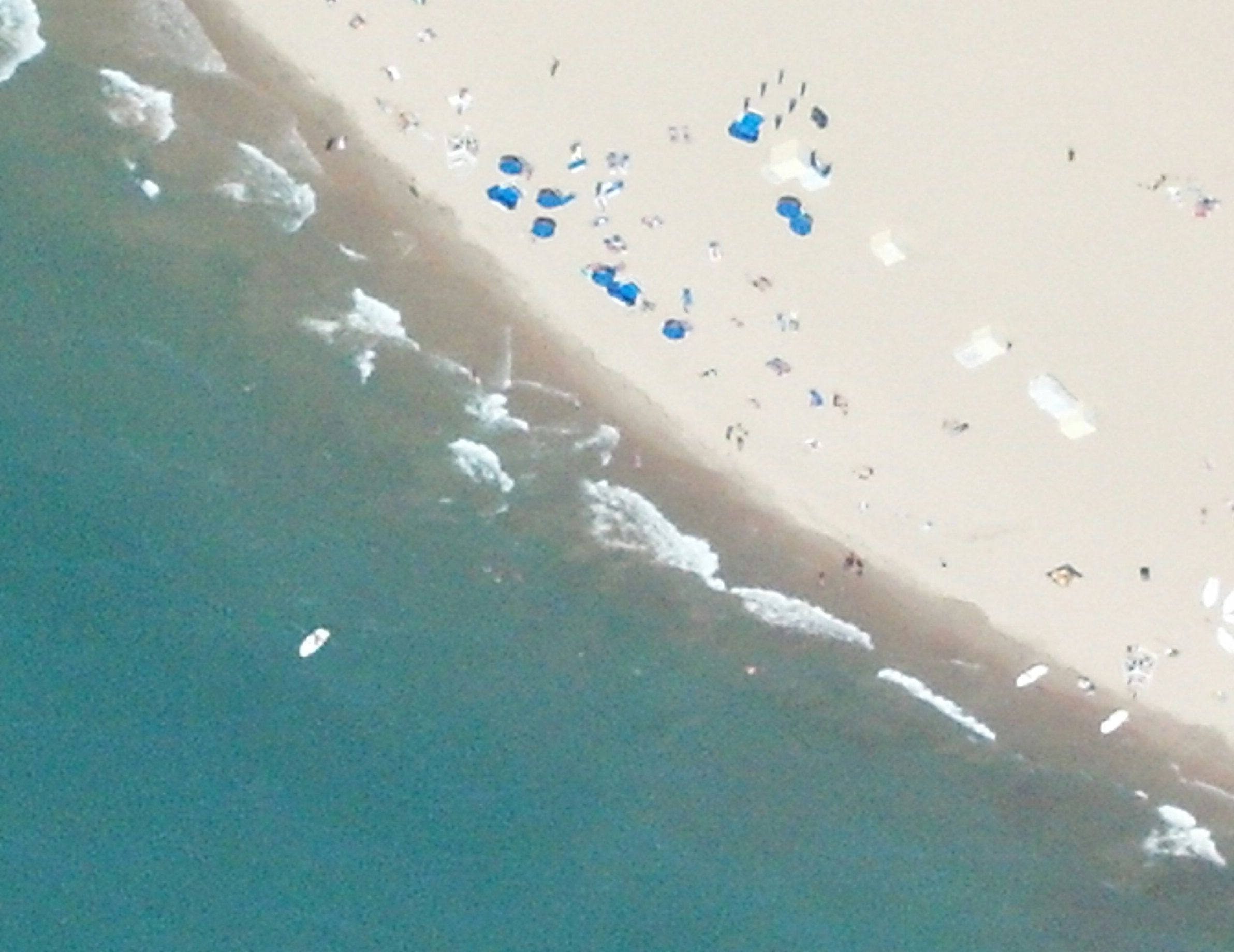
Initially, the judges were concerned my initials were in the piece (they are supposed to review without knowing who pieces belong to). But, an exhibit assistant pointed out that it meant “Love Myrtle Beach”. Very true. They said it is a very clever and creative addition to the piece. Little did they know, it is also means “Love Melita & Bill”. It happened that seminar was later this year near our 28th anniversary!
The judge’s critique raised excellent points. A few threads in the sandy area began to lose the twist. However, my laid threads are smooth and tension is very even. Maybe I should stay away from threads that twist!! The texture and color of the chenille was a good choice for the breaking waves. But, the gradation of the blues was a bit too abrupt especially because the texture changes of the threads emphasize those sudden transitions. When I switched from a diagonal stitch to the vertical bargello pattern, the thread was too thin & they didn’t miss it! The judge said a diagonal water stitch would have drawn the viewer ‘s eye from the water to the beach (that was more of what I had used in my first rendition).
This was interesting: “Turn your piece upside down so that you’re viewing the heart and letters upside down and do the same with the photo you took from the John Hancock building. First, do see how the water (the larger portion of the design) is sweeping you “up into it” and moving you toward the sand? Do you see how the water now appears to go from the “heavier” weight it to the “lighter”. Since this is an aerial view, this gives the viewer a more “I wish you were there” sensation.” I can see the sweeping motion differing between the two.
As always, I love learning from the comments – the judges do an excellent job offering constructive criticism.


Filed under: Gentle Waves
The background of the waves didn’t blend as I expected. Maybe I used too many blues. And, I think the waves are too symmetrical.
In the positives, I like the surf and sand stitch. I’ll round out the heart next time.
Yes, this will be redone with lessons learned. But, I’m finishing another project as I think about what all to do to improve this design. Thoughts?

I’m encouraged by folks who came by yesterday at New Jersey Needle Festival & commented on how much they like this design. Thanks to Susan (Foxview Needlepoint & Rug Hooking for hosting the event), Trish with Trish Vine Designs (love my project keepers), Karen from Nimble Needle (who brought stuff I hadn’t seen in her shop!), Anne from Mrs. Stitches (I got a signed copy of her design, Florentine Fantasy, which is an advanced class she teaches in Florentine canvas embroidery, pattern couching, and basic composite filling patterns), and other vendors who brought wonderful items (I need to retire so I can stitch more)! Met new people, enjoyed old friends, learned a tad about smocking, and loved seeing all the wonderful needlework and various crafts being done in person.
It’s probably more difficult to see from the photo than in person but the sand near the surf has a slight glimmer to it because I am using Planet Earth Silk Opal (Calm 103 & Oxygen 098 with hints of brown on the beach side of the surf and Cloud 097 which is white on the ocean side of the surf) & that has sparkles throughout the thread. Then, for the dry sand I’m using Rainbow Linen (R405) which is a bit rough. I’m going to go back next & fill in open areas of the water & the sand (the open x space in the Criss Cross Hungarian pattern from SuZy’s Portable Stitches). Can you find the heart draw in the sand!?!

I still have water on the brain. Perhaps that is due, in part, to the 2015 ANG Seminar being in Myrtle Beach!
This is the basic pattern of the water for my next original design. I saw someone use the pattern on Facebook’s Needlepoint Nation for snow and liked it immediately for water! It is the Snow 20 from Stitch Landscape which is almost identical to the Water 25 pattern except that water is completely symmetrical. No wonder I saw water even though it was “snow”! But, I prefer the asymmetrical Snow pattern because water is more unpredictable.
I practiced making a sample which I gave to our (ANG Main Line chapter) charity gift tag effort.
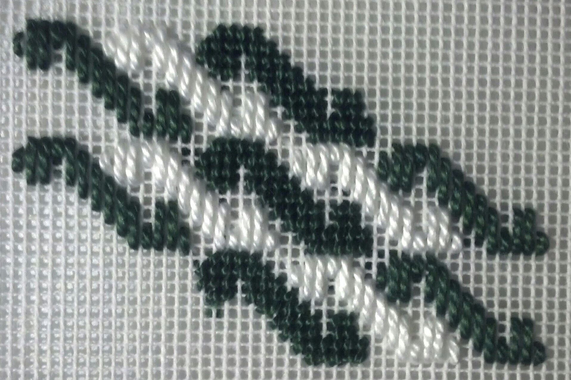
I tried the pattern with basketweave but the threads, Petite Facets and Kreinik Micro Ice Chenille, that I wanted to use isn’t appropriate for that stitch. The threads are too thick. But, I wanted a bumpy effect for part of the waves so I switched the stitch pattern. It was still difficult to stitch with for 2 reasons.
One, the Petite Facets didn’t go through the eye of the needle easily but occasionally it was a little easier. I thought maybe I was imagining it but that is what I just read in the tip from the Portable Stitches app (that I found quite by accident). There is a larger opening on one side of the needle making it a tad easier to go in on that side.
Two, even using a large needle (#13 tapestry), I am opening the hole in the canvas with the tip of the laying tool in order to decrease the wear on the thread especially for the Kreinik Micro Ice Chenille which sheds easily.
I also used Planet Earth Silk Opal that has little sparkles throughout which you can see better when you click on the image and see it larger.

The close-up allows you to see the variations in threads which you can see better when you click on the image and see it larger.

