Filed under: 2025, 2026, A Spring Sampler, Melita's Designs, National Academy of Needlearts (NAN), Project Runway with Dawn Donnelly
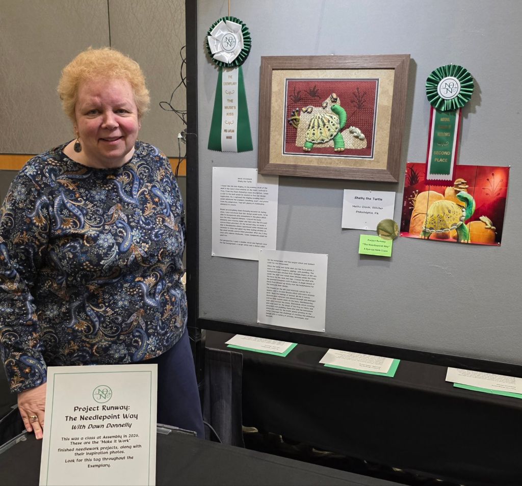
We returned to Troy, MI for the 2026 National Academy of Needlearts Assembly. I completed my Project Runway piece that is an adaptation of a photo I took last year as part of completing Dawn Donnelly’s Project Runway Design Class. The only requirement was that it incorporate wire. There was no input from Dawn on any portion of my piece.
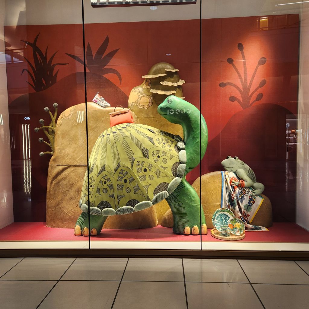
Here’s my inspirational photo taken at The Somerset Collection, a high-end shopping mall in Troy, Michigan from a Gucci display window (featuring a purse, sneaker, scarf, and plate which I later Photoshopped out of the piece).
The shell is a canvas applique of Congress Cloth placed onto 18-count canvas, the stems on the left are needle weaving over thread and wire, the growths on the rocks and frog are stumpwork both using wire. We got to the exhibit about 3 pm and Bill saw that Shelly the Turtle had 2 ribbons next to it before I did. He was very excited as was I when I saw the Second Place Award and The Muse’s Kiss/Peggy Laflam Award for innovation or imagination!
It will be making the rounds of exhibits (after NAN, it’ll be at ANG in Denver, EGA in Orlando, and Woodlawn in Alexandria). So, you’ll have opportunities to see it in one of the exhibits!
There were 6 of us from Dawn’s class that completed a piece and submitted it. Diane B encircled a large bead with small beads and wires blending 2 photos (Dolores Andrew Award for color and design). Lois K did the Somerset Inn circular staircase (Honorable Mention and got the People’s Choice for Project Runway although they said several others came close). Lous’s was very challenging to get the depth and movement of the staircase especially in the small design space (about 6″x4″). Lois K also did Dahlias – one of her lovely embellished photo transfer flowers. Izzy M has a large teddy bear holding her hand puppet, Cocoa with Truffles. Teresa F made a lovely interpretation of a concrete floor pattern. Cindy P’s beaded and sequined turtle is fantastic. Everyone nailed theirs! These are all under the Adaptation category.
Eventually, all award winning photos will be posted at National Academy of Needlearts – Awards at The Exemplary https://share.google/lL9M1n15Qi61wYix7 (previous years are worth browsing through) but I’ll talk about a couple of this year’s pieces here.
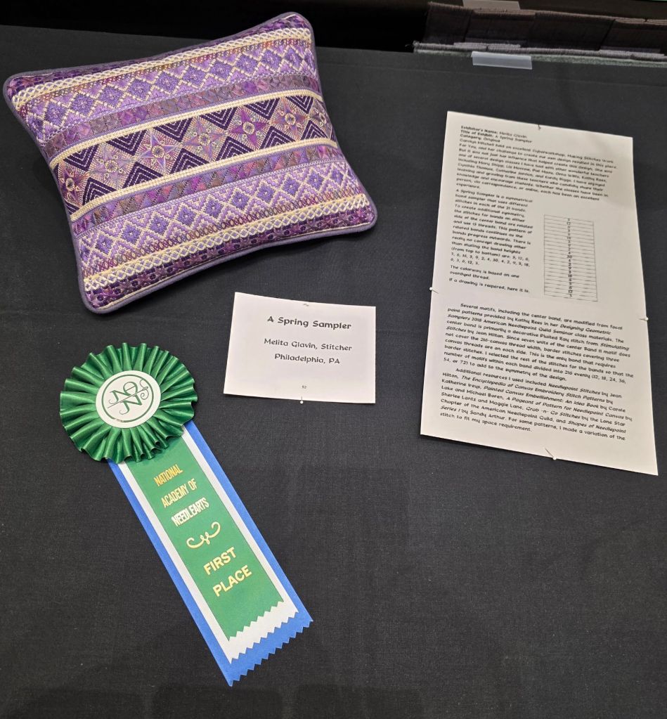
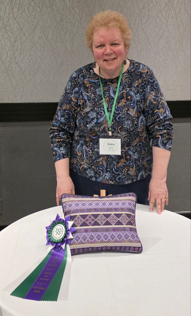
My pillow, A Spring Sampler, won First Place in Original Professional along with a First Place Dawn Donnelly design, Chuck, a whimsical reindeer.
All the pieces in the exhibit are outstanding. Heart of the Matter designed and stitched by Wendy Moore, won Third Place and the Michele Roberts Heart Award. That’s the 3-day class I’m taking at ANG’s Seminar in Denver.
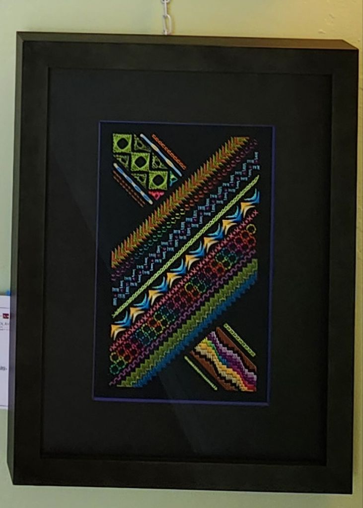
I saw another Lattice-Scape, a Kurdy Biggs design stitched by Sue F that won a First Place Award. I’d seen one at Woodlawn too. Very interesting piece.
The Poppy by Helen G won First Place, Judge’s Choice, and Silk & Metal Awards. Stunning! That won the People’s Choice Award.
There is a Laurel Burch cat (painted canvas) stitched in Or Nue that was fantastic and deserving of it’s First Place Award.
An antique Victorian footrest reminded of Patrick B who repurposes items into unique pieces of Needlework. The piece was titled What Treasures Lie at the Forest Floor and deserved its First Place Award with so much going on. I definitely have to revisit the exhibit. So many lovely pieces.
At the Welcome Banquet, the Best in Show is announced. It has to be a First Place Award winner but from any category. So, I knew my pillow qualified but there were so many pretty pieces in the exhibit that when I saw the curtain being pulled aside and that it was mine, I was beyond shocked. Apparently, both judges had no argument over their decision. But, I still can’t believe it! Bill knew from my face when I returned to the room that something had happened at the Welcome Banquet. I showed him this photo and he was thrilled too.
I’m not sure if I will ever exhibit again!! You can’t get better than this. At least one woman said her ANG chapter might be interested in stitching it. That’s just as thrilling for me as winning the award. Today may have been Friday the 13th but nothing bad happened to me.
I joined Chris L and her friend, Cathy, at the Welcome Banquet. They and others are taking Meredith Willett’s canvas embellishment class who was also at our table. I got a lead on Noah’s Mill, Meredith’s favorite bourbon from the Willett Distillery (yes, a family connection). And, learned that Beeswax or a glue stick can be used to stop Radiance, Meredith’s thread line, from splitting at the ends! Two great tips.
My two 2-day classes should be fun. I pre-registered last year and got my 1st Choices which are Exploring Needlelace with Diane Clark (Sat-Sun) and Magical Color with Jennifer Riefenberg (Mon-Tues). More on those to follow over the next few days.
Best wishes go out to Mary Alice Sinton for a speedy recovery from her fall here on Monday. She had to go home. Luckily, a replacement teacher stepped in to teach her Japanese Embroidery class.
There are about 100 attendees. Same as last year. Merchandise Night is Wednesday for an hour. There is a small silent auction and two stitching areas.
Last but not least, congratulations to Barbara Richardson for being this year’s Lifetime Achievement Honoree! There is a wonderful display of her work. She joins quite a list who earned a Lifetime Achievement Award. Check out their past inductees in the National Academy of Needlearts Gallery at https://gallery.needleart.org/gallery/lifetime-achievement-award/
Everyone who exhibits gets the Judge’s Score sheet although the points vary by category (this is for original design). A summary of the critique which follows does cost $25 but is worth it to hear their thoughts about the piece. Always thoughtful, supportive, and offers constructive feedback.

The judge’s main comment on the design was that the curves at the start and the end are too abrupt which I can see. Also, the values of the greens do not have enough contrast. That is also a good point. I did not take the black and white photo of the threads before stitching (the judge did). The other comments on the framer (me) needed to align the top border – it’s off just a tad on one side. Getting 8 out of 10 is actually good – I usually get a 7 (even when I am not the framer)! There were plenty of positives such as:
- “The quiet color and sizes of the mats pull the viewer’s eye into the piece.”
- “The variety of threads and stitches are suitable for this canvas. They are controlled, evenly stitched, and very appropriate.”
- “The bright pink (I call them coral) stylized flowers are fun! Your stitching shows your mastery of those specialty stitches.”
If you submit a piece for judging, I highly recommend getting a critique. And consider sharing it with your chapter members as a learning experience.
For the artist statement and to see the lovely Creative Inspiration Ribbon, go to:
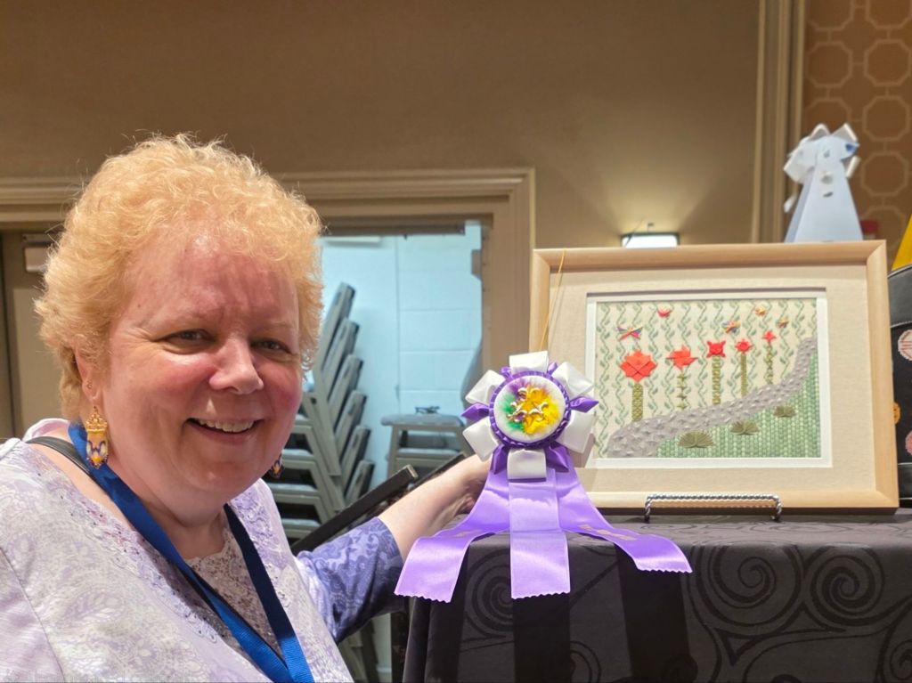
For the 2025 ANG Seminar exhibit, I submitted Flowers Along a Rhode, an original design, Professional. It won a Second Place Ribbon! I was happy to see that.
The first award of the evening at the Welcome Banquet was the Creative Inspiration Award and I won it too. What a surprise and an honor! The special ribbons were designed and most of them stitched by Deb D. They are all lovely!
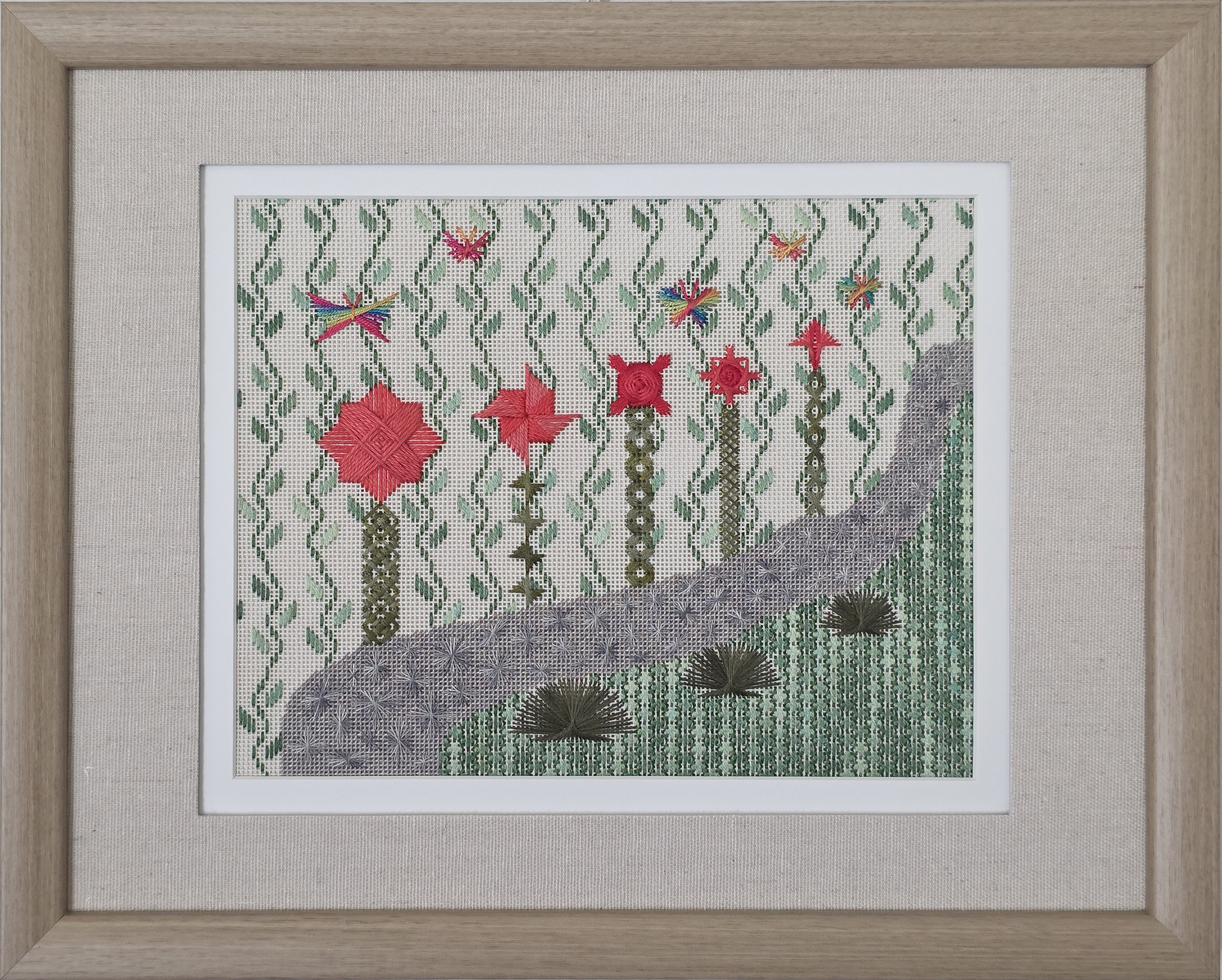
The design is slightly smaller than the 10″ x 8″ mat opening and is framed (16″ x 13″).

Here is my Artist Statement, a requirement for this category.
Debbie Rowley challenged us to be experimental during her “Explore and Design” class. In her 153-page booklet, she not only provides hundreds of stitch diagrams but explains how to understand the stitch so you can alter it when needed. Debbie had no input on my design.
The first section in Debbie’s booklet had 20 Rhodes stitch diagrams. That is when I envisioned a cobblestone walkway for my design. I ended up with more than 20 Rhodes stitches by searching through other books for more shapes and even making up a few of my own shapes. To line the far side of the cobblestone walkway, I saw stylized flowers made from the Waffle Star, Milanese Pinwheel, Walneto, layered Jessicas, and a combined Arrow Amadeus while the round Amadeus made bushes to line the nearside. The stems came from various sections of her booklet. And a flower garden would not be complete without butterflies buzzing around!
I did modify some motifs to my preferences such as placing the diagonal stitches on top of the straight stitches in the Waffle Star. And I shrunk two of the round Amadeus stitches and made small butterflies to add to the perspective. I added additional stitches to fill in the bushes carefully sliding the threads under the center line of the round Amadeus to maintain the characteristic appearance of the base.
Both the grass and the background combined an overdyed green thread and a matching middle value solid green to tone down the shifting color while conveying a breeze.
I enjoyed creating this contemporary garden stitched on 18-count canvas with a variety of threads.
End of artist statement. Additional information for further reference. Based on one of Debbie’s butterfly diagrams, I created the other four.
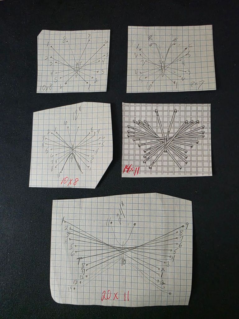
The grass and backyard stitches come from ANG Lone Star’s booklet, Grab -n- Go Stitches. The patterns have no names. These came from the section “Stitches That Read Straight”.
I have requested a critique and will post that and my scores once I get them after they are shipped home.
Debbie Rowley was so happy for me! And, another of her students won the Founders Award for the 4 colorways of a design of Debbie’s. That was quite an undertaking and they look great. Well deserved honor.
By the way, this completes Goal #4 for 2025.
Additional information is also available on the Judge’s Score and critique at https://melitastitches4fun.com/2025/09/02/flowers-along-a-rhode-the-judges-score-and-critique/
Filed under: ANG Seminar 2025, Flowers Along a Rhode, Melita's Designs, Walk in the Woods with Deborah Mitek
My first class for the ANG 2025 Seminar in New Orleans, LA is Walk in the Woods with Deborah Mitek.
A lovely photo transfer was already on Congress Cloth (Deborah explained her process). A gorgeous array of threads and ribbons greeted us. What a beautiful start to Seminar.
We started off with an easy square leaf stitch for the border.
Next, using a chenille needle proved tricky! I did this twice while stitching the ferns. It’s a good thing I don’t use the sharp needles often.
As usual, it doesn’t look like much is done but this is partly because the ferns blend into the background alot (left side). The stems are showing (also left side).
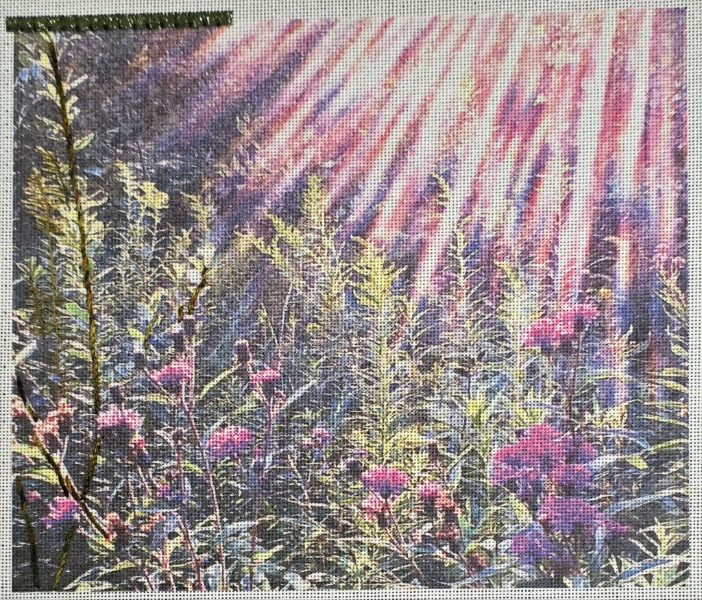
We watched ribbon demonstrations and will again tomorrow. Then, I suspect I will practice them in the extra wide border she gave us.
We were able to secure a table for our Main Line Stitchers at the Welcome Banquet. Good food and great company! The first award of the evening was the Creative Inspiration Award and I won it with Flowers Along A Rhode. What a surprise and an honor! I will publish my artist statement which explains the inspiration for this stylized garden.
The special ribbons were designed and most of them stitched by Deb D. Lovely!
Back in November 2024, I posted about my A to Z books and included a photo of my River Silk Ribbon and Flair Spring Flower.
As part of my recent flurry of finishing, I purchased a mini frame at Michael’s. The 3″ square opening is a perfect size. It’s going to be a get well gift for our neighbor’s mom who lives with her. She fell and broke her pelvis last week but is already home! And, this flower has no maintenance for her daughter who has her hands full.
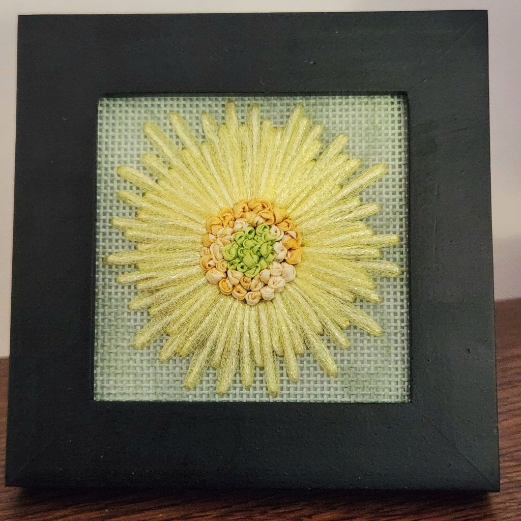
This is a great size for trying out stitches and threads while making a small gift. I love the vintage green canvas for these threads.
I keep a 5″ doodle canvas ready for experimentation. I don’t have more of the green canvas. So, eggshell is next up. Maybe I’ll use my markers to color the canvas.
Filed under: Crescent Journey, General comments, Melita's Designs, Woodlawn Needlework Exhibition
The Nellie’s Needlers are celebrating their 50th Anniversary with an excellent show, the 62nd Annual Needlework Show at Woodlawn. We made it on March 1 this year!
There are 579 judged entries listed but over 600 with the non-judged pieces on display by Nellie’s Needlers and ANG Checkerboard Chapter, who are celebrating their 50th Anniversary.
Congratulations to both.
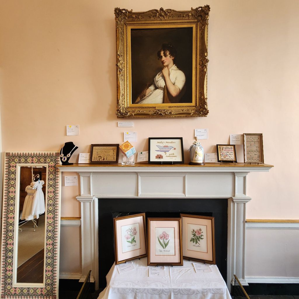
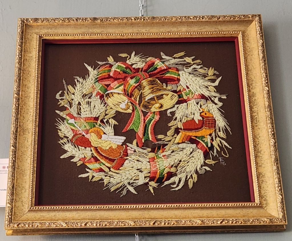
That is Nellie in the photo above. And, look at stitched frame around that mirror by Eman K. Wonderful.
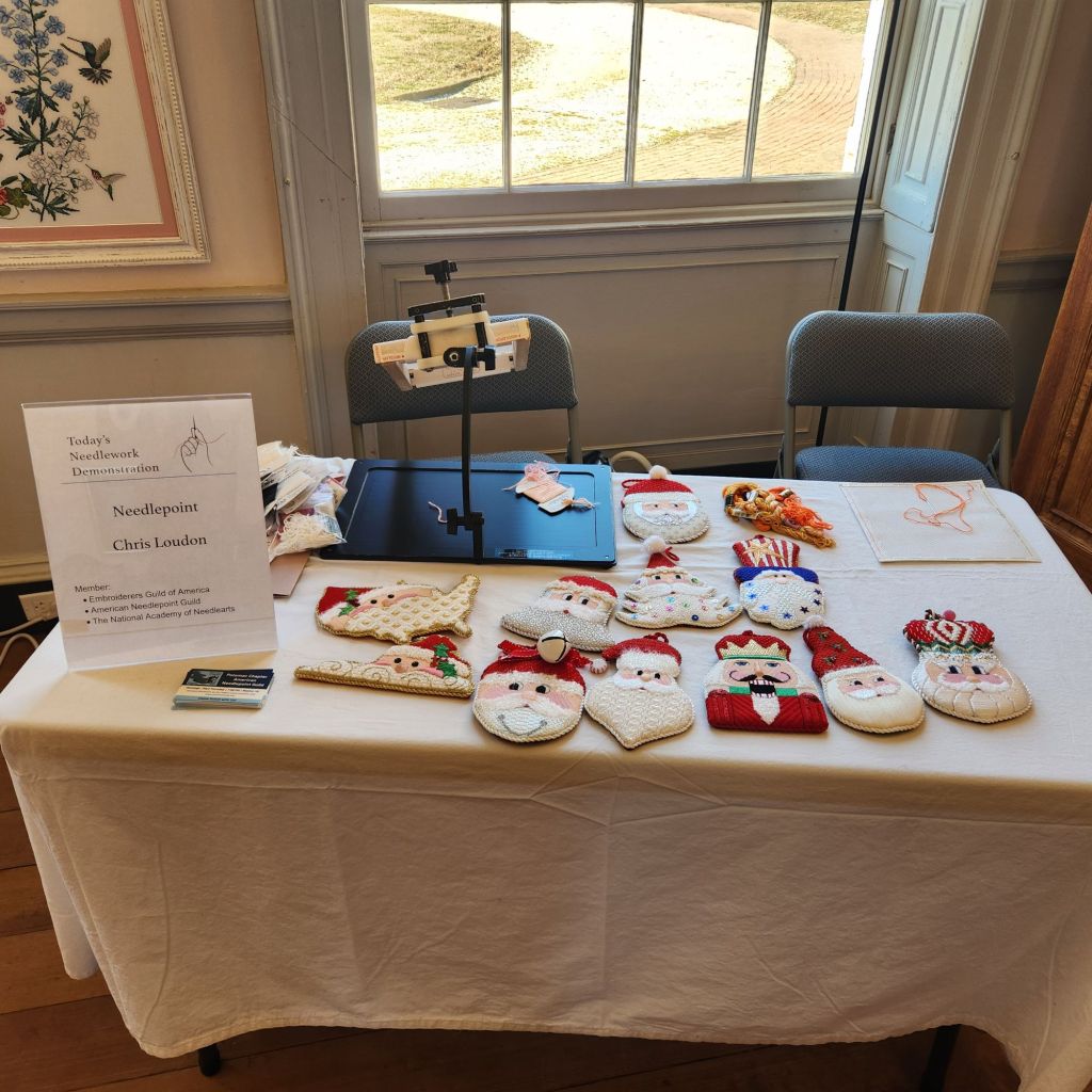
I got to see Chris L and her Janet Casey Zickler Santas. We had a nice chat when she returned from lunch. And, I found out we’ll both be at NAN in a couple of weeks. How fun is that!
To see more information on each piece exhibited, use the QR code listed in the brochure. That’s all the information in the docent paperwork located in each room. Fantastic feature! Now, if Woodlawn asked for and people included the name of the designer for commercial pieces, it would be incredible! I recognized about 3 dozen of the canvaswork counted pieces. Too many to write about but lovely to see.
My photos are not great this year. The light was super bright shining in the windows or there was glare from artificial lights. Woodlawn allows glass and reflections are impossible to avoid. And, I was reprimanded by a docent for taking photos too close.
Link to the photos of the major award winners and a list of all winners are available at: https://www.woodlawnpopeleighey.org/2025-nws-award-winners
Theresa B swept Original Senior Sampler Multi-Stitch awards as she does here and in Rehoboth Beach’s exhibit. I won’t share photos of any original designs without permission. See the link above for photos of the major winners.
The American Needlepoint Guild (ANG) New Jersey Needle Artists Chapter was well represented with 24 entries by Sylvia B, Diane B, Sue C, Cathryn C, Noelle D, Barbara L, Rosie L, Linda M, Janet P, and myself.
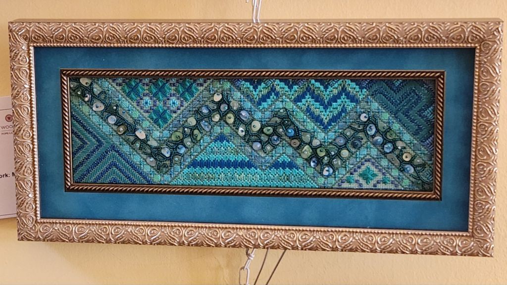
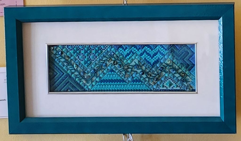
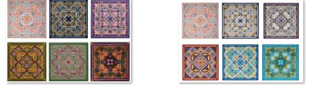
There are 3 Crescent Journeys, my design, and the ANG Stitch of the Month from 2023, on display. Diane’s B did hers in black and red, earning Honorable Mention. Rosie’s green and pink colorway remains my favorite one despite not getting a ribbon. Linda M got 3rd place for the neutral colorway.
Linda M got 4 awards in total – one for sampler, miniature, and 2 for canvaswork. Linda M also stitched Interchange by Linda Rienmiller (which I stitched too). Fun piece.
Noelle D and another person stitched Bermuda Reef by Kathy Rees. Love those blues. And, it’s a great light colored (sandy) frame and blue mat that Noelle selected.
Kristin S went in the opposite direction with a blue frame and white mat. Do you have a preference?
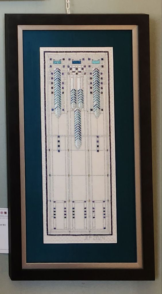
The NJNA members got 14 total awards, including the Director ‘s award for Janet P for Frank Lloyd Wright in Needlepoint #2. Big congratulations! But, I preferred FLW #3.
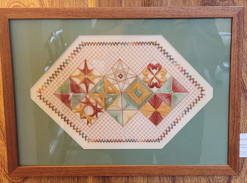
Heather G, from my ANG Main Line Stitchers Chapter, must not have anything left on her walls because she entered 6 pieces! Heather led discussions for our chapter on Flowers of Italy designed by Ro Pace, Stitch of the Month in 2011. It looks great in a tray.
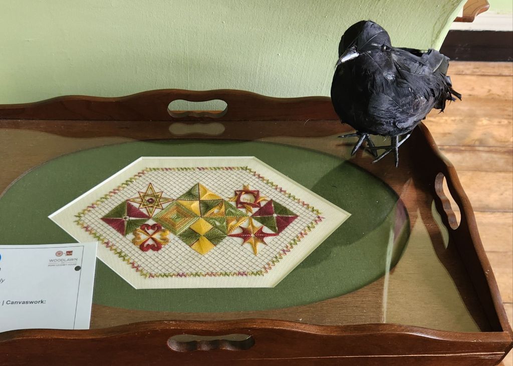
Brenda C. from the ANG Delaware Seashore chapter stitched it as well, but framed it. They both pulled the green for the mat surrounded by wood.
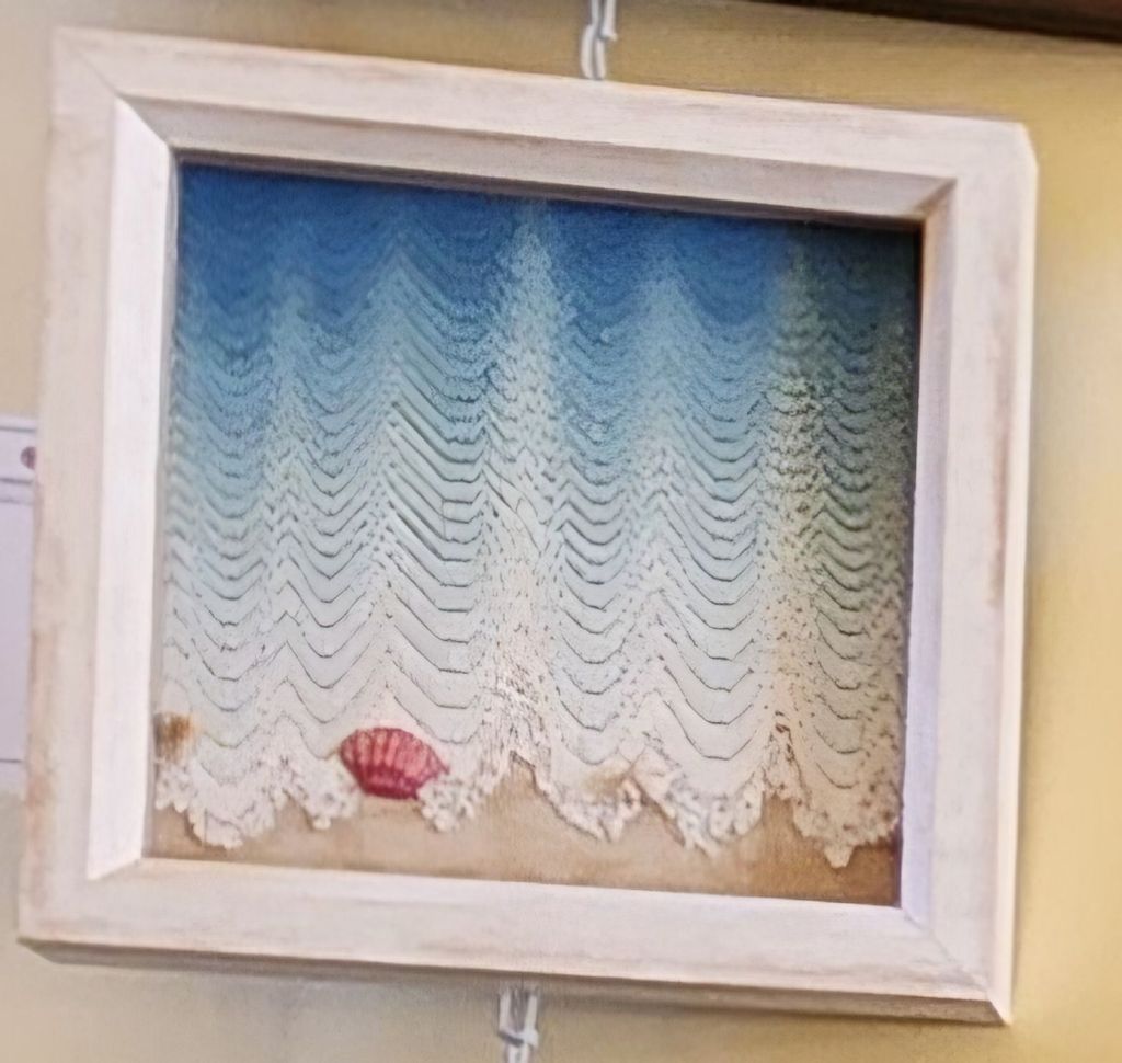
Nissa W flipped Walking the Water’s Edge by Dianne Herrmann making for a very interesting interpretation.
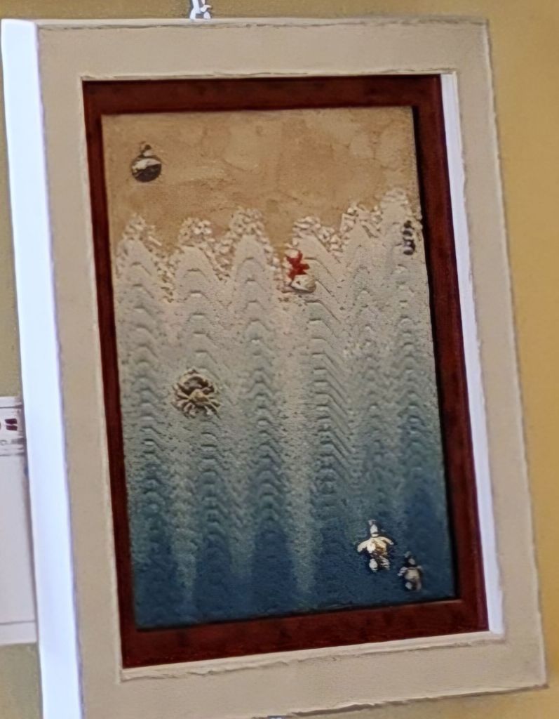
Kathy W oriented as in the original but changed the seashell and named hers Granddaddy’s Beach.
Thomas S-G from my EGA Brandywine Guild submitted a crewel piece. It’s a commercial design by Sunset Stitchery from 1978 but looks timeless to me (there is one on eBay).
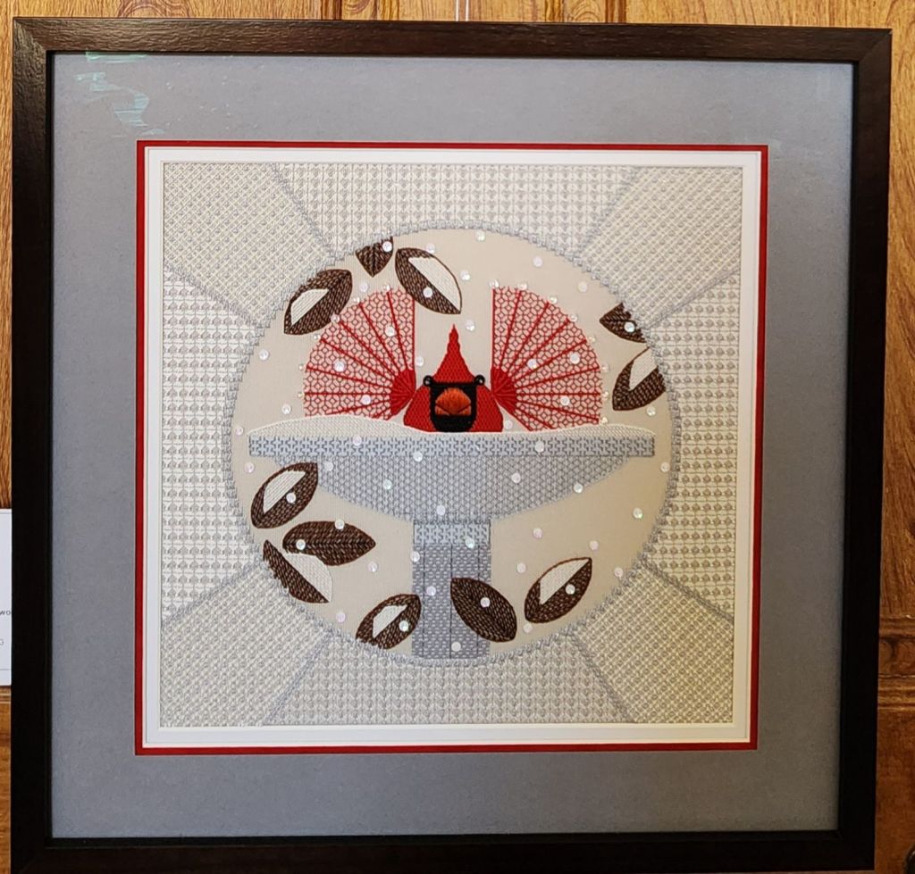
Norma H did it again! She does pieces I absolutely love. This year, she had Brrrdbath, a Charlie Harper design and got a Blue Ribbon (723). And, even better, she was there in person, and we had a wonderful chat.
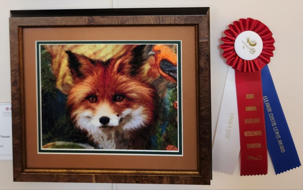
It’s not just cross stitch when you have pieces like Vixen by Nancyanne C where the shading makes you feel the soft fur and deserved First Place and the Eleanor Custis Lewis award. Bill voted for the fox.
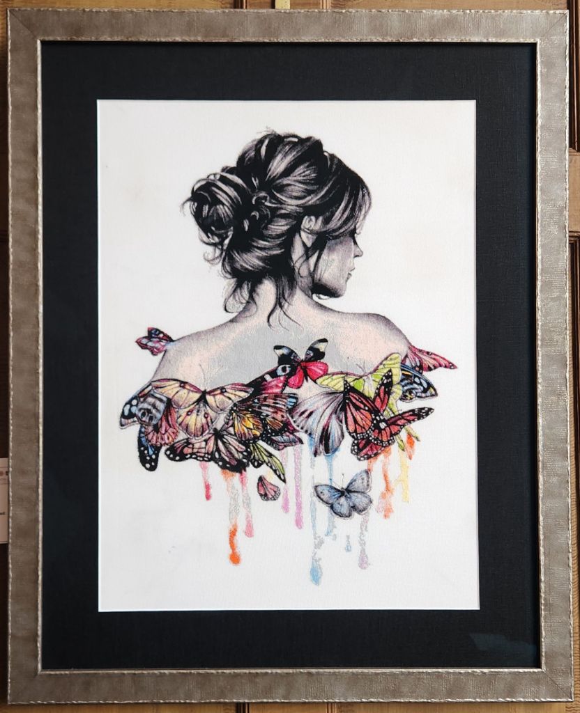
Butterfly Effect by Richard S gives a fresh new look to cross stitch designs.
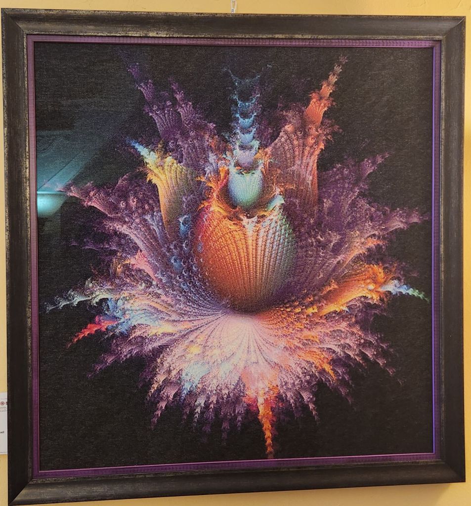
Fractal by Gay S (24″ square?) has amazing shading. Between the size and burst of colors using cross stitches, I made it my People’s Choice vote.
Being in the midst of stitching Dawn Donnelly’s Treasures of the Great Lakes, I probably should have voted for the 10 times more complex, A Bleached Coral Reef by Kim B-R. It’s an original design 8″ diameter full of beachy stumpwork and surface embroidery. A must see!
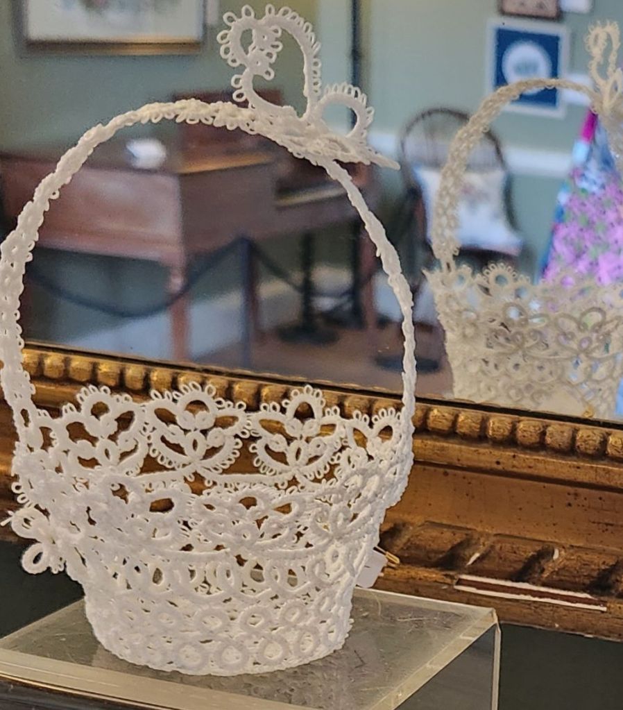
Bob-Bon Basket by Bonita S is an adorable piece of needle lace.
Before I left, I saw Dana C, who informed her chapter would be doing Festive Fireworks from Needle Pointers Magazine July/August 2017 issue. I love to hear that published pieces get utilized by chapters.
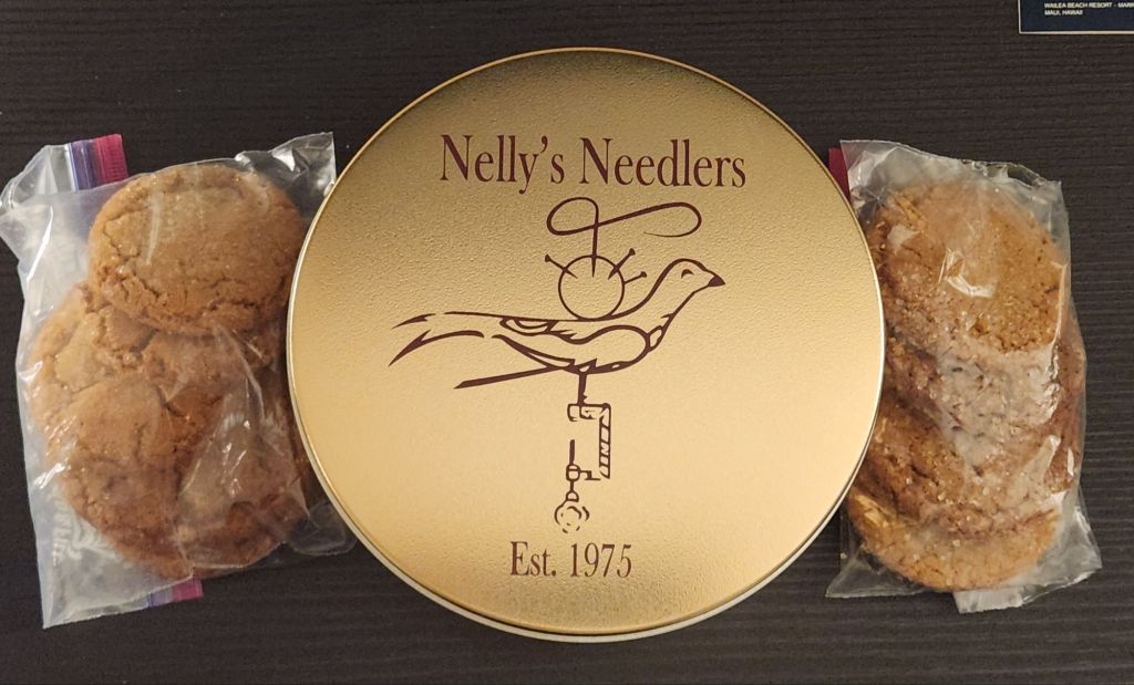
They have commemorative tins! And, I got 2 bags of their cookies (yes, one has been eaten as I had to make sure they were up to their usual standards before I recommend them-they are delicious). They made 5,200 of them and expect to sell out. So, don’t delay!!
Filed under: ANG Needle Pointer's Article, ANG Needle Pointer's Timeless Treasures From the Archives, Crescent Journey, Melita's Designs
The current issue of ANG Needle Pointers is chock full of good stuff, including an article in Timeless Treasures regarding a series, Design by Susan Dawson. She reviews principles of design and color over 5 issues.
I presented a Contrast Talk based on the original and several new Crescent Journeys colorways from ANG stitchers. Learn why this is the same design, but each one looks different. Practically an optical illusion! Several of the new ones and other Crescent Journey pieces will be on display at Woodlawn Needlework Exhibit in March.
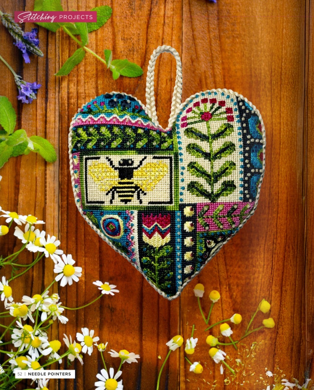
And, saving the best for last. Meghan from my ANG Main Line Stitchers Chapter stitched and created an excellent stitch guide for a Mindy canvas, Folk Heart. I did the diagrams, and her notes made writing up the stitch guide a breeze. For a relatively new stitcher (3-4 years?), she really excels. She did the finishing herself too. Her first attempt at that! Amazing!!
Filed under: ANG New Jersey Needle Artists Chapter, Christmas Ornaments, Festival of Trees, General comments, Melita's Designs
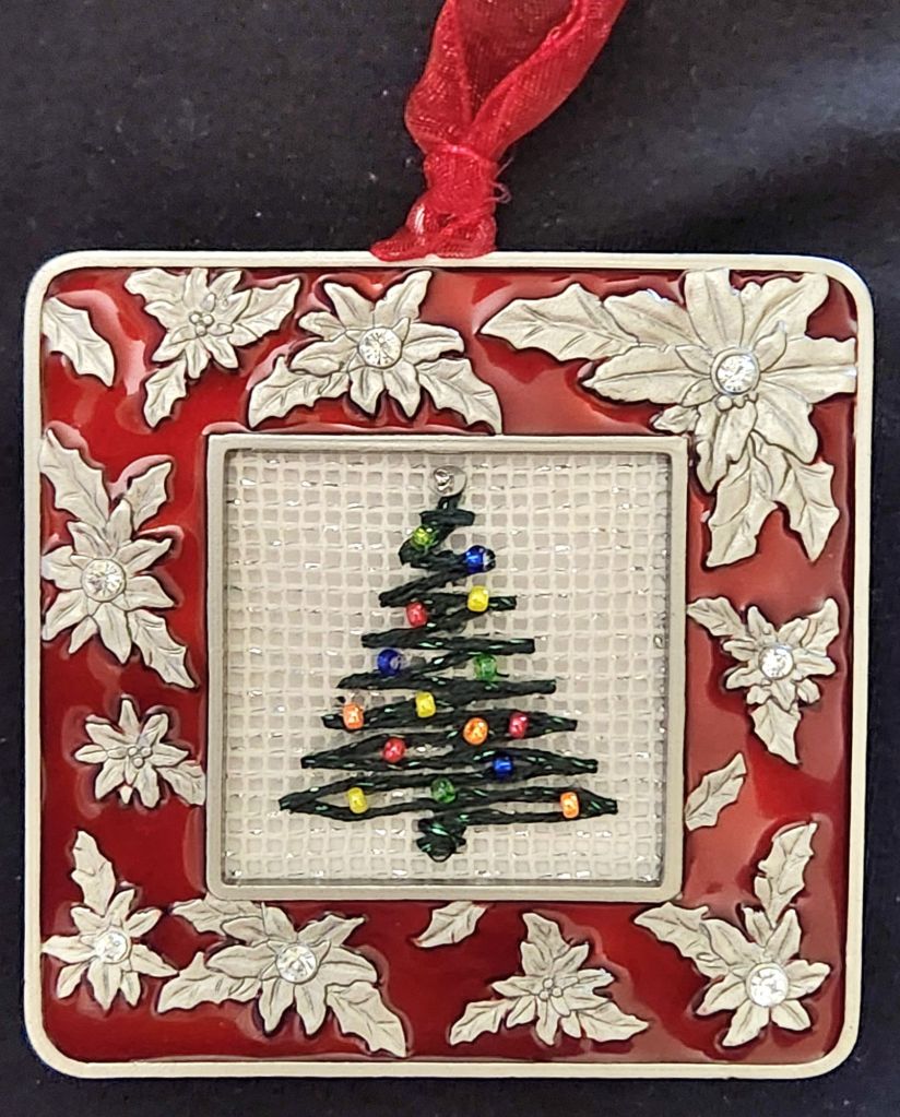
Sue C from New Jersey Needle Artists Chapter had this frame in her unwanted stash pile, and I knew that I would make a nice ornament for the chapter’s tree at the Festival of Trees held annually.
There will be 2 large rooms on display at the Environmental Education Center in Basking Ridge, NJ (190 Lord Stirling Rd). You can see them Friday, December 6, through Sunday, December 29 (except 24th and 25th).
So, I dubbed this ornament Festive Tree for the Festival of Trees. There is silver Kreinik #8 Braid in a diagonal gobelin stitch to secure the edges the size of the frame (doesn’t show). One length of green Silk Lame Braid for 18 count was used to form the base and criss-crossed upward to create the tree. There is a silver sequin and a bead for the tree top and 3 beads of 5 different colors (blue, green, red, yellow, and orange) making up the lights. The canvas has silver sparkle in it.
I delivered it, and the Christmas Plaid ornament I posted previously to Jacqui at the November of the Central Jersey Chapter (CJC) Saturday meeting/Stitch-in (every 3rd Saturday 10-3).
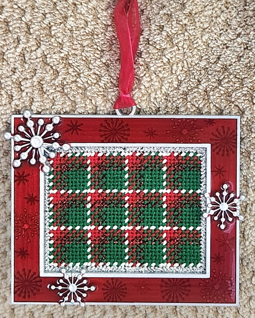
Ellen of Serendipity gave a lesson on Chottie’s Plaid yesterday. I left our ANG Main Line Stitchers chapter Stitch-in an hour early to listen to the talk. Ellen focused on a simple pattern to teach the ones that never heard of it before.
I’ve done the reversible birthday plaid for Bill and I with areas up to 9 wide and 7 number combinations. So, it has to be a decent space to get at least 3 repeats.
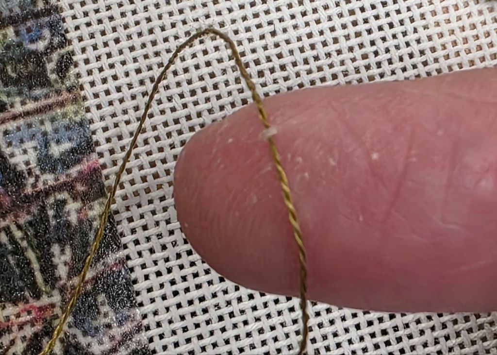
Ellen got me thinking about a smaller, simpler plaid. Can you see what’s my small sett (the sequence and number of coloured threads which produces that tartan’s distinct look when woven in criss-crossing vertical and horizontal stripes)?
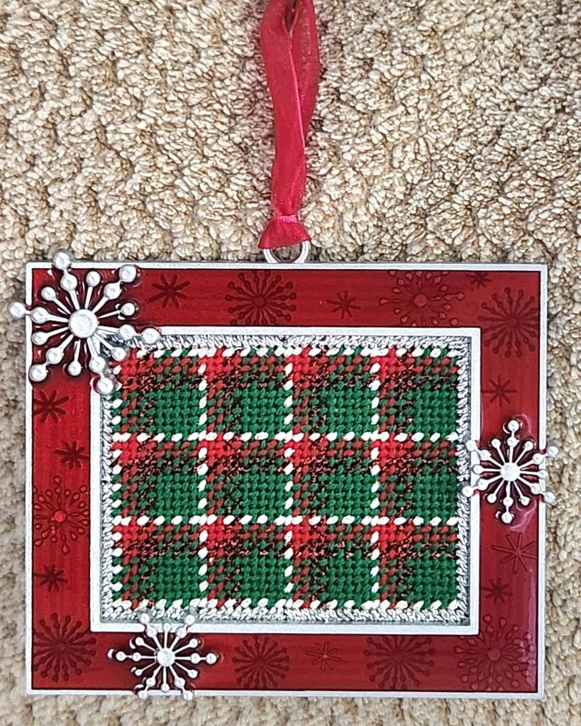
The colors may have given it away. Do you know now? It’s 12 25 in white (1 row of Silk Lame Braid for 18 count), red (2 rows each of Bella Lusso and Kreink Braid #8, and green (5 rows of Bella Lusso). I outlined in a silver Kreinik (#8 would have been better than #12 but 12 works) over 2 rows in a diagonal gobelin in order to place the canvas under the edge of the frame. I cut the canvas right up to the stitched edges.
It was easy to stitch up and the perfect piece as I watched Game 2 of the World Series last night. It looks like Christmas windows to me. Each year, Michael’s has the cutest little frames that can hold a small piece of canvas. I have 2 more (rounds) from last year’s batch to stitch up.
Filed under: Christmas Ornaments, Melita's Designs, Other People's Designs
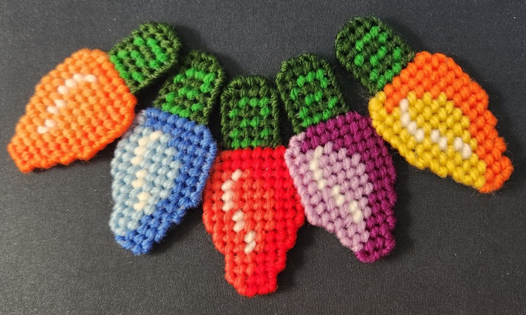
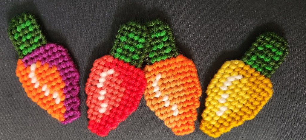
Thanks to my ANG Main Line Stitchers chapter Stitch-in on Saturday, Saturday night’s movie, and football on Sunday, here’s a couple of days’ work on the Christmas bulbs (7 count plastic canvas kit from last year). Three before the meeting, four during the meeting, and five after the meeting, which means half are done!
And, half of Bill’s Chottie’s Plaid bookmark is stitched. I’m curious about how much his plaid will differ from mine. The yellow band is the biggest difference (6 vs 2).