One of my ANG Main Line Stitchers chapter members asked about a thread substitution for Trebizond in Crescent Journey.
You wouldn’t want to use anything stranded (although as soon as I say it, I wonder what would happen except take a lot longer to stitch).
So, I decided to see how they work with the main stitches.
-
Vineyard Silk Classic (gray) top
-
DMC Perle #5 (brown)
-
DMC Perle #8 (white)
-
Trebizond (white) bottom
Here are my stitched samples.

Filed under: ANG Main Line Stitchers Chapter, ANG Stitch of the Month, 1999, Crescent Journey, Melita's Designs, Vases with Curly Bamboo by Sharon G
September 9 (always the second Monday of the month from 7-9 pm) starts another year for our ANG Main Line Stitchers Chapter. Please join us at Starbucks in Wayne, PA (218 Lancaster Ave). We’re excited about this year’s programs.
One of the counted projects is ANG’s Stitch of the Month (SOTM) from 1999, Barbara’s Patchwork. I selected threads that DMC calls Topaz (Color A) and Raspberry (Color B). We need each in light, medium, and dark values. I got an extra value of Topaz just because I might want it. We’re getting instructions each month. So, I’ll wait and see if I want to add a Kreinik for some sparkle. This will be a 5″ x 5″ design area.

The second counted project that 8 people signed up for is my design (6″ x 6″), Crescent Journey. Linda stitched a “Neutral” colorway as she proofread what I wrote up for directions as I stitched a “Beach” colorway. It’s a 43-page booklet with about 60 diagrams. Now, these folks are my first pilot class! One of the most interesting things we learned from this piece is how different values in different areas of the piece make the focal point change. The grayscale really helps show this. I’m excited to see how everyone’s choices of colors work. At least 3 people are changing some or all the threads. This too is a monthly project. I divided it into 12 parts.

The third project is a painted canvas, Vases with Curly Bamboo by Sharon G. It was from a class that several of us took with Sharon at Nimble Needle of NJ a few years ago (2012) and never finished. We have stitch guides to compare including those written by Sharon G, Amy Bunger, and Tony Minieri. This will be discussed every other month to give people a chance to stitch a vase before discussing the next one. The last month we’ll review the background and border. My first vase was done (March 2017) following the Sharon G stitch guide. The little bits done on the other vases was done in class. I’m so glad we’re going to get back to this canvas. Loved it then and still do. Even if everyone is not stitching this, we are learning how different stitch guide writers approach the same painted canvas. We are not copying the stitch guides. Each person has their own or can take notes regarding the other stitch guides.

Tahitian Treat was my piece at the 2019 ANG Seminar Exhibit. It’s an original design in the Non-professional category. And, I am pleased to say that it got an Honorable Mention ribbon.
The scores were: 81 out of 100 (design=21 out of 25, color=19 out of 25, workmanship/technique=15 out of 20, suitability=17 out of 20, finishing=9 out of 10; Note: The First Place design only scored 90 out of 100, the lowest scores for a First Place design that I can remember).
As usual, I got the judges critique. So, I waited to post until the critique and piece returned to Philadelphia. All very positive except for twisting threads – my nemesis! Excerpts:
The more that one explores Tahitian Treat, the more that can be discovered! While you were basically starting with a 12” grid, your piece does not look like a checkerboard.
The way that you created a path around the outside of the design encourages movement of the eye. Yet, your paths had some resting places that were a good idea and nicely stitched. The palette of colors that you chose to work with by using Watercolours Tahiti seems to work well in adding to the movement and balance in your piece.
Your choices for the stitches are also successful. As the direction of the area in which you are stitching changes, so, too, does the direction of the stitches themselves. This in turn offers a cohesive look to your piece. This is especially effective in the yellow-green areas in the outer ‘path’ and the dark blue surrounding the central diamond area. The range of values used is equally effective.
The challenge of working with any twisted thread, e.g., pearl cotton, is the need to be diligent in maintaining the twist of the thread. Your eyelets are consistent in maintaining the same-sized opening in each execution. Your threads are well laid in the dark blue area surrounding the central diamond. You have also determined the right number of threads to have in your needle when using floss.
Your stitch, thread, and color choices all work well in achieving an overall successful design. Thank you for sharing Tahitian Treat with us and we hope that we will see more from you in the future.

There was some thread left over from the Floche Star Ornament and I had this small photo ornament (opening of 1 & 3/4″ diameter) just waiting for something.
I drew a circle on the canvas as large as the paper with the fake photo that came in the face of the ornament.
Sandra Arthur’s Shapes of Needlepoint, Series I, includes stitches for circles and the Milanese Pinwheel stitch is the largest at 22 x 22 canvas threads.
For the red background, I intentionally rotated the canvas to stitch acute triangles of basketweave using DMC Perle Cotton #5 (321) in different directions to add some interest. I learned that is called directional rotation from teacher/designer Diane Hermann.
Using a frame ornament like this, you can’t have thick thread near the edges or fold back the edges to secure them because it won’t close completely. So, I used 4 strands of Kreinik Silk Mori (1114) a Diagonal Weave stitch (see Painted Canvas Embellishment: An Idea Book by Carole Lake and Michael Boren.
I cut close up to where I had stitched without cutting the stitching. The ornament is not going to get opened up often to worry about finishing the edges any better. That made finishing really easy and inexpensive (it’s a $3 frame ornament from Big Lots).

Filed under: ANG Main Line Stitchers Chapter, Crescent Journey, General comments, Melita's Designs, Organization
I finally recovered from a month long viral head cold to visit people this past weekend. We made up for lost time. I took multiple pieces to our monthly ANG Stitch-In Time sessions (please join us at Starbucks on Lancaster Ave in Wayne, PA on the 4th Saturday 10-2 through April). We had another great turnout. From there Bill & I headed to Delaware for a birthday party where I shared my needlepoint exploits (one is also a stitcher) and on Sunday got together with Linda, my stitching buddy.
Linda and I exchanged gifts belatedly. I am fortunate to be the recipient of her first attempts at new patterns. You’d never guess that by looking at anything I’ve gotten so far. And, these 2 project bags are no exception. The bags have beautifully coordinating colors, a zipper closure, a see through plastic front, and a handle! The backs are quilted. Stunning.
I just put one of my current projects, another colorway of Crescent Journey. The threads fit perfectly in the small bag. This colorway looks fantastic in these bags! Thanks again Linda. This is also the project that Linda is proofreading my instructions as she stitches a third colorway.

Filed under: ANG Seminar 2018, Melita's Designs, Purple Mountains Majesty
Purple Mountains Majesty didn’t receive a ribbon even though it scored 91 out of 100 (design=23, color=25, workmanship/technique=17, suitability=19, finishing=7). No real negatives were pointed out in this judge’s critique. Rather positives were pointed out including that the stitches themselves were well executed with a nice even tension, I manipulated the thread well to yield the affect I was looking for, and the areas that I refer to as ‘broken color placement’ (in my artist statement below) enhanced the overall design by providing depth to your landscape. She did make an interesting comment: “There are a few spots where the dye is not solid on the thread. There is nothing you can do about that unless you get a colored marker. Such a marker can be used on a thread before or after stitching. If the thread is too thin, you can color wash the canvas to prevent it from glinting through.” I didn’t realize using a color marker on thread was an acceptable practice!
My artist’s statement follows:
I wanted to explore using one overdyed thread with a few distinct colors to see how I could control the color of that overdyed thread in a single design that was pictorial in nature. This thread popped out at me because it had blue and green. I knew using an overdyed blue thread for sky and an overdyed green thread for grass is very effective. When I saw that the color shift was green to purple to blue, I heard “America The Beautiful” singing the lyrics “purple mountains majesties” and knew this would be great for the exhibit in Washington, DC. I thought I’d control the color best with the brick stitch. However, the various lengths of each color varied within the skein make controlling the color more difficult. There is some broken color placement which when viewed from a distance mixes optically to form the impression of reflected color. And, I obtained some aerial perspective with some of the mountains in the far distance which blurred into a bluish-purple haze.
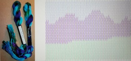

Crescent Journey received a 3rd place ribbon at ANG Seminar and scored 94 out of 100 – anything in the 90s is fantastic! So, you know some other wonderful pieces were submitted in this category. I requested a Judge’s Critique and am thrilled especially with design and color scores – doesn’t get any better! The technique issue that continues to plaque me is twisted threads. I knew I was having issues with Trebizond. Apparently, some beads were not oriented correctly (I may have rotated my canvas as I stitched & if that was intended then I should have noted that in the statement) or they leaned a tad (I need to get out my magnifying glass as I stitch). And, the judges thought some stranded silks might have been more suitable and would have eliminated the twist issue. I can see them used as well although I think it would give a different effect.

My artist statement follows:
I’ve been through an enlightening journey with Orna Willis. During her “Color Inspirations”, “Come Design With Me”, and “Dare To Design” classes, I have learned techniques and processes that allowed me to discover designs within myself. Two of the earlier black and white sketches are shown to see how I developed this design. The colored sketches do not even represent the final design because portions didn’t stitch up as I expected. So, I discarded some stitches and kept others until I had the final stitched design.
Key elements were the way the crescents came together in the corners and the frame within the triangles (Knitting stitch and Mosaic stitches in light and dark purple). The base that the 3 diamonds fit into is same throughout the design except for the colors of the crescents and half Waffles. The center diamonds have 2 or 3 shared components (Wavy, Smyrna, and Nobuko stitches) adding to the continuity within the design. And, the placement of colors helped tie all the elements together too.


Well, I’ve done some stitching wrong again. Everything outside the darker crescents on the upper right and lower left corners is wrong because I rotated the canvas 90 degrees. The upper left and bottom right are correct. So, do I rip out the upper right and lower left, continue to rotate 90 degrees and see what happens, or finish it at this point by just adding beads and sequins and add more Kreinik around the whole irregular edge?
If I continue, I have to buy more Trebizond threads in several colors anyway. If I rip, I may run out of the Watercolours. Do I want to invest more time and money in this design? I’m happy with how it looks at this point especially after adding beads and sequins. I’ve learned from it but other projects may be time and money better spent.
At this point, I welcome your thoughts on what to do. So far, I have 3 rip and restitch. This was very valid advice, “Depends what you will do with it. If you love it enough to get it done by a finisher and display it, then fix it to be correct. If not, then move on.”
I’m going to see if additional threads match what I’ve used so far and continue to ponder my options.

Filed under: Celtic Knot, Dare to Design With Orna Willis, General comments, Threads
Have you ever had threads get twisted when you stitch? Who hasn’t? Well, I heard people try and explain z twist and s twist. While I understand it, I can’t see it. Until I can see the different twists, I will use the simple tip I heard from Cleo at my EGA Brandywine Chapter meeting which is to use the thread as it comes off the skein. This means that the beginning of the thread goes in the eye of the needle. Then, cut the other end and finish with that end. I was seeing issues with Trebizond and now I’m not.
This is the beginning of the second design that has come out of my design class with Orna Willis. My paintings reminded Patrick from my ANG Chapter of a Celtic Knot. I don’t know if the stitched piece in my colors will still remind him of a Celtic Knot but that’s what I’ve called this design.
Here are the paintings.
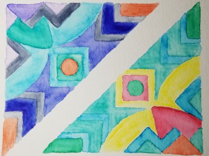
I tried to paint in my stitched colorway but didn’t do great.

Here’s the inner area stitched (sequins and beads will be added last). I’m using Trebizond TRA 381 Orange Sherbet, 3586 Birds of Paradise, 343 Peach Sorbet, Bijout MMT 429 Jasper, Kreinik 1/16″ ribbon 2122, and Watercolours 144 Pomegranate in this inner area.

A different color of Trebizond, Bittersweet TRA 376, replaced the Orange Sherbet TRA 381 into the next surrounding area.
I love how it’s looking but it certainly isnt easy to stitch due to the nonsymmetrical features and the weaving. I could stop here and add beads and it’d be a pretty little thing but I am going to keep on going!! All these threads are from the kit that came with Orna’s class. Even after I finish this piece, I’ll have threads enough to stitch at least a third piece!

Needle Pointers magazine has published Scotch Stew in the May/June 2018 issue! The magazine is late reaching our homes but it got posted online a week ago. So, I knew that it wasn’t on the cover. But, it’s so rewarding and fun to see my design published. I can’t show much of what was published due to copyright issues but this should be ok.


Again, Pam Gardner did a magnificent job of diagramming the stitches and clarifying text I suggested. I was able to send her better diagrams than previous published pieces and she said that made it much easier for her. I sent everything to her shortly after Seminar last year and was able to practice using computer skills that I learned from Cynthia Thomas.
This was my second attempt at an all Scotch stitch design. Here is the piece framed (by Repenning Fine Arts in Audubon, NJ). It received a third place ribbon at Seminar last year. Both of my Scotch pieces will look great on our newly painted bedroom walls.

Postscript 1. I was thrilled to hear that a favorite designer of mine stitched this in another colorway and shared it with me – very pretty. Also, nice to hear that it was easy to follow the instructions and diagrams. She’s going to use it as a lead-in to a meeting program about changing colors or threads in a published project.
Postscript 2. I got a lovely thank you note from Diane from Needle Pointers magazine for sharing the design and I got an extra copy of the magazine.
Postscript 3. An ANG chapter stitched my design in another colorway and posted it on Needlepoint Nation (https://www.facebook.com/groups/NeedlepointNation/permalink/3636499066427225/)! It turned out great and made my day!

