As you can see, Fiona joined us in January 2020 and I finished it shortly after her third month birthday! So many cute pictures of her but I finished her piece on Easter Sunday. So, this one seems appropriate.

The crayon lettering for “January” is from chart 95 on page 34 in Alphabets Galore 136 Alphabets Leaflet 3071. I made up the numbers and lower case letters. ‘Welcome to our world’ lettering is from chart 79 on page 28 in the same leaflet.
It may be a while until I can get it framed and delivered but I am happy that it is ready whenever I can go somewhere.

Happy Easter or Passover to all!
My husband and I have another adorable great niece. Norah welcomed a baby sister, Fiona, to our world in January. It took me awhile to decide what to stitch for her. Luckily, I decided on the design and obtained the Aida cloth and threads sometime in February.
When I started this about two weeks ago, I wasn’t even concerned about coronavirus. I was planning on it being my travel piece. Now, all travel seems unlikely for quite a while. But, by staying safe now, we’ll get back to traveling eventually. So, I continue to stitch this piece because the colors are bright and happy. And, we’re seeing cute posts on Facebook about the girls.
Normally, I would wait to post this until it is done. But, Fiona’s mom knows that I am stitching something for her. And, I doubt she reads my blog. I just won’t put this on Facebook.
Fiona is an Irish name meaning “fair, white, beautiful”. White light is composed of the seven colors of the spectrum: red, orange, yellow, green, blue, indigo (blue-violet, not used in this rainbow), and violet. Those are also the colors which were used in Norah’s piece. Since they will likely share a bedroom, I decided to coordinate the design with that done for Norah. Instead of repeating balloons, I emphasized a rainbow theme adding 3 small rainbows in Fiona’s name. The alphabet is the same one I used for Norah but hers only had one rainbow in her name. The chart was modified to fit my height and width but is based on the Irish lettering in chart 73 on pg 26 from Leisure Arts 120 Alphabets Leaflet 2285.
I used as many of the same colors used in Norah’s piece including DMC flosses: yellow 444, green 701, green 700 which is a little darker for the green in Fiona, blue 825, violet 552, red 666, red 666, and orange 970. Again, I used Kreinik #12 braid 010HL for the pot and #8 braid 002 for the gold.

Filed under: General comments, Melita's Designs, Tahitian Treat, Woodlawn Needlework Exhibition
March means that the month-long Woodlawn Needlework Show is going on again. I’ve been going since 2010 and the number of entries had been on a steady decline until this year. The highs were 600+ (681 in 2011) through 2013, dropped to 500+ through 2016, further dropped to 400+ through 2018, and the lowest last year at 360. But, it is nice to see it on the rise again at 484 entries this year. Because there were more pieces and some really large ones, some of the pieces were hung quite high way above eyesight. Bill & I picked a glorious sunny weekend to visit. So, some photos have glare from the sun coming in the windows or because of glass over the needlework. Since photos from a distance were allowed, I’ll show a few walls. And, closer photos are all Commercial pieces. If anyone can name the designer of the pieces I didn’t, please leave a comment. Thanks in advance.
Spoiler alert! I list winners of ribbons which are all listed on the website: http://www.woodlawnpopeleighey.org/annualneedleworkshow/ . It looked like more ribbons were awarded this year. But, even the ones without ribbons were great. I’m always glad I’m not a judge. And, that brings me to my review of select pieces with the entry number and category in parens. I identified any designers and websites that I know.
Last year there were only 2 original designs entered under Canvaswork Multi-Stitch (4+) Adult. This year there are 7 pieces. Mine is called Tahitian Treat with a 12″ square design area and it got 3rd Place (147, top piece in Photo 1). I was really taken by Joan’s lengthy panoramic view of seascape (893, Commercial Counted Cross, Senior, Honorable Mention, third one from the top in Photo 1). Lynn stitched the Maine Lobster Shack on Bailey’s Island which is by Sea Breeze Designs available at The Wellesley Needlepoint Collection online or in Wellesley, MA (30 minutes west of Boston if you are going to EGA National Seminar in Boston Sept 4-8, 2020).
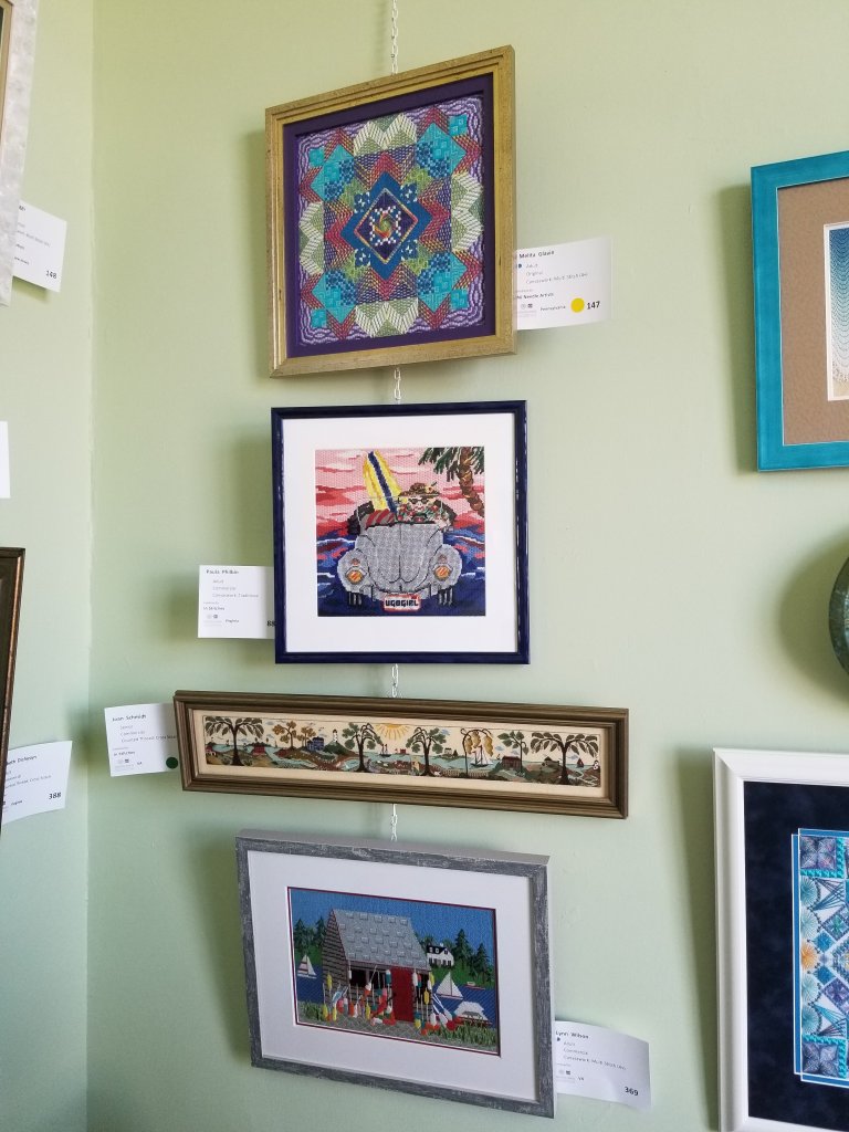
It is very cool to see Heather from my ANG Keystone Garden chapter get 1st Place and a Judge’s Award (855) in the same category as mine. She also got 1st Place for a beautiful, very long Multi-Stitch Commercial Sampler on linen (857). Congrats Heather!
My piece hitched a ride with Linda who delivered 27 pieces from 17 people from New Jersey Needle Artists chapter members (127-153). And, 12 won 15 awards from 1st place to Honorable Mention! Most are in the Canvaswork Multi-Stitch (4+) Adult Commercial category. Congratulations to all the NJNA members!
I found 9 pieces stitched by members of NJNA who did Autumn Kaleidoscope by Lorene Salt for their annual group submission (see lorenesaltneedlearts.com). They are done in different colorways and all looked really good. Their 9 pieces (I hope I didn’t miss any) are spread out in different rooms. Don’t miss Diane’s SOTM in the small upstairs attic staircase with the Halloween pieces. Many or all of the current SOTM pieces are on the NJNA blog (blog.njneedleartists.org).
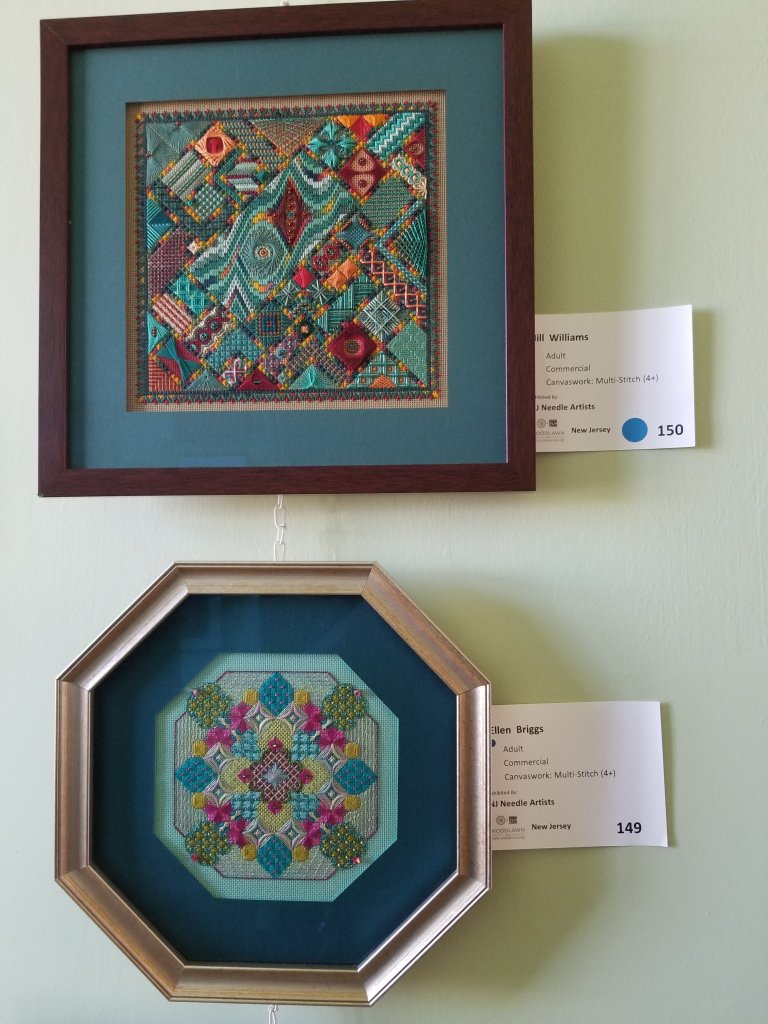
Jill got 1st Place (150, top piece in Photo 2). Also shown is Ellen’s Patchouli designed by Tony Minieri (149, bottom piece in Photo 2). That one’s interesting to me because I ran into Kristen from my ANG Main Line Stitchers chapter at the framer recently and that was one of the pieces that she was getting framed (see tonyminieri.com).
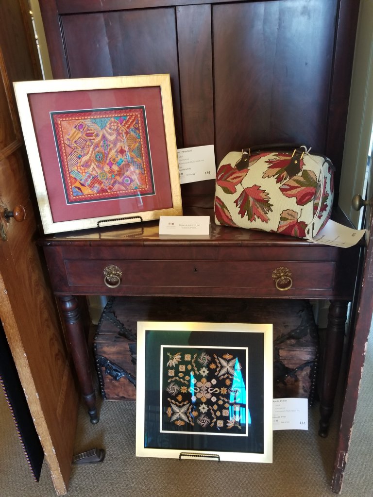
Although it didn’t get a ribbon, I was taken with how bold the colors were in Janet’s SOTM (139, top framed piece in Photo 3) and how the aqua cooled the piece down. Noelle from NJNA also caught up with last year’s SOTM designed by Debbie Rowley, Linda Reinmiller, Mary Knapp, and Pat Hartman (132, bottom framed piece in Photo 3). It was created for ANG Stitch of the Month in 2019 as a Mystery Project. All ANG SOTM designs which began in 1998 are available free to all members (see needlepoint.org).
There were 2 flags (do not know who the Commercial designer is) that have all the states listed by dates of admission into the United States. Margaret stitched one (140, 3rd Place) and Cynthia stitched hers with Virginia in another color because she lives in Virginia (102, 2nd Place, top piece in Photo 4).

A few familiar names to me who all won awards across a variety of categories included Norma Hiller (305, 306), Christin Loudon (307, Commercial Canvaswork Multi-Stitch Senior) for her 4-piece patriotic train which is sitting on the mantle in Photo 4, Donna LaBranche (381, 382), Ruth Dilts (478-479), Theresa Baird (483) for an original Multi-stitch Sampler Senior, Donna Pence (491), and Catherine Jordan’s original designs, Pilgrim Map and Whale Tales Journal (808-810, see where she’ll be teaching them later this year on her website at catherinesdesigns.net).
Norma Hiller (306) and Donna LaBranche (381) both stitched Ambrosia Honey which was published in EGA’s magazine, Needle Arts, in the June 2017, September 2017, December 2017 and March 2018 issues (see egausa.org). Norma’s is in the middle column, 3rd from the top in Photo 5. Also, in the middle column of Photo 5 are 2 pieces that didn’t get ribbons but really caught my attention. The top one by Natalie is a Counted Cross Stitch Commercial piece of a train in a city scene in a bottle (363). It was too high to get a good look at but the appearance of the glass and all the shading is fantastic especially around the edges and top in front of the cork. And, Whirligig designed by Joan Zimmerman (131, bottom one) by Joan from NJNA is striking and what a great frame. Shirley stitched Deborah Forney’s Healing Labyrinth 1 (173, Honorable Mention, left column, 2nd from the top in Photo 5) (looks like Deborah only has a Facebook page under ‘Deborah Forney Needlework’). An original design was cropped out of Photo 5. The Quilting Angel designed by Jim Shore was stitched by Michele (911, right column, top one).
Mary got 1st Place for her adaptation of a 2016 EGA Correspondence Course, Bargello Challenge, offered by Gail Stafford (347, upper left piece in Photo 6). I can’t find Gail’s website but she teaches regularly through ANG and EGA (try contacting either organization).
It was great to see Barbara’s Mystery of Life designed by Sue Reed (433, upper right corner of Photo 6) because I’d recently seen my Main Line Stitchers chapter member Linda’s finished piece. At suereed.squarespace.com, you can find her piece(s).

Donna Pence’s 32-count miniature tiger stitched on gauze won 1st Place and the Pope-Leighey Award (491, Commercial Senior, right column 4th one from top). In the second column from the right, 2nd from the top (344), Jim stitched a piece that was on the cover of Cross Stitch & Needlework, May/June 2000 issue. In the left column, 4th from the top (358, 1st Place), Caroline used Danish Flower thread, a thread I’ve never seen but I did find it online in the US at Alex-Paras NeedleArts, from a Danish kit.
There is another amazing piece depicting the Copenhagen Harbor by Caroline (359, Commercial Cross Stitch Senior, 2nd Place) that used a large variety of colors of Danish Flower Thread in the piece sitting on the mantle in Photo 8. The kit was from the Danish Handcraft Guild and measures 6 feet wide and 12 inches tall. I get lots of hits for books and kits using the term ‘Danish Handcraft Guild’. And, I found the North House Folk School teaching Danish Embroidery and so much more with fiber art, beading, basketry, and hand-sewn leather projects in Grand Marais, MN (see northhouse.org).

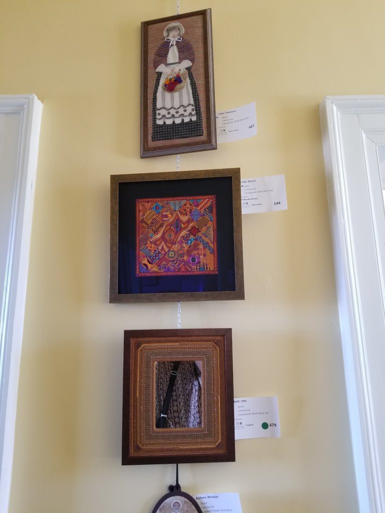
Ruth’s frame around a mirror (479, Commercial Canvaswork Multi-Stitch Senior, piece on the bottom in Photo 9) had some quite interesting patterns with some sparkling threads. This is a Susan Porta design. No wonder I liked it. I have several of Susan’s pieces in my To Do pile (see susanporta.com). Don’t know how I could have avoided having my shirt and purse strap showing in the mirror. Also pictured (144, in the middle of Photo 9) is another SOTM by Linda with NJNA done in bold colors and again with some cooling blues that I like as much as any of the others. The Pilgrim lady (447, on the top of Photo 9) is an ancestor of Patti, the stitcher, who used her own hair to enhance the piece.
There was another stitched frame done in cross stitch by Mary (419, Commercial, right piece in Photo 10) that caught my eye as well perhaps because the stitching is red against a black and white photo or because the inner corners are not squared.

In 2016, they allowed pieces for sale (at the request of the stitcher & priced by the stitcher with a commission applied). This year 30 pieces are for sale ranging from $50 to $5,000. I’m not going to show them but a peacock with a sculpted mat (928, Commercial Beadwork) and a tree with the sun chasing away winter (500, Original Surface Embroidery) that are the most expensive ones are heavily beaded and very colorful.
Speaking of beads, the piece done by Patricia in entirely in Delica Beads (Commercial Beadwork, not for sale) was absolutely amazing (453, top piece in Photo 11). I just love Monet & this depicts the colors in his Garden at Giverney. The Paris skyline (129, Commercial Canvaswork Multi-stitch, middle piece in Photo 11) was done by Rosie from NJNA and got 2nd Place. The stitch selection for the sky is quite different (not sure what it is) and shading really caught my eye. And, I’m not familiar with the designer of the geometric done by Kathryn, an original member of Nelly’s Needlers, (475, Commercial Canvaswork Multi-Stitch Senior, bottom piece in Photo 11) but the colors are amazing. It won 1st Place and the Adelaide Bolte Award.

There were 2 Commercial designs both stitched by Nancy with NJNA that I was familiar with including Diane Herrmann’s Walking The Water’s Edge (322, Canvaswork, Multi-stitch, top piece in Photo 12) which I have stitched (see dianeherrmann.com for her designs). And, Tropical Punch (320, Canvaswork, Multi-stitch, 2nd place, bottom piece in Photo 12) designed by Deb Rowley (see debbeesdesigns.com). An original design was cropped out of the photo.
Laura Perin’s Daffodil Collage done by Sondra (948, 2nd Place, top piece in Photo 13) reminds me that it is in my To Do pile. I’ve spent a lot of time looking at her designs (lauraperindesigns.net). Also in Photo 13 on the bottom is a beautiful example of Japanese Embroidery done by T Ann (397, Commercial Senior, 3rd Place).

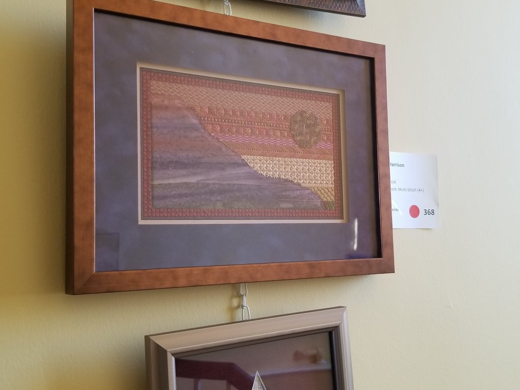
Under A Copper Moon designed by Toni Gerdes was stitched by Barbara (368, 2nd Place, Photo 14). Toni uses a batik fabric applique in the lower left corner and a hot foil technique to create the first layer of the moon which is later appliqued in place. With the variety of techniques, I have been intrigued by this piece. And, I love the colors. See Toni’s website (tonigerdes.com) and where she’ll be teaching later this year.
I stitched Michele Robert’s CyberWorkshop called The Exodus Breastplate as did Marilyn Court Photo 15). Also, in the room is Marilyn’s piece from an ANG Correspondence Course from 1996 called Old Staffordshire designed by Kathleen Rake (bottomright corner in Photo 16). Neither are available now. You can see both and more past award winners in the special exhibit room upstairs that is celebrating the 45th anninersary of Nelly’s Needlers. There are several other special exhibits to check out including The Fiber Art of Roxana Alger Geffen (a local artist), The Shenandoah Valley Tapestry (spearheaded by the Winchester Chapter of EGA; 81 stitchers from US and around the world brought this piece to life along with 1,400 people who took just one stitch in the piece including myself), and Girl Power which are pieces created by children representing our next generation of crafters.


There wasn’t as many goldwork pieces as usual but what I did see was lovely including a small bird stitched by Raven (175, Commercial, 2nd Place), Sue Ellen’s butterfly (309, Commercial, 1st Place, Photo 17), Joyce’s Fleur de Lys (312, Commercial), Susan’s original design of a shell (407, 1st Place), and a purse with a long feather (874, Commercial, Honorable Mention).

There was a set of kneelers (329-333, 335-338, 439) all of which got Honorable Mention except for Barbara’s which got 2nd Place (335). They were all done with excellent technique. So, my guess is that Barbara who is also the designer of the original pieces got 2nd Place.
Many of the Commercial cross stitch pieces are very impressive because of all the detail cross stitch allows and partly because they are so large. I liked Lisa’s dog in leaves (110), Escher stairs with 50 shades of grey stitched by Michelle (319), Theresa’s A Stitch in Time (designed by Aimee Stewart – google her designs) which depicts 4 seasons, different rooms, sewing implements, and 20 stitchers throughout time (365, 3rd Place), Ronda Lynn’s A Bowl of Christmas which is a large framed half circle of a Christmas scene that was too pretty to be used as tree skirt (366), Renata’s rainbow band sampler which reminds me of an un-Twisted Rainbow Sampler by Northern Expressions Needlework that I saw there a few years ago but it’s probably not their design (858, 1st Place, Photo 18), Michelle’s large elegant lady (862, bottom left piece in Photo 6), Michele’s The Joy of a Beautiful Quilt (911, upper right piece in Photo 5), Annie’s red heart outlined by black stitching (923) and another large sleeping lady (942, bottom right piece in Photo 6). And, Doris’ original design of Santa with a flowing robe delivering a beautiful tree (941, Honorable Mention).

Bill used his People’s Choice vote for Anita’s original design Year of the Woman – From the Dawn of Time because of the originality and research involved. There are 180 of the most famous women throughout history based on contributions to society and the world that are depicted in the piece (486, Cross Stitch, 2nd Place). You can see this at the ANG New Jersey Needle Artists blog.
I voted for Karen’s original design of 4 seascapes (449, Surface Embroidery) that won 1st Place and a Judge’s Award. It really makes you hear the ocean, one of my favorite sounds. You can see this piece (diamond shaped piece as a whole and close up for each of the four sections) at EGA’s website https://egausa.org/gallery/2017-fiber-forum/
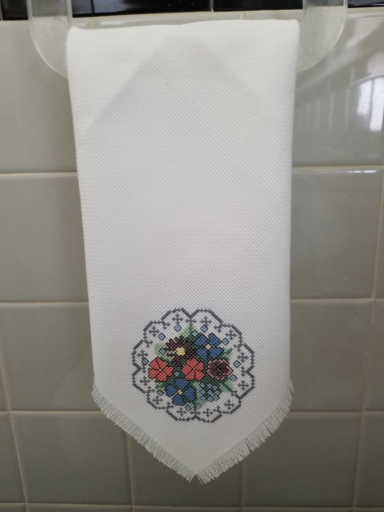
Before we left, I purchased a new guest bathroom towel stitched by a Nelly Needler (Photo 19).
Lastly, please leave a comment with the name and/or designer of any pictured pieces. Others may be interested. Many thanks. And, I hope you make the trip to see all the pieces in person. It’s a wonderful exhibit.
One of my ANG Main Line Stitchers chapter members asked about a thread substitution for Trebizond in Crescent Journey.
You wouldn’t want to use anything stranded (although as soon as I say it, I wonder what would happen except take a lot longer to stitch).
So, I decided to see how they work with the main stitches.
-
Vineyard Silk Classic (gray) top
-
DMC Perle #5 (brown)
-
DMC Perle #8 (white)
-
Trebizond (white) bottom
Here are my stitched samples.

Filed under: ANG Main Line Stitchers Chapter, ANG Stitch of the Month, 1999, Crescent Journey, Melita's Designs, Vases with Curly Bamboo by Sharon G
September 9 (always the second Monday of the month from 7-9 pm) starts another year for our ANG Main Line Stitchers Chapter. Please join us at Starbucks in Wayne, PA (218 Lancaster Ave). We’re excited about this year’s programs.
One of the counted projects is ANG’s Stitch of the Month (SOTM) from 1999, Barbara’s Patchwork. I selected threads that DMC calls Topaz (Color A) and Raspberry (Color B). We need each in light, medium, and dark values. I got an extra value of Topaz just because I might want it. We’re getting instructions each month. So, I’ll wait and see if I want to add a Kreinik for some sparkle. This will be a 5″ x 5″ design area.
The second counted project that 8 people signed up for is my design (6″ x 6″), Crescent Journey. Linda stitched a “Neutral” colorway as she proofread what I wrote up for directions as I stitched a “Beach” colorway. It’s a 43-page booklet with about 60 diagrams. Now, these folks are my first pilot class! One of the most interesting things we learned from this piece is how different values in different areas of the piece make the focal point change. The grayscale really helps show this. I’m excited to see how everyone’s choices of colors work. At least 3 people are changing some or all the threads. This too is a monthly project. I divided it into 12 parts.

The third project is a painted canvas, Vases with Curly Bamboo by Sharon G. It was from a class that several of us took with Sharon at Nimble Needle of NJ a few years ago (2012) and never finished. We have stitch guides to compare including those written by Sharon G, Amy Bunger, and Tony Minieri. This will be discussed every other month to give people a chance to stitch a vase before discussing the next one. The last month we’ll review the background and border. My first vase was done (March 2017) following the Sharon G stitch guide. The little bits done on the other vases was done in class. I’m so glad we’re going to get back to this canvas. Loved it then and still do. Even if everyone is not stitching this, we are learning how different stitch guide writers approach the same painted canvas. We are not copying the stitch guides. Each person has their own or can take notes regarding the other stitch guides.

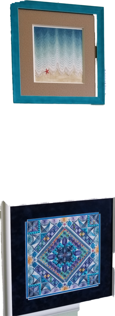
Tahitian Treat was my piece at the 2019 ANG Seminar Exhibit. It’s an original design in the Non-professional category. And, I am pleased to say that it got an Honorable Mention ribbon.
The scores were: 81 out of 100 (design=21 out of 25, color=19 out of 25, workmanship/technique=15 out of 20, suitability=17 out of 20, finishing=9 out of 10; Note: The First Place design only scored 90 out of 100, the lowest scores for a First Place design that I can remember).
As usual, I got the judges critique. So, I waited to post until the critique and piece returned to Philadelphia. All very positive except for twisting threads – my nemesis! Excerpts:
The more that one explores Tahitian Treat, the more that can be discovered! While you were basically starting with a 12” grid, your piece does not look like a checkerboard.
The way that you created a path around the outside of the design encourages movement of the eye. Yet, your paths had some resting places that were a good idea and nicely stitched. The palette of colors that you chose to work with by using Watercolours Tahiti seems to work well in adding to the movement and balance in your piece.
Your choices for the stitches are also successful. As the direction of the area in which you are stitching changes, so, too, does the direction of the stitches themselves. This in turn offers a cohesive look to your piece. This is especially effective in the yellow-green areas in the outer ‘path’ and the dark blue surrounding the central diamond area. The range of values used is equally effective.
The challenge of working with any twisted thread, e.g., pearl cotton, is the need to be diligent in maintaining the twist of the thread. Your eyelets are consistent in maintaining the same-sized opening in each execution. Your threads are well laid in the dark blue area surrounding the central diamond. You have also determined the right number of threads to have in your needle when using floss.
Your stitch, thread, and color choices all work well in achieving an overall successful design. Thank you for sharing Tahitian Treat with us and we hope that we will see more from you in the future.

There was some thread left over from the Floche Star Ornament and I had this small photo ornament (opening of 1 & 3/4″ diameter) just waiting for something.
I drew a circle on the canvas as large as the paper with the fake photo that came in the face of the ornament.
Sandra Arthur’s Shapes of Needlepoint, Series I, includes stitches for circles and the Milanese Pinwheel stitch is the largest at 22 x 22 canvas threads.
For the red background, I intentionally rotated the canvas to stitch acute triangles of basketweave using DMC Perle Cotton #5 (321) in different directions to add some interest. I learned that is called directional rotation from teacher/designer Diane Hermann.
Using a frame ornament like this, you can’t have thick thread near the edges or fold back the edges to secure them because it won’t close completely. So, I used 4 strands of Kreinik Silk Mori (1114) a Diagonal Weave stitch (see Painted Canvas Embellishment: An Idea Book by Carole Lake and Michael Boren.
I cut close up to where I had stitched without cutting the stitching. The ornament is not going to get opened up often to worry about finishing the edges any better. That made finishing really easy and inexpensive (it’s a $3 frame ornament from Big Lots).
Filed under: ANG Main Line Stitchers Chapter, Crescent Journey, General comments, Melita's Designs, Organization
I finally recovered from a month long viral head cold to visit people this past weekend. We made up for lost time. I took multiple pieces to our monthly ANG Stitch-In Time sessions (please join us at Starbucks on Lancaster Ave in Wayne, PA on the 4th Saturday 10-2 through April). We had another great turnout. From there Bill & I headed to Delaware for a birthday party where I shared my needlepoint exploits (one is also a stitcher) and on Sunday got together with Linda, my stitching buddy.
Linda and I exchanged gifts belatedly. I am fortunate to be the recipient of her first attempts at new patterns. You’d never guess that by looking at anything I’ve gotten so far. And, these 2 project bags are no exception. The bags have beautifully coordinating colors, a zipper closure, a see through plastic front, and a handle! The backs are quilted. Stunning.
I just put one of my current projects, another colorway of Crescent Journey. The threads fit perfectly in the small bag. This colorway looks fantastic in these bags! Thanks again Linda. This is also the project that Linda is proofreading my instructions as she stitches a third colorway.

Filed under: ANG Seminar 2018, Melita's Designs, Purple Mountains Majesty
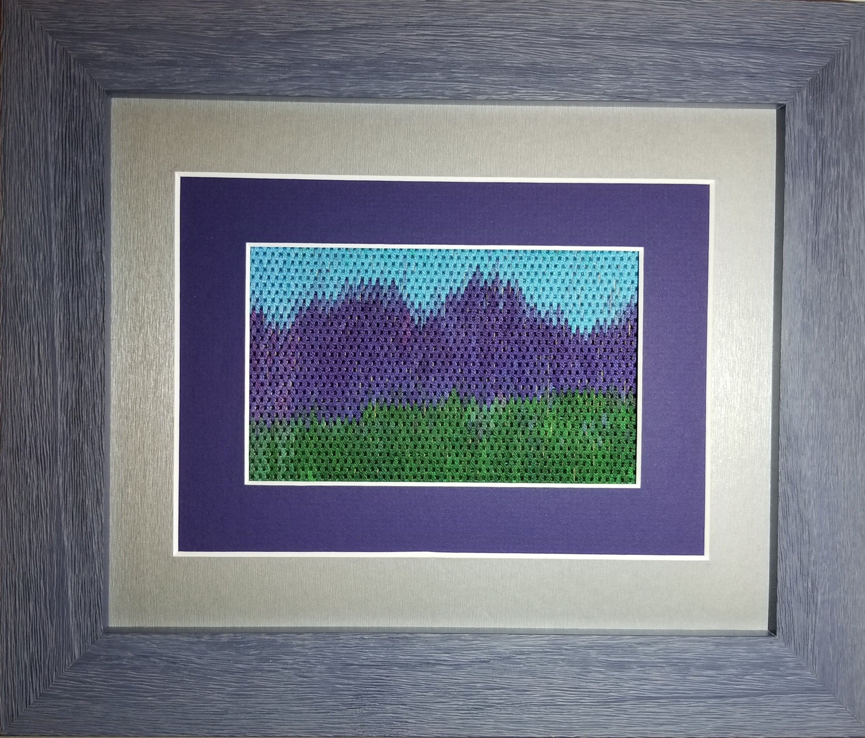
Purple Mountains Majesty didn’t receive a ribbon even though it scored 91 out of 100 (design=23, color=25, workmanship/technique=17, suitability=19, finishing=7). No real negatives were pointed out in this judge’s critique. Rather positives were pointed out including that the stitches themselves were well executed with a nice even tension, I manipulated the thread well to yield the affect I was looking for, and the areas that I refer to as ‘broken color placement’ (in my artist statement below) enhanced the overall design by providing depth to your landscape. She did make an interesting comment: “There are a few spots where the dye is not solid on the thread. There is nothing you can do about that unless you get a colored marker. Such a marker can be used on a thread before or after stitching. If the thread is too thin, you can color wash the canvas to prevent it from glinting through.” I didn’t realize using a color marker on thread was an acceptable practice!
My artist’s statement follows:
I wanted to explore using one overdyed thread with a few distinct colors to see how I could control the color of that overdyed thread in a single design that was pictorial in nature. This thread popped out at me because it had blue and green. I knew using an overdyed blue thread for sky and an overdyed green thread for grass is very effective. When I saw that the color shift was green to purple to blue, I heard “America The Beautiful” singing the lyrics “purple mountains majesties” and knew this would be great for the exhibit in Washington, DC. I thought I’d control the color best with the brick stitch. However, the various lengths of each color varied within the skein make controlling the color more difficult. There is some broken color placement which when viewed from a distance mixes optically to form the impression of reflected color. And, I obtained some aerial perspective with some of the mountains in the far distance which blurred into a bluish-purple haze.

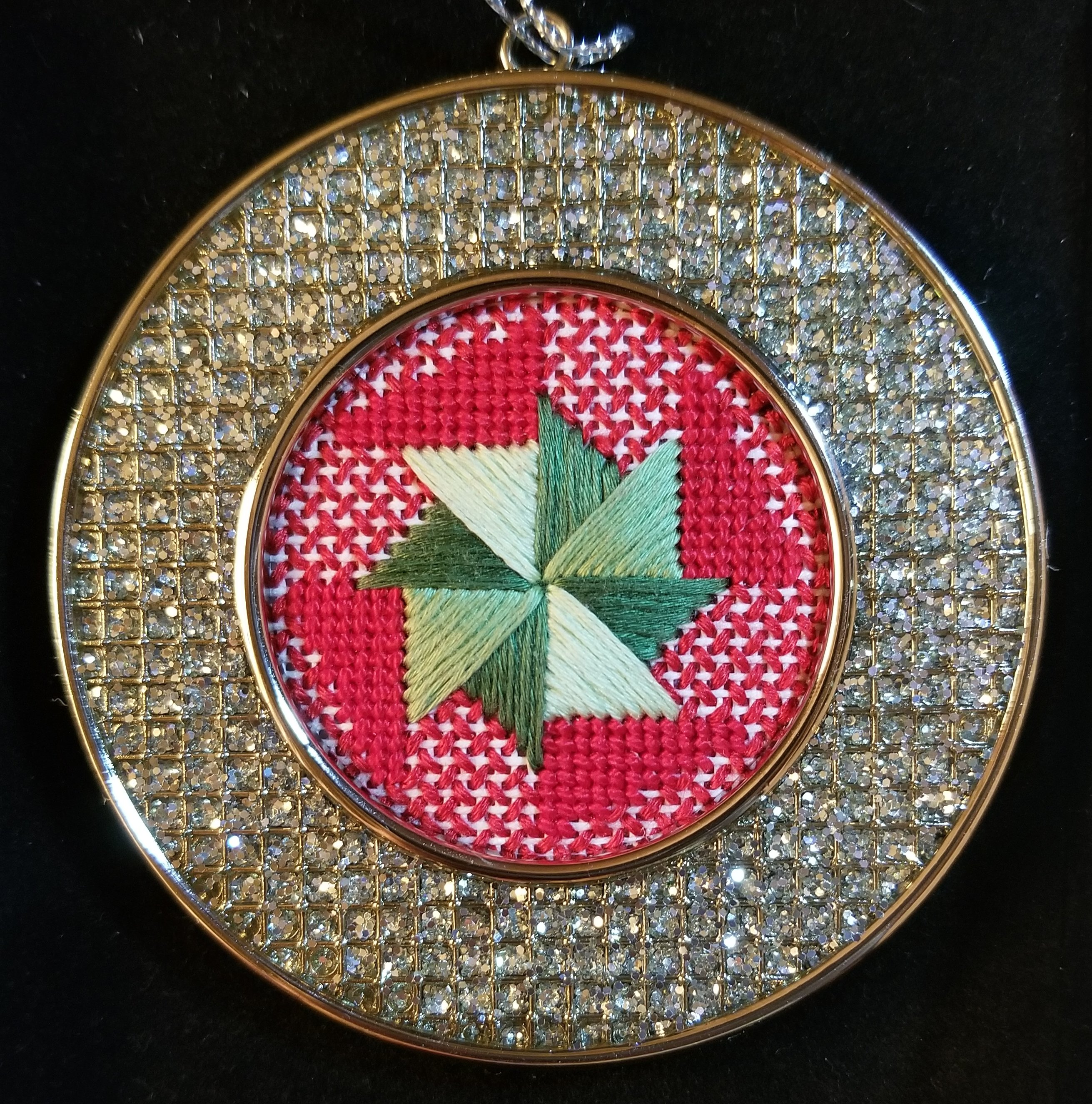
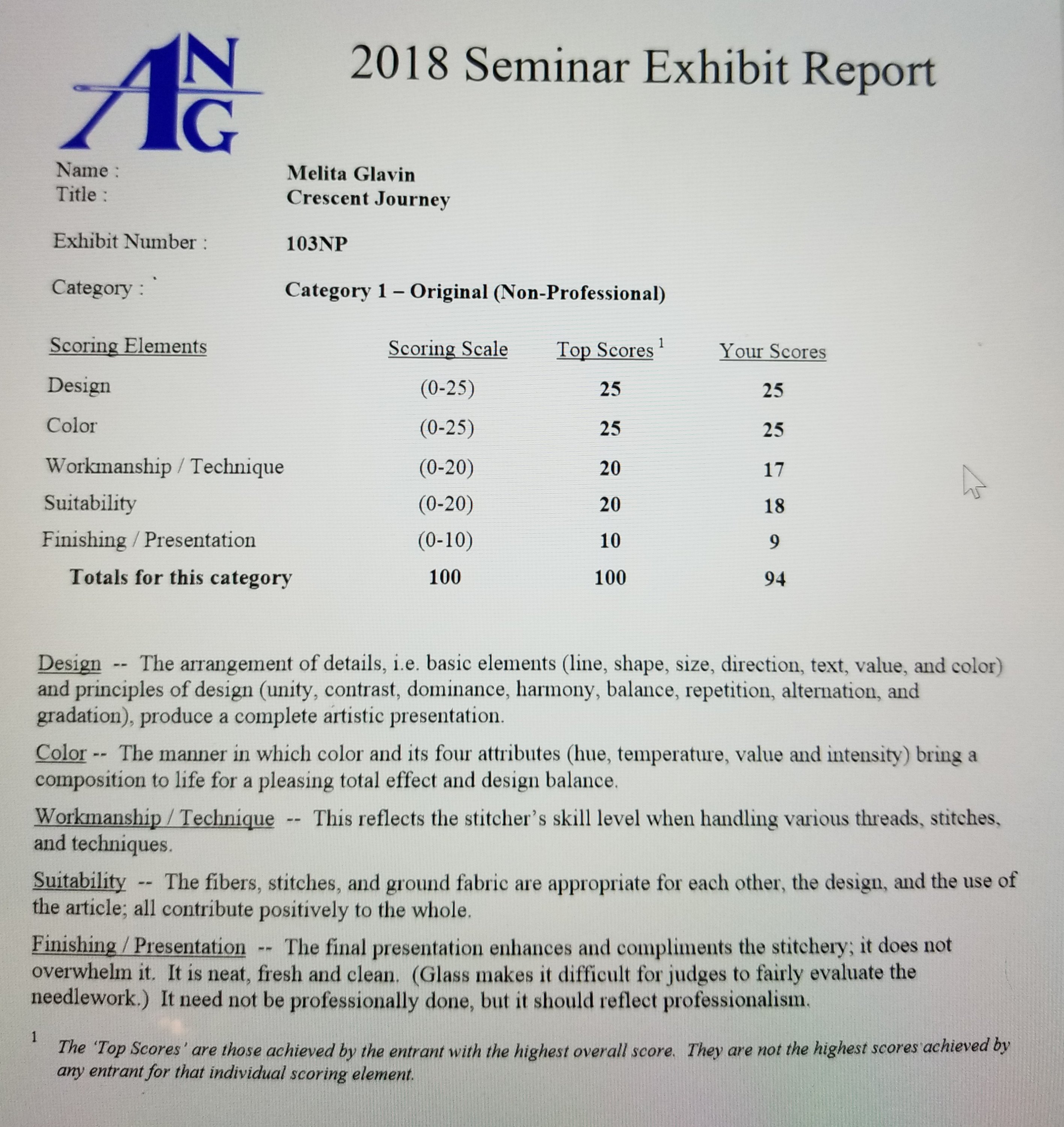
Crescent Journey received a 3rd place ribbon at ANG Seminar and scored 94 out of 100 – anything in the 90s is fantastic! So, you know some other wonderful pieces were submitted in this category. I requested a Judge’s Critique and am thrilled especially with design and color scores – doesn’t get any better! The technique issue that continues to plaque me is twisted threads. I knew I was having issues with Trebizond. Apparently, some beads were not oriented correctly (I may have rotated my canvas as I stitched & if that was intended then I should have noted that in the statement) or they leaned a tad (I need to get out my magnifying glass as I stitch). And, the judges thought some stranded silks might have been more suitable and would have eliminated the twist issue. I can see them used as well although I think it would give a different effect.
My artist statement follows:
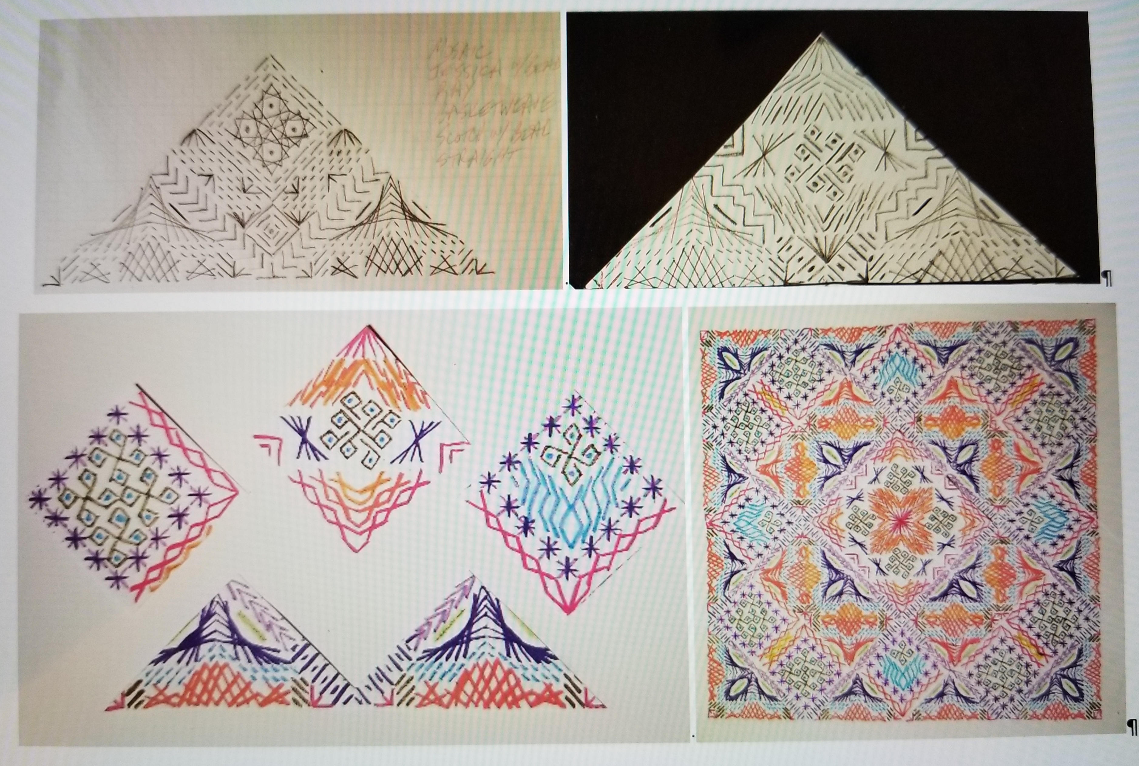
I’ve been through an enlightening journey with Orna Willis. During her “Color Inspirations”, “Come Design With Me”, and “Dare To Design” classes, I have learned techniques and processes that allowed me to discover designs within myself. Two of the earlier black and white sketches are shown to see how I developed this design. The colored sketches do not even represent the final design because portions didn’t stitch up as I expected. So, I discarded some stitches and kept others until I had the final stitched design.
Key elements were the way the crescents came together in the corners and the frame within the triangles (Knitting stitch and Mosaic stitches in light and dark purple). The base that the 3 diamonds fit into is same throughout the design except for the colors of the crescents and half Waffles. The center diamonds have 2 or 3 shared components (Wavy, Smyrna, and Nobuko stitches) adding to the continuity within the design. And, the placement of colors helped tie all the elements together too.